Thursday, 1 December 2016

Ironjaws Megaboss part 7

Once I’d finished his black armour the main part of the Megaboss was looking more complete. There are quite a few details to attend to but the outstanding major elements are the axe and the dracoth skull on his shoulder.


I decided to turn my attention to the skull. As the single most striking element of the mini, it’s the thing that first drew my attention to it. And, as much as I’ve enjoyed painting the armour, the skull has always looked like it was going to be the fun part of the job!

I haven’t been disappointed. Painting the skull was a thoroughly enjoyable experience and I’m very pleased with the result. A major part of the painting process went into resolving the textures. I wanted the skull to have a slightly rough, gnarly looking texture. In addition to the bone texture, I wanted to add chips and scratches. A lot of fun was had resolving these textures and figuring out the balance between then.


My colour palette for the skull is one I often use for bone.

Base colour:

Games Workshop - Rakarth Flesh

Shade:

The Army Painter Quickshade - Strong Tone & Soft Tone
Games Workshop – Rhinox Hide

Mid-tones:

The Army Painter Quickshade - Soft Tone

Highlights:

Games Workshop - Rakarth Flesh
Scalecolour Fantasy & Games – Purity White

The shading is built up with a series of glazes using the The Army Painter Quickshades. Rhinox Hide adds a bit more depth and opacity to the colour of the horns. This combination gives me a good range of yellow/brown and red/brown shades to play with.

I built the highlights on top of the mid-tones by gradually adding white to the Rakarth Flesh. The final highlights are pure white. Once the highlights were dry, I glazed a little dilute soft tone quickshade here and there to soften the effect and tie everything together.

Friday, 18 November 2016

Ironjaws Megaboss part 6

The Boss is back and this time I’m not stopping until he’s finished!


Despite putting my Megaboss on the backburner several times, I love painting this mini! One reason for this is I’ve been able to take my NMM technique in a new direction by combining it with texture techniques. The work has sometimes been quite challenging, but it’s also made for some rewarding painting sessions.

I decided to paint the armour on the shoulders and arms as blackened metal. This wasn’t in my initial plan but I feel the addition of black provided a necessary contrast to the other colours, and it makes the overall colour palette feel more complete.

As I said while painting the Farseer, black is a colour I’ve not used for many years. The practise I gained on the Farseer has paid off and I was able to approach the blackened armour with considerably more confidence than I would otherwise have done!

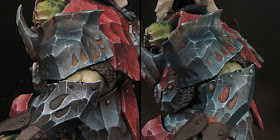
The key colour is - no prizes for guessing - Vallejo Dark Sea Blue. It’s mixed 50/50 with black for the base colour and then with white for the mid-tones and highlights. Once the rust effects were painted on, I repeatedly glazed over the entire area with highly diluted Dark Sea Blue. When I’d built up a pleasing depth of colour, I picked out a few extreme highlights with white. The Dark Sea Blue ties it all together and gives some subtle depth of colour to the blackened areas.

Before & after glazing with Dark Sea Blue.


Friday, 11 November 2016

Eldar Farseer - chosing a colour palette

As usual I worked out my ideas for a colour palette before I began painting but once I'd started I allowed my plans to evolve as the work progressed.


It took me quite some time to make my initial choices for an overall colour scheme for my Farseer. I considered a lot of options but in the end I decided to paint the majority of the costume in dark tones with a contrasting light outer robe. The colour palette features black, blue, red, purple, gold and light grey. This gave me some bold colours and strong contrasts, both light/dark and warm/cool, to experiment with. In addition both black and white are colours I tend to avoid using so, by choosing to work with them, I’d set myself a little challenge.


I used black as an overall base colour for the scheme. Although I first learnt to paint minis with a black base colour, it’s been many years since I’ve worked in this way. I used a mix of GW Abadon Black, for good coverage, and Scalecolour Flat Black, for a matt finish.

The first part of the mini I painted was the inside of the robe and straightaway I found myself struggling! The black base colour really threw me as my colours behaved very differently from what I'd become used to. Colour is relative and colours that would have been vibrant on a light base looked chalky and washed out on a dark base. After this initial set back, I gradually built up a more pleasing intensity in my colours by layering them. In addition I would have had an easier time blending my colours into a black base if, rather than using a pure black, I had mixed a little of my colour into the black base.

For the black areas of the Farseer’s costume I used Dark Sea Blue in my mix. This gave a subtle blue/green tone to my blacks and tied it in with the cool elements of my colour palette. Black can be highlighted with a straightforward grey tone, but the addition of a little colour adds a lot of interest to what could otherwise be a rather flat and boring colour.


The use of black in my palette helped me to create a darker and moodier feel, more so than I would normally achieve. This is exactly what I wanted as I think it suits the nature of an Eldar Farseer. However the palette needed some contrast and the Eldar are not all about darkness!

My initial intention had been to use white for the outer robe but I quickly rejected this as the scheme developed. White would have been too strong a contrast for the overall feel I wanted. I chose instead to use a light grey, which felt right both in terms of contrast and as a colour choice for the sometimes ambiguous Eldar.

The obvious colour choice seemed to me to be a cool grey but I decided to experiment. One of the basic rules of colour I was taught at college was ‘never mix warm and cool grey in a design’. For years I never questioned this until I was required to create a design in an Art Deco style. After some research and experimentation I discovered that the best colour scheme for the job used both warm and cool grey. Under the right circumstances warm and cool greys can be used together to great effect.


I decided to attempt a warm/cool grey contrast on the outer robe. To do this I used warm greys in the shadows and cool greys in the mid tones and highlights. It took a lot of going back and forth between the tones to get the balance right but I’m delighted with the result!


The colour contrast needed to be kept fairly subtle to work but it adds a lot of interest to the otherwise plain outer robe. I’ve also incorporated a subtle stippled texture to contrast with the smooth armour. In addition by using Games Workshop paints on the outer robe and Scale colour on everything else, there is a pleasing contrast between the matt finish of the inner robes and the soft sheen on the grey outer robe.

Monday, 7 November 2016

Golden Demon: Enemies of the Imperium

Yesterday felt rather special and it caught me by surprise! I was hoping like mad to get a trophy for my Farseer and was delighted that it won Gold. But when I saw who the other Gold winners were, and what they had won with, I tucked my statuette under my arm so I would have both hands free to applaud the latest Slayer Sword Winner.

I honestly didn’t expect to hear my own name at that point and it still hasn’t quite sunk in!


It makes me think back to my 21 yr old self, entering the first Golden Demon in 1987 with no idea of the journey he was about to go on. I’m extremely proud of the swords and trophies I’ve won but way above and beyond that I feel grateful for all the friendships and experiences I’ve had as a result of my miniature painting hobby!

Please forgive the cloying sentiment but I’m a bit tired and very over excited. Normal service will be resumed shortly.

Friday, 4 November 2016

Eldar Farseer


The Farseer is finished and in the end I had plenty of time to get everything done in time for Saturday’s competition. I’ve really enjoyed being able to turn this project around in just a few weeks and it served the purpose of getting me into a steady routine very nicely.

It’s also given me the chance to try a few things I’ve been meaning to have a go at for quite some time. Aside from the use of black in my palette I’ve tried object source lighting for the first time.

The base is inspired by something that Roman Lappat did over on Massive Voodo. As soon as I saw what Roman did I wanted to try it myself and this project felt like the perfect opportunity!


Thursday, 27 October 2016

Eldar Farseer - Conversion and Construction

I wanted my Farseer to be levitating with both feet off the ground. My plan was to take the Farseer’s torso and fix it to the legs from the Harlequin Solitaire to create the dynamic pose I desired.


The first stage was to do a rough test fit to see is the idea was even possible. For this I held the parts together with Blutack. From my test fitting it seemed clear that the concept would work and the parts were, with some serious trimming, compatible.

I removed the mould lines with a combination of scraping and sanding. It’s a fiddly job, but it’s essential to take the time and effort to get it done right. The discovery of a missed mould line once you’ve started painting will result in a world of pain!

With the parts cleaned up, it was then time to trim them to fit together. In this case that involved carving away a quantity of plastic from the inside of the Farseer’s outer robe and the Solitaire’s backside. It’s best to go slowly and carefully with this sort of work. Gradually shave away the plastic a little at a time while making frequent ‘test’ fittings. You want to avoid removing too much plastic. Once I was happy with the way the parts fitted together, I sanded the carved surfaces to a smooth finish. This was especially important on the inside of the long robe, as this previously concealed area will now be visible.

The parts were glued together using Humbrol’s plastic glue. I allowed plenty of time for the joins to set after I attached each part. Once all the parts were together, I let the glue fully harden overnight. This is an important process as you want a strong bond between the various parts. They will need to hold up during the next stage, which is gap filling and more sanding.

In the case of this conversion there weren’t too many gaps to deal with. However the waistline, where the parts from the two minis join, needed some attention.

I always take my time on the preparation of a mini. I find it tedious because I want to get on with the painting. But good prep work will enhance the finished mini just as bad prep will spoil it.

In order to achieve a levitating effect I needed to find a way of supporting the mini above the base. As GW have developed their plastic minis they have become increasingly bold with the poses and many of then, like the Solitaire, have a leaping aspect with a cunningly contrived point of attachment that leaves the feet free from the base. I needed to achieve something similar.

I had already given some thought to this when I was working on my Dark Eldar diorama and one of the options I’d considered provided a solution for my Farseer. I decided to create a long trailing sash that would act as a support for the mini. To do this I needed a material that was strong enough to support the mini while thin enough to be convincing as a sash. Brass sheet provided the solution with the added advantage that I was able to cut it with scissors and bend it to shape.

Monday, 24 October 2016

Work in progress

So, here I am three weeks into my new life and I’ve been conspicuous by my absence.

I’ve actually been very busy getting a feel for how I can spend my days and, most importantly, pace my painting. I’d planned out my painting projects for the next few months but, of course, things change and I’ve decided to adapt my plans to new circumstances.

I need to go to Nottingham to pick up my minis from Warhammer World and so I thought I might as well go there when an event is on. With ‘Golden Demon: Enemies of the Imperium’ set for November, it was a bit of a ‘no-brainer’ as to when I should plan my trip. Of course there was no way I could enter the competition as I’d nothing ready and not enough time to paint anything … but then again.

I began mulling over the prospect and possibilities of ‘having a go’ at getting a mini ready for November 6!

I saw it thus:

  • I know I can turn a single mini around in four weeks. At that point I had seven weeks before the competition. For five of those weeks I would be ‘retired’ from work. 
  •  A short-term, focussed project would be a great way of establishing a regular and productive painting routine as I embarked on my adventure as a full time hobbyist. 
  •  I‘ve had the idea and parts for an Eldar Farseer conversion for some time and it fits the ‘Enemies of the Imperium’ theme. 
  •  I’m going to the event anyway so I might as well have a go at painting an entry. 
  •  I had planned to see if I could do the Farseer for the ‘Classic’ Demon in May. If I can’t get him ready in time for November I can still take him along in May as originally intended. 

So the Megaboss is on the back burner (again) and project Farseer is go!


At this point I’m well into the project and it’s going well although I find that my painting days go by very quickly. It’s true that time really does fly when your having fun!


I’ve been recording my progress on the Farseer and will be posting in more detail later. For the moment I’m thoroughly immersed in my hobby and enjoying every moment of it.

Friday, 23 September 2016

Making a title/name plaque for a display plinth.

A title or name plaque may not always be a necessary and I firmly believe that most finished models should be capable of doing without one. The addition of a title or name plaque won’t make a model any better than it already is but it can provide an extra finishing touch to the presentation of that model.


I’ve had a few people ask me how I made the name/title plaques for my plinths so here is a description of the process I use.

To be honest I should be thoroughly ashamed of myself for not thinking of this years ago! I’m a Graphic Designer so I have all the skills and resources to generate the graphics for title plaques quite literally at my finger tips. Having said that it should be possible for anyone to generate the graphics for a plaque in nothing more sophisticated than Microsoft Word.

Materials: 


Printed plaques - It's very important to use laser prints for this technique. Laser prints are set with heat and the ink is then waterproof. Inkjet prints will not work as they are not waterproof.

Plasticard/styrene sheet – between 1 & 2mm thick

Vallejo matt varnish

Scalpel/craft knife

Two part epoxy glue e.g. Araldite

Paint, ink & washes for weathering.

Method: 


The graphics are by far the most complicated part of the process but they are also the most creative. As I said above, there is no reason why this could not be done in Word, but I generate the graphics for my plaques in Adobe illustrator. The first step is to decide on a size for the plaque and draw a box to those dimensions to define the working area.

You can use whatever combination of text, illustration and graphics you wish but, remember, clarity is the most important thing to consider. You want the label to be legible at a glance so don’t make things too complicated. A clear font and simple border will usually be the best solution.

Having said that, don’t be afraid to experiment with different combinations of text graphics, colours and size. Print and cut them out and see how they look on the plinth. I often find that once I see my designs in situ the most successful version is not the one I expected it to be!

The picture below shows some of the different type styles and colours I tried for my Abalam bust.


Once you have printed out your final design make sure to leave a margin of about 5mm around the edges when you cut it out. Now prepare your plasticard by first giving the surface a light sanding and then a thin coat of undiluted matt varnish. This will help the paper to stick to it. You can use whatever thickness of plasticard you like, but I prefer it between 1 and 2mm thick. If you use anything thicker the finished plaque may look too ‘chunky’ on the plinth.

Next soak the paper in a dilute solution of the matt varnish. Roughly 60% varnish to 40% water will do the job. The varnish serves a dual function. It glues the paper to the plasticard and seals the printed paper so that it can be over painted. Soaking the paper ensures that the varnish penetrates the surface. This will soften the paper making it easier to apply. It will also cause the fibres in the paper to swell and the paper to expand a little. As the paper dries it will shrink back and this will help to ensure a flat surface. I use a flat-ended brush to gently work any pesky air bubbles out from between the paper and plasticard. Be careful when handling the wet paper as it can become quite delicate.


Once the paper is totally dry I give it an extra coat of undiluted varnish. When the varnish has dried it’s time to cut the plaque out. When cutting a straight line (use a metal edged ruler) in plasticard, it is only necessary to score the surface a couple of times with a sharp blade. The plasticard will then snap apart cleanly along the scored line.


There is almost always a very slight ridge along the edge of the plasticard and this needs to be carefully sanded away. I like to round off the edges on my plaques when I sand them as I think it gives them a smart finish. The next step is to carefully paint the exposed edges of the plaque black.

You could use your plaque like this, if you wish, but I prefer to take things a bit further and apply some paint effects to give the plaque a distressed look. The degree and nature of the effect very much depends upon what I feel is appropriate for the mini.

I usually darken the outer edges with multiple glazed layers of washes (from Secret Weapon). In addition to that I may apply a combination of sponging, stippling and splattering. In the case of my plague bearers I went all out with painted chipping and rust effects.

The pictures below show a selection of my plaque designs before and after I distressed them.


I use epoxy glue (Araldite) to fix my finished plaque to the plinth. I prefer this to super glue as superglue can sometimes cause white fogging on the plinth. The epoxy glue also has the advantage of allowing enough time to tweak the positioning of the plaque before it sets. Only use a small amount of epoxy, if you use too much it can ooze out from under the plaque when it’s pressed into position!


Monday, 12 September 2016

Seeing red

I've been painting the red armour on my Megaboss this week and this has given me cause to consider my approach to painting this particular colour.


Red is the colour of passion, danger and excitement! The eye will pick out a flash of red among other colours making it an excellent accent colour. And we all know that if you paint something red it will go faster!

In a nutshell, red is a very useful colour to have in your palette but, it has to be said, it’s also a potentially tricky one.

The big problem with red is that it can be a very difficult colour to successfully highlight. Once you start to lighten red it can become another colour. Sometimes orange but most commonly pink. This is one situation where simply adding white to a colour to lighten it really won’t work!

My own tendency to over highlight makes this a problem I’m all too familiar with. To overcome this I use a mixture of approaches when highlighting my reds.

It’s very easy to think only in terms of lighter colours when highlighting, however, a slight shift in attitude can provide a solution. Rather than lighter, think brighter! Using a brighter more saturated shade of red for highlights will help to avoid the curse of chalkiness, desaturation and pink highlights.

Instead of building your highlights up from a dark base, try using a bright saturated red as your base colour and shade down from this. A light to dark style of painting can be very effective when used on reds as it gives a rich saturated quality to your colours. I used this approach to paint the jacket on my Uncle John bust.


You will probably need to use a lighter colour in your final highlights, so pick your highlight colour with care. The type of surface you are trying to represent, and how reflective it is, will also affect your colour choices; but save white for the final extreme highlights. For my reds, I like to use gold/peach colours in my highlights. In the case of my Megaboss I'm using  Scalecolour Golden Skin.


Whatever colour you are using it’s important to keep the lightest highlights to the absolute minimum possible. If you go a bit too far with the highlighting (and I often do), not all is lost! Glazing over the red areas can work wonders. A carefully glazed layer of bright-saturated red/orange can restore the mid-tones and boost saturation. You can do this with dilute paint, but ink is really ideal as it is both translucent and saturated. I dilute the ink and work with several subtle layers to control the effect. I glazed over the highlighted reds on my Hellion with orange/red tones to create a saturated fiery red.


I’ve focused on highlighting red because that’s where things often go wrong, but it is also important to think about the shadows. You can mix red with black or dark brown to shade quite successfully, but the finished effect can be a bit flat and uninteresting. The use of a contrasting colour in the shadows can make a big difference. Dark blue or purple are good choices and I’ve even seen green used!

For my Dark Eldar Scourge I've created a 'cool' red by using strong blue tones in the shadows and slightly pink highlights.