Wednesday, 25 January 2012

Dark Eldar Diorama – The second Scourge part 2

I've extended and filled out the hair for a more dramatic feel so my Scourge custom is finally ready for some paint! It's just stuck me that this is the first mini that I've actually started from scratch since I began this Blog. Everything else I've posted so far was in some way started before June 2011. 


I'm being asked if I'm going to enter Golden Demon this year. So I suppose it's time to go public and say yes ... hopefully! 


It's important to stress the hopefully bit as I'm nothing if not a slow painter. If the Dark Elf Diorama is ready in time it shall be going to the Demons. But this diorama is turning out to be something of a long game and I'm determined not to rush (as if) to try and meet the deadline. So I might be looking at 2013. 


One of the big things I needed to re-learn when I came out of painting 'retirement' was to take the time I need to do the job properly. I can paint quite quickly if I want to but I don't enjoy the process as much and it never results in my best work and my best work is demanded for the Demons. Also my job as a Graphic Designer/Illustrator is very deadline driven and it's good not to have any such pressures involved in my hobby.


On a personal level entering the Demons again is quite a big deal. I last entered in 1990 and at the time I felt that I'd achieved as much as I could. The best I would ever be able to do would be to equal past triumphs. I just wanted to take time enjoying mini painting for it's own sake. To be honest that's still my primary motivation - if it ain't fun I ain't doing it! 


Mini painting is more fun than ever and as for the Demons, well I'm up for the challenge. It would be rather fine to prove that there's still some life in the old dog nearly twenty two years after I last won a Demon!

Thursday, 19 January 2012

Painting NMM armour - an illustrated guide.

I've decided to present this guide in a three step format but with some reservations. Step-by-step guides are a great way to present information but they won't always give an accurate representation of the painting process. A step-by-step approach is not a true reflection of how I usually work. There's a lot of trial and error involved and I tend to make it up as I muddle along. I don't want to give the impression that mini painting is simply a matter of following an exact set of steps to achieve a guaranteed result. It's all the little accidents happening along the way that keep things 'interesting'.

Mine is a stylised rather than realistic style of painting and my approach to NMM is pretty basic. I wanted to give a feel of the model's armour reflecting the colours in it's environment. My assumption is that the armour will reflect warm colours from the ground below and cool ones from the sky above. It's the same basic theory applied to painting a simplified chrome effect, the sort of thing so popular in 80's airbrush artwork. The look I was aiming for was for something far subtler but this provided the starting point from which I developed my ideas.

The colour palette for the armour was picked directly from the diorama's base. I'd experimented with a NMM effect on some of the bits and pieces attached to the monoliths and liked how things turned out so I decided to approach the armour in the same way.


Colour Palette
All the colours used are from Games Workshop.

Base colour/shade: 

Calthan Brown & Devian Mud Wash

Shade/accents: 
Calthan Brown + BlazingOrange


Mid tones: 
Calthan Brown + Ice Blue + Codex Grey

Highlighting: 
Mid tone mix + IceBlue + Skull White

Final highlights: 
Skull White

For me one of the most interesting things about this palette is using orange/brown and blue together as these colours have a high level of contrast and the potential to clash. Its challenging to use this contrast to proved visual interest without producing an overly colourful 'eye popping' finish. Equally I needed to avoid over mixing the colours and getting a drab muddy looking mess.

Painting guide.

As always what you will find here is an explanation of how I approached a particular painting challenge rather than a definitive guide on the only or best way to do it. I almost always paint by building up translucent layers. I try to keep the paint layers as subtle as I can to create a smooth transition.


Step 1 Base colour/shade.

The choice of brown is vital to the finished look of the mini. I could have used a warm grey but I wanted to have an earthy feel to the colour palette. The whole mini was base coated with Calthan Brown and then given a light wash of Devian Mud to help pick out the detail.


Step 2 Mid tones.

This is where all the interesting stuff happens with the colours. The mix of the brown base colour with ice blue gives all sorts of interesting variations and its here that the transition from warm to cool happens. Broadly speaking I add blue and a little grey to the brown and gradually work up in layers to the lighter/cooler mid tones. Each layer will contain a little more of the blue/grey in it than the last but it's important to keep some brown in there. Only the lightest highlight layers will have no brown in the mix at all. The combination of blue/brown in the mix keeps the colours from becoming too bright and artificial looking. Some of the best NMM I've seen has been created using a very narrow and almost 'muddy' palette of colours and it is this that I was trying for. 
The introduction of a small amount of codex grey into the mid tones helped to stop the brown/blue mix taking on a greenish tint. In a few places there is a little scorched brown added to the mix. This gives some mid tone areas an almost purple tint. The greenish and purple tints I am talking about are very subtle but their presence gives a greater depth to the colour range and make the armour more interesting to the eye. The overall visual impression of the finished armour is one of a blue/grey colour with warm shadows.


Step 3 Highlighting.

As I worked up from mid tones to highlights I began adding white to the mix up to pure white for the very finest highlights. To give a shiny/reflective look to the armour the final highlights need to be kept as fine and sharp as possible. There are also a few very tiny dots of white to create the effect of the armour glinting. I always work with diluted colour - it is far more affective to build up the final highlights with a few very subtle applications.
To get a bit of interest into the shadows there are some reflections/glints built up with a Calthan Brown + Blazing orange mix. 


Colour Palette - Gold/Brass

The gold/brass areas were created using the same stages and approach as mentioned above but with a different colour palette. Tiny touches of Ice Blue & Blazing Orange enhance the shiny/reflective effect.

Base colour/shade: 
Calthan Brown

Mid tones: 
Calthan Brown + Iyanden Darksun

Highlighting: 

Iyanden Darksun + Skull White


Accents/Glints: 
Ice Blue & BlazingOrange


UPDATE 29 June 2012
I've put together an illustrated guide to painting NMM Copper
as an expansion to this guide.


Detailed Views.

A few mercilessly enlarged pictures to illustrate my NMM technique.


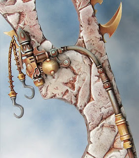
 The upper surfaces reflect the cooler (sky) colours and the lower ones reflect the warmer (earth) colours. The tones in between the two tend to be neutral. Highlights are kept small & sharp.


Compare the bluer mid tones on the inside of the leg to the warmer mid tones on the outside. The use of orange in the shadows helps to add to the reflective look and adds interest.


 Some examples of the gold/brass effect. Notice the reflections of the ice blue colour.

Thursday, 12 January 2012

Dark Eldar Diorama – The second Scourge

I'd hoped to start this mini before Christmas so that all the conversion and prep work would be done and I could spend some quality time painting over the holiday. Naturally enough life got in the way and all my plans went out of the window so I'm presenting this report later than I'd expected.


I was really taken with the plastic Dark Elf Sorceress Games Workshop brought out for Storm of Magic. So I wanted to find a way to incorporate her into my Dark Eldar diorama. It's taken a bit of planning and some of the conversion work was a right old fiddle but the new mini is beginning to shape up nicely.


Parts/materials used:
Dark Elf Sorceress - arms body & hair
Daemonette of Slaanesh - legs
Dark Eldar Scourge - wings and helmet
Dark Eldar Raider -  spear
Superglue
Green stuff


The first stage was to get all the parts together to test out how (and if) they would fit together.


Things are pretty rough at this stage. I've trimmed away a fair bit of plastic, glued the legs into place and filled in the worst of the gaps around the legs. Every thing else is held together with blue tack. At this stage I've trimmed away enough plastic to get the parts fitting roughly but need to trim a little more away to get things fitting more tightly. I like to go cautiously as it's all too easy to trim too much away and have to do a load of filling/repairs.


Next I work on all the parts to get the best fit possible. I start to glue then together and fill the gaps. I like to take this slowly letting each stage dry and set fully before moving on to the next. Its worth thinking through this stage carefully and planing the order in which the parts will be assembled. 


Here is my new Scourge as she currently stands. The parts are all stuck together but I still need to do some gap filling and a little more sculpting.


As a complete aside I thought I'd share a picture of one of the things that kept me away from minis in the run up to Christmas. I needed to create a set of illustrated characters as a part of a major branding exercise I've been involved with this Autumn. Rather than presenting the 2D illustrations my client expected I broke out the plasticine and put some of my sculpting experience to use.

Monday, 2 January 2012

Spots before your eyes – a guide to stippling

First and foremost here’s to a happy and healthy New Year for all!

I’m very pleased that my step-by-step guide to painting Dark Eldar Scourge Wings has proven to be fairly popular. It’s even been picked out by Roman from Massive Voodoo for inclusion in his latest list of inspirational links! As an addition to the step-by-step I’d like to present an illustrated guide to stippling. It’s something I get asked about on a fairly regular basis so I guess there needs to be a bit of explaining done and it’s easier to show rather than just tell.
 It’s worth pointing out that how I use the term stippling with regards to mini painting is very much my own personal definition of a painting technique and I’m not laying claim to the invention of something new and previously undiscovered.

Stippling is a term I was familiar with from painting and illustration and it is from this that I drew my initial inspiration. One method of shading a black and white illustration is to apply small dots of black. You can adjust depth of shading by varying the density and distribution of the dots.


You can work in a similar way with paint and here the dots can be used to create changes in both colour and shading. The most famous example of this can be seen in pointillist technique used by artists such as Andre Derain and Georges Seurat.


For the purposes of this guide stippling is a mini painting technique where you apply tiny dots of colour using the very tip of a fine brush. Varying the density and colour of the dots can create a shading/highlighting effect. The stippling action can be performed quite quickly but I’d advise a slow careful start - speed will come with practice. This technique is very controllable and can be used to make precise adjustments to an area’s colour/shading. It can be used on its own to highlight/shade an area or in conjunction with other painting techniques.

Stippling is also extremely variable. Working with very fine dots and subtle changes of colour/shade will give subtle graduation with a less visible dot texture. Alternatively you could push the dots to the max for a dramatic and spotty effect like the one I’ve used on the back of the Scourge’s wings. Both paints and washes can be used and their differing qualities will affect the final result.


When I first use stippling I mostly applied it to Eldar armor. Here I have used a relatively subtle (OK its bright pink but I’m not referring to the colour!) variation in texture and tone to give a smooth transition from highlight to shade with a light speckled texture. When I refer to texture in regards to stippling this is a painted effect as the actual surface is smooth.


This painted ‘texture’ is one of my favorite things about stippling. It is particularly affective when used alongside areas of more conventional blending. In my opinion stippling is a particularly good affect for use on large areas of flesh as it can give mottled/speckled look and flesh is very rarely all of a smooth even tone. The subtly of the affect can be varied to keep things looking relatively naturalistic.

On the Unicorn above stippling has been used to highlight and give a dappled texture. Colour has been used very simply working up from a blue grey base to white highlights in an almost monochrome style.

 
The Nurgle predator above also used stippling to give a fleshy quality to it’s surface. As well as providing highlighting and shading the stippling helps to give a more interesting quality to the flesh by using a combination of greens and ochres. The coloured dots are distinct but the eye blends them together when viewed at even a slight distance.


Here on the inside of the Scourge’s wings stippling is built up to create a textured area of shading between the fingers. I’ve used a combination of red & brown washes for the stippling and kept the dots very fine. Where necessary I’ve gone back over and stippled with the lighter base colour to adjust the tone.


The tattoos were filled in with a stippled texture to keep the look of then consistent with the wings.


On the back of the wings some of the dots are applied using a cocktail stick so that the stippling gives the impression of a spotted skin pattern. Check out the ever-excellent Massive Voodoo For Roman’s Tutorial -Making skin with dot grain.

You can also see how washes have been used with the stippling to help blend the effect in with the overall look of the mini.


Also on the back of the wings you can see how stippling has been used to build up both highlights and shading. At the same time it provides an overall grainy texture and a spotted skin pattern. Again the careful application of washes in a glaze helps to bring everything together.

I hope this guide proves useful. I’ve deliberately avoided trying to produce a step-by-step to stippling, as, for me, the process is one of constant improvisation and adjustment as I’ve said before I make it up as I go along. Although it can sometimes result in tears the best way to learn is to take a deep breath and just give it a go. Nothing ventured - nothing gained!