Showing posts with label Infamy Miniatures. Show all posts

Wednesday, 10 February 2016

Looking back... and forward.

About his time last year I’d reconciled myself to a less productive 2015, at least in terms of the number of minis I’d get finished. I decided to concentrate on quality and enjoy myself obsessing over Gutrot Spume. Gutrot was painted with an eye to entering the Golden Demon competition, whenever that happened; and I’d resolved to quite literally push the boat out for him.

As it turned out 2015 was a far more productive year than I had predicted! After a slow start, Gutrot came together and was finally finished in September. I’d already taken time out to paint Mole, but once Gutrot was done, I switched up in scale to paint Commodore Borgossa, and most recently Abalam Prince of Hell. I also started painting a unit of Plague bearers as part of the preparations for my Weekend Workshop in Cardiff.


And now we finally have a date for the next Warhammer Fest and the 2016 Golden Demons! Sunday, May 15, at the Rico Arena in Coventry. It’s been a long wait!

With Abalam finished, all bar his plinth, I am turning my attention to the next project. I was going to paint another mini for Salute (April 16) and then return to the unit of Plague bearers, but the Golden Demon announcement has changed everything. The Plague bearers have jumped right back up to the top of my painting priorities. Remembering 2014’s last minute Haemonculus, I want to try and complete them without putting too much pressure on myself.

Project Nurgle is all GO….again.

Monday, 27 April 2015

Salute 2015

With Mole done and dusted I had a little time to consider some other entries for Salute. So I was busy all day Friday making some adjustments to Squarg's base - that was very nervous work, but it was well worth the effort. I’ll post in more detail about Squarg’s base, the changes I made to it and why I made those changes, in the near future.

When the big day arrived it found me in a calmer frame of mind than in previous years. It might just be possible that I’m finally getting used to entering painting competitions and I have my nerves under better control!

Salute seemed to be bigger and busier than ever but the venue had much more space this year and that made for a more enjoyable overall experience. As usual the day seemed to go very quickly with the painting comp, stands, games and socializing (always the best thing about these events) making for a busy time. Before I’d managed to get round and see everything it was time for the painting competition results.


Uncle John made it through to the finals. Mole got First Place in Science Fiction Single Figure and, to my utter delight, Squarg got First Place in Fantasy Creature or Vehicle. But that's not the best of it because Squarg also won Best in Show! Needless to say I'm a very happy bunny.

Saturday, 25 April 2015

Infamy's Mole - Part 6

Here he is - and I finished him in time for Salute.

I made all my usual mistakes when I was building the base for Mole. The first thing I tried out involved ruined walls. However, after several days of playing around with different compositions, I realised that this was simply the wrong thing for me to be doing with Mole. For my taste, Mole looks much better on a simpler base with no backdrop.


With that decision made I set about constructing the base onto a plinth. I’d decided on a brick paved ground surface with layers of earth beneath. I would also incorporate a pit of some sort to tie in with the idea of Mole’s role as an excavator. 


The ground was built up with and carved away from cork. The brick paving was made with a set of tiny plaster bricks purchased from the Wamp Store. I decided to lay the bricks in a herring-bone pattern for visual interest. The bricks were set onto a layer of PVA wood glue and nudged into position with a sculpting tool. When the glue had set I brushed a little dried garden soil into the gaps between bricks. This was then carefully painted with dilute PVA which soaked into the soil and held it all together. It was a bit of a fiddly process but worth the effort, I think. 

The surface texture of the earth was achieved by painting the cork with dilute PVA and sprinkling it with more dried garden soil. The addition of a few old watch parts (also purchased from the Wamp Store) added some steampunk detail. 


My first version of this base had the earth breaking free from the edges of the cube in a muffin top effect. I really didn’t like it! It still felt too big and clumsy for Mole so I took a risk and cut it free from the cube. I then carved and filed the sides down flat. I’m much happier with this more austere composition. A test fitting of Mole confirmed my feelings. To give height to the composition, I added a lamp post to the base. 


Painting the base was fairly straightforward. I used the same palette of colours that I’d worked with on Mole to tie the Mini and base together. I paid special attention to the colour of the earth. A solid brown mud colour would not have looked very realistic or interesting. I graduated the earth from a drier gritty looking grey at the top down through dusty browns to a darker earth colour at the bottom. I also made use of the matt/gloss properties of my paints to reinforce the feeling that the earth was dry at the top and damp deeper down. 

Monday, 20 April 2015

Infamy's Mole - Part 5

Mole is finished but I'm going to keep him under wraps until Salute at the weekend! That's partly because I'm a big tease and partly to give myself some breathing room to see if I want to make any tweaks and adjustments before the reveal.

In the meantime here are a few teaser pics of Mole's base.


Thursday, 9 April 2015

Infamy's Mole - Part 4

It’s been a long time since I’ve painted any significant areas of true metallic on a mini so I’ve become, if you’ll excuse the pun, a little rusty on the subject. My decision to paint Mole in a muted colour palette, and a less cartoony (than usual) style, meant that true metallic seemed to be the way to go with him. Over the years, I’ve swung back and forth between true metallic metals (TMM) and non-metallic metals (NMM) and finally decided that no one was ‘better’ than the other. For me it’s simply down to a matter of personal preference and what feels appropriate. 

In common with many other steampunk minis, Mole provides the opportunity to paint several different types of contrasting metal. That said I think it’s important to plan out a scheme for the metallics. It would be all too easy to go over the top and paint a confusing scheme. I decided that Mole’s drilling rig would consist primarily of steel & brass with a few touches of copper. The metals could then be weathered to different degrees depending on their age and the nature of their use. 

The first piece of Mole’s digging equipment to be painted was the hammer. All the metals would be fairly dirty and worn but I decided that the hammer would look slightly newer than the main drilling rig. To do this, I went a little brighter on the highlights and less heavy on the weathering than I planned to do elsewhere. 


 Next to be painted was the boiler & furnace strapped to Mole’s back. I wanted this to look very dirty. I very rarely use pure black in my mini painting but black was essential to give a sooty look to the weathering on the furnace. Pure black alone would, however, have looked rather flat and dead in contrast to the rest of the mini. To counter this I incorporated several shades of brown & orange into my glazes. 


The boiler was painted in copper and brass. I wanted it to look old and leaky which gave me the opportunity to add some verdigris. The green tones that I’ve used to age the brass and copper add interest to the overall colour palette by providing a contrast to the red areas. The overall look might be fairly desaturated but it helps to have a few spots of stronger colour. 

The process of painting metallics seems to be fairly straightforward. I’ve achieved my best results by working over a metallic base colour with glazes and then refining this with a combination of metallic highlights and further glazes. This involves a lot of going back and forth between the highlights and glazes to refine the results and build some character into the metalics. As I said in my previous post, I’ve found it necessary to use washes, paints and inks in the glazes to achieve a satisfactory finish. The different materials give me a good range matt/gloss finishes to use as seems appropriate. 


In spite of my initial hesitation, I’ve enjoyed using true metallics on Mole. I’d forgotten just how varied and versatile they are and I’m already planning a future project that will require more metal to be painted. 

The long Easter weekend gave me the opportunity to crack on with Mole and get some serious painting time under my belt. As a result I’ve just about finished painting him! That leaves me couple of weeks to sort out a display base and takes a lot of the deadline pressure off my shoulders. 

I’d feared that project ‘moving Mum & Dad’ would seriously impact on my ability to finish Mole in time for Salute. As it turns out Mole took less time to paint than anticipated and I’ve turned him around in a month.

Friday, 27 March 2015

Infamy's Mole - Part 3

I may revisit Mole’s troublesome trousers to push the contrast a little further but, for the time being, they are finished enough to allow me to move on to other areas. My first priority is the face. Like many other painters, I like to get the face sorted as soon as I can because it sets character of the mini. Equally it really doesn’t matter how well the rest of the mini is painted if you can’t get the face right! 

My first pass at Mole’s face was OK as a start, but the contrast was too strong and it lacked overall subtlety. So I went back and glazed over the face with colours in the mid-tone range. For the first time ever, I consciously tried out the principle of using yellow tones in the top of the face, reds in the middle and blues in the lower section. I was a bit sceptical but swiftly changed my mind on the subject. Even though I was using very subtle glazes the face really started to come alive and the flesh tones were greatly improved. I’ll put that down as a lesson learned! 


With the basic flesh tones sorted I set about refining the detail. Mole has a very distinctive face with heavy lips and fleshy jowls and it was all too easy to paint him in an overly cartoony stile. It took me a lot of going back and forth but I finally reached a result that I was happy with. I’m really struck by just how much the face on the sculpt matches the concept art. 

Mole’s Goggles are a key element of his face and require due attention. To my surprise I painted the lenses very quickly. The rest of the job was going to take more care and attention as I’d decided to use true metallics (TMM) on this mini. I’m woefully out of practice with TMM on account of my on-going love affair with non-metallic metals (NMM). Scalecolour have come to my rescue once again with their metallic paints. The word on these has been very good and they seem to live up to their reputation for ease of use and a great metallic finish. 

Once the face was done I could move on and paint the shirt. I’d decided on a simple white shirt but wanted it to look very dirty. Mole’s excavations would definitely leave a literal mark on his clothing. A combination of Petroleum Grey, Rakarth Flesh and Ivory gave me a pleasingly dirty grey/white but the colour was a bit flat and uninteresting on it’s own. Some subtle touches with GW washes livened up the colour just enough and some less subtle Gryphone Sepia in the armpits added appropriately unpleasant sweat stains! 


With the shirt now ‘weathered’ It seemed like a good time to begin adding dirt to Mole’s trousers. I mixed brown pigment powders into a stiff paste with Valleyo matt varnish. This mix was carefully dabbed onto his shoes and the bottom of his trouser legs. I find it best to build up effects like this a little at a time. You can always add more, if you need to, but add too much and you’re in trouble! I’m very pleased with how the dirt effect has turned out and I may add a little more dirt to mole’s clothing later on. But first I’ll paint the drill so that I can balance out the dirt effects over the entire mini. 

The shoulder brace & gauntlet for mole’s drill were the first significant areas of metallic I had to tackle. It probably makes things a little easier that I want a dirty and greasy look to all of the metallic areas on Mole. That said I had to proceed with caution as I was on a fairly steep learning curve. 


I picked Peridot Alchemy from scalecolour as a base colour and worked over this with a series of glazes to shade and dirty it down. I quickly realised that a mix of dilute paints and washes was more effective than washes alone. Washes made the shadows very matt which looked bad against the metallic. It also failed to look suitably greasy. This was particularly important to me as the business end of the drill will be dirtied down with pigments to give a dustier/earthier look. 

I’ve avoided inks for years. Back in the mid eighties some of my minis were displayed in a shop window. After just three days all of the ink (Windsor & Newton) had been bleached away. I lost all the shading from the best part of my entire collection! I’ve finally swallowed my fears and ordered a set of inks. This will give me more options with the level of gloss available in my glazes and I’m really looking forward to experimenting with them!

Monday, 16 March 2015

Infamy's Mole - Part 2

Real life has its way of sticking a spanner into the works of even the best-laid plans and so it has proved with my painting schedule! My parents are moving home! This is fantastic news but after having lived all their lives in the same village and almost 50 years in the same house it’s a very big deal for them! All those weekends I thought I had free for ‘project Mole’ are suddenly looking very full with project ‘moving Mum & Dad’. 

I’ll carry on as best I can with Mole but the Salute deadline has to come second in my list of priorities. There are some ‘interesting times’ ahead for the Soper clan.

Trouser Troubles!


What could be simpler than painting a pair of brown trousers? Well apparently just about anything as I’ve really struggled to achieve a satisfying result on the offending garment! 


On reflection a combination of factors have contributed to my trouser troubles. I started the week in a very low mood and that rarely makes for a good painting experience. Also, I feel that my initial colour choices were not successful and, although they seemed right at the onset, they really didn’t work well in combination. After a couple of evenings, struggling to no good effect, it was time to reconsider my approach. 

My choice of a highlight colour seemed to be the chief culprit. Once on the mini it had a warm yellow/gold tone, but that didn’t work with the (comparatively) cooler base and shade colours. A brief trial with Vallejo ivory quickly yielded a more pleasing result. Feeling confident about my basic palette helped matters, but I decided that still more was needed because, when all is said and done, a pair of plain brown trousers lacks a certain something in terms of visual interest on a mini. Even worse, I’d decided to dirty Mole up with a lot of mud and dirt from his excavations and brown mud on those brown trousers gave me another reason to rethink my approach! 

I was ignoring the obvious! Mole has stripes sculpted onto his trousers and all I had to do to inject some interest was paint them as stripes. With that decision made I took the plunge and went for a red stripe (Scalecolour Red Leather) on the now light brown/cream trousers. That’s a lot more dramatic than I’d initially intended for this mini. However, the desaturated palette helps avoid too much colour contrast and somehow the whole thing looks a bit more steam punk to me with stripes. 


I’ve still got quite a struggle on my hands with this mini. This must be the most desaturated colour palette I’ve ever tried to work with, and it really goes against all my instincts. That said I’m feeling happier with the results I’m getting now, so I just need to have the courage of my convictions and see where they take me!

Monday, 2 March 2015

Infamy's Mole - Part 1

If you’re a regular follower of this blog you’ll know that I’m a fan of Infamy Miniatures. So I was more than happy when James from Infamy generously sent me a mini to paint ahead of it’s official release. This is Mole, Infamy’s steampunk take on The Wind and the Willows’ meekest hero. 

To be honest, Mole didn’t grab my attention from amongst all the other wonderful character designs when James first revealed them. Now I’ve got the mini in my hands, it’s quite another matter! 

The mini comes in six parts that need to be released from their sprues. This was a straight forward job as the sprues all join to the mini in places where they can be trimmed off relatively easily and cleaning up doesn’t impact on any areas of delicate detail. The casting is of a good quality with very few air bubbles and no serious mould lines. In fact I had quite a job to find the mold lines on this mini. 


The sculpt is packed with lots of characterful. There are some wonderful touches ranging from from the mole on Mole’s cheek to the burst stiches and ragged tears on his clothing. 

The parts all fit together as they should with no need for gap filling. That’s a major plus point in my books! Although I’ve decided to pin the arms to reinforce the joins (I usually drop my minis at some point during painting), I don’t think this is an essential step for this particular mini. 


With Mole assembled, primed and base coated I’m looking forward to getting stuck into painting him. I’m especially eager to try out true metalics and to experiment with the contrast between the finishes I can get when using both Scale Colour and Games Workshop paints.

Friday, 19 September 2014

Finishing Uncle John

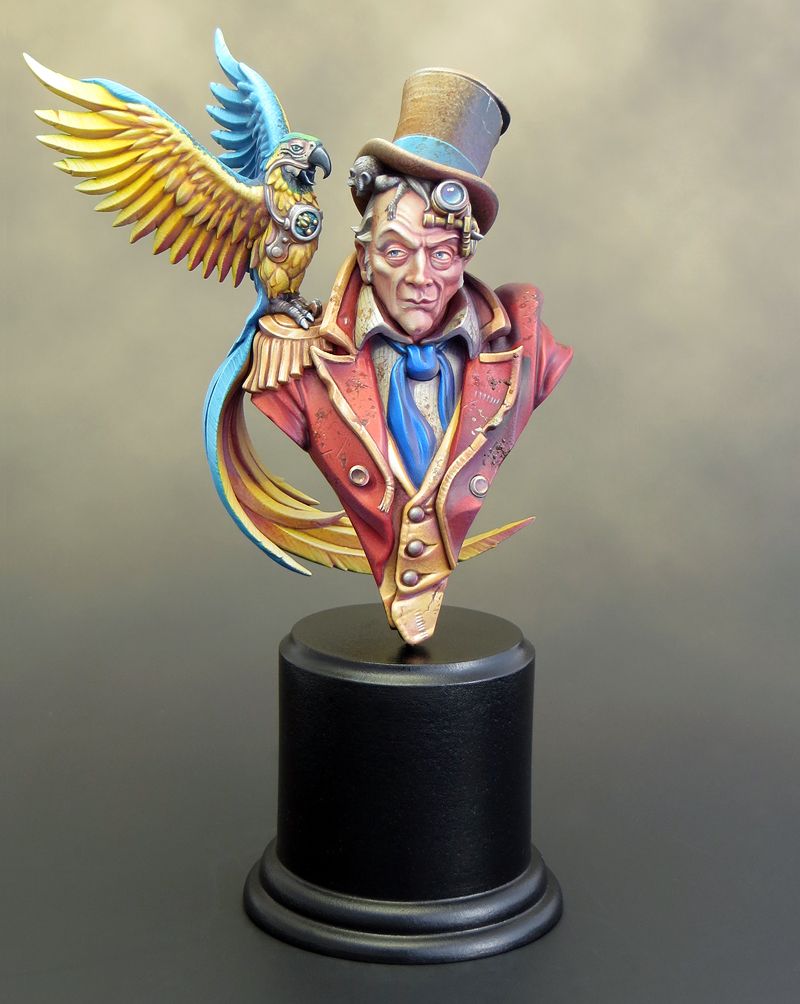
With the parrot painted it was time to assemble the separate elements and finish off the Uncle John bust. As often seems to be the case everything came together very quickly in the end! My biggest concern was with how well the parrot would fit but, after a couple of dodgy test fittings, it slipped into place almost perfectly. There was a very slight space under the feet but a little dilute PVA flowed into the crack and filled the gap. 

I’d prepared a couple of alternative plinths for Uncle John in advance. I thought the best option would be a rectangular plinth with a tapered top but, because the parrot’s tail comes down behind Uncle John’s shoulders, the angle of the taper just didn’t suit (or fit) the bust. In the end a simple flat topped round plinth was the best option. 


In just three hours time I'll be heading off to Folkestone for Euro Millitaire and I'm as ready as I can be. Finishing off a project is often a slightly odd experience. It's usually a matter of deciding to stop rather than actually completing every possible tweak and adjustment to the peak of perfection. It's important to know when to stop and move on to the next project. 

It’s now been a year since I won the Slayer Sword and in that time I’ve completed four projects. Chee-Chee, Jason and the Golden Fleece, Squarg and Uncle John. With Chee-Chee and Jason I consolidated the developments I’d made while working on the Dark Eldar diorama. With both the Uncle John and Squarg miniatures, I’ve expanded my range of painting techniques by working with transparency over a light background and by the application of texture. 

I’m now very much looking forward to taking what I’ve learnt and developing it further. For my next project I’m going to be painting Commodore Borgossa from LeBeN Studio. He may be a pirate but I can absolutely guarantee there will be no trace of a bloody parrot anywhere near this project! 

Sunday, 14 September 2014

Painting Uncle John – Part 6


Polly is painted!


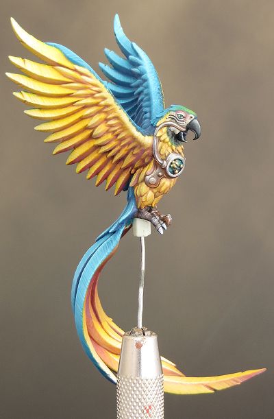
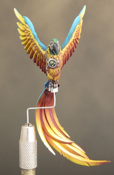
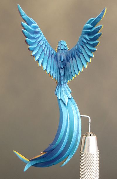
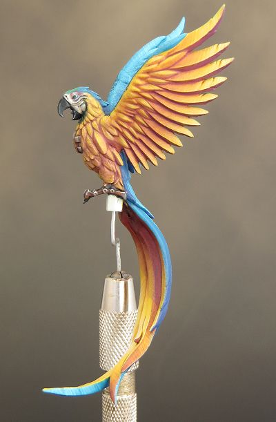
 I’ve finished the parrot with a sense of relief! Unlike the rest of the bust it felt like a struggle to resolve this part of the paint job satisfactorily, but I eventually got there. As I’ve said before I probably blundered with my choice of a lemon yellow base colour. Although now the parrot is finished, I like the vibrancy of colour that I’ve gained through having such a bright base colour - so it all turned out well in the end.

The other issue I’ve had was around painting the feathers. The sculpt is quite stylised; not least because it has been ‘blown up’ from it’s intended use as a 32mm scale miniature. That’s provided the challenge of deciding where to pitch my paint job between realistic and cartoony. It’s something I’ve continually had to play with as I’ve painted the parrot and, over all, I’m pleased with the final result. Painting this part of the parrot became a happier experience as things progressed, so I’ll take that as a good sign.

Now everything is painted I have to fix the Parrot onto Uncle John’s shoulder. Then I shall turn my attention to the long list of tweaks and adjustments I’ve been compiling as the job has progressed. This will need to be a considered process as some extra touches may well refine and improve things, but as we all know, it’s easy to go too far and over work a paint job.

When all the painting is finally done I’ll mount the bust onto a plinth. I’ve already prepared two alternatives, so I can see what works best for the bust. Then it’s a matter of making up some transportation boxes for both Uncle John and Squarg ready for Euro Militaire next Saturday. It’s going to be a busy few days! 

Wednesday, 10 September 2014

Painting Uncle John – Colour Palette

Now that I have the majority of the Uncle John bust painted it seems like a good time to talk about the colour palette I’ve been using. Unless otherwise stated all the colours used are from Games Workshop. (VMC has been used to show when Vallejo Model Colour has been used.)

The key colours for this particular palette are Xereus Purple and Dark Flesh (VMC). Broadly speaking the purple is used in the shadows and the Dark Flesh, in reality a shade of yellow, in the highlights. This is a high contrast colour combination and hopefully I’ve avoided the extremes and managed to achieve an energetic, but not violent, level of contrast. 

Uncle John’s costume and parrot are painted with the primary colours red, yellow and blue. This could easily result in an overly bright and cartoonish look but the colour palette I’ve used helps to provide an overall harmony. This is achieved by having common colours that are used in all the areas regardless of the apparent colour. The Dark Flesh and purple are the most obvious colours used this way but the entire bust employs a relatively limited palette. 

The Flesh Tones 


Unsurprisingly the flesh tones are the most complex areas with regard to the colours used. The flesh areas were painted first and have heavily influenced the overall colour palette. All of the colours in the flesh have been used elsewhere on the bust. 

I’ve broken the colours down into shadows, mid tones and highlights but the process was far more intuitive than step-by-step. The shadows were blocked in over the base colour to provide a bold foundation for the more subtle mid tones and highlights. The colours were then applied in many thin glazes and built-up using transparency. The colours were mixed together in many different combinations and used across all areas of the face. For example a Ratskin Flesh and Rakarth Flesh mix served as a shadow on the light side of the face but also features in the highlights on the dark side of the face. For the most part Rakarth Flesh is the lightest colour used on the highlights with only a very little ivory here and there. The Rakarth Flesh is a key colour in the flesh tones as it has a cool almost grey quality and helps to calm down and unify the brighter colours. 

Base Colour:
 Rakarth Flesh
Shadows:
Bugman’s Glow + Xereus Purple mix
 Mid-tones: 
Ratskin Flesh
Bugman’s Glow
Rakarth Flesh
Xereus Purple
Mournfang Brown
Evil Sunz Scarlet
Dark Flesh (VMC)


Highlights: 
Rakarth Flesh
Ivory (VMC)

Dark Flesh (VMC)

Shirt 


The shirt provides an area of neutral colour to contrast the brighter shades around it. Of particular note is the combination of Baneblade Brown and Xereus Purple in the shadows. These colours were mixed to create an interesting range of greyish/purple tones that I’m sure I’ll be putting to good use in the future.
 

Base Colour & Mid-tones: 
Rakarth Flesh

Shadows: 
Baneblade Brown
Xereus Purple

Highlights: 
Rakarth Flesh
Ivory (VMC)

Silk Tie 

  
The use of pure Enchanted Blue in the mid-tones gave the tie the intense bright blue I wanted. Adding purple and a few touches of Dark Flesh to the shadows helped to link the blue into the rest of the palette.

Base Colour: 
Enchanted Blue

 Shadows: 
Enchanted Blue
Xereus Purple
Dark Flesh (VMC)

Mid-tones: 
Enchanted Blue

Highlights: 
Enchanted Blue
Ice Blue
Ivory (VMC)

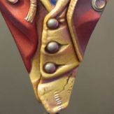
Waistcoat and Gold Trim

  
Yellow can be a challenging colour to paint but the addition of other colours from the palette has added interest and variety. The purple was difficult to incorporate into the shadows without creating a psychedelic effect but I overcame this with the addition of Bugman’s Glow and Dark Flesh in the mix and as separate glaze layers.

Base Colour:
Mournfang Brown & Iyaden Darksun mix

Shadows:
Mournfang Brown
Xereus Purple
Bugman’s Glow
Mid-tones: 
Iyaden Darksun
Bugman’s Glow
Dark Flesh (VMC)
 
Highlights:
Dark Flesh (VMC)
Ivory (VMC)

Ringmasters Coat.

  
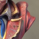
I expected the coat to be tricky! Red can be a notoriously difficult colour to highlight but things went surprisingly well. This was partly the result of making sure that the highlights stayed in the orange part of the spectrum and avoided pink tones. But for the most part the red went well because I started off with a base colour in the lighter mid-tone range and most of the painting involved adding in the deeper tones and shadows. Working from light to dark really helped me to get the sort of red I wanted, and avoided any problems with chalky highlights.

Base Colour:
Merchrite Red + Xereus Purple + Evil Sunz Scarlet mix

Shadows:
Base colour
Xereus Purple
Rhinox Hide

Mid-tones:
Base colour
Evil Sunz Scarlet

Highlights: 
Wildrider Red
Dark Flesh (VMC)

Hat 


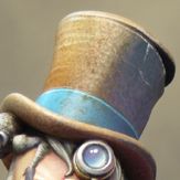
The hat has been painted using a combination of stippling and glazes. It was painted, for the most part, from light to dark.  

Base Colour: 
Rakarth Flesh

Shadows: 
Xereus Purple
Mournfang Brown
Dark Sea Blue (VMC)

Mid-tones: 
Mournfang Brown
Baneblade Brown
Seraphim Sepia

Highlights: 
Seraphim Sepia
Ivory (VMC)

The hat band was painted with Sotek Green. It was shaded with Xereus Purple and Dark Sea Blue (VMC) and highlighted with a Sotek Green and Ice Blue mix. Ivory (VMC) was added for the final highlights. 


Sotek Green
Xereus Purple
Dark Sea Blue (VMC)
Ice Blue
Ivory (VMC)

Deep Shadows

In a few areas I needed a very deep shadow colour. This was achieved by using a combination of Dark Sea Blue (VMC) and Rhinox Hide. These were used on their own and in combination with each other and the area’s predominant colour. 

Rhinox Hide
Dark Sea Blue (VMC)