Showing posts with label Warhammer. Show all posts

Friday, 11 April 2025

Unfinished business!

Horticulus Slimux – Part 6

I suspect that every miniature painter has a few unfinished projects that sit neglected on their desk or in a cabinet. It’s a frustrating situation but one that’s all too easy to fall into. One such project for me was Horticulus Slimux and I was shocked to realise that I last worked on him in March 2018! I can’t even remember exactly why I put the project on hold, though I suspect that I was chasing deadlines on other projects. I’d painted Horticulus Slimux to a standard I was very happy with but the project stalled with his giant snail, Mulch. Other projects took precedence and after finishing my Daemon Tank I was suffering from an overdose of Nurgle themed painting. So Horticulus remained forgotten at the back of my miniatures cabinet.

Forgotten by me that is until a couple of weeks ago when he came up in conversation at the Hammerhead painting competition. The upshot of this was that Horticulus was taken out of the cabinet and re-considered. I think he’s too good a piece to remain neglected and unfinished but the snail is a problem. Considering my current commitments and the potential time it would take me to paint Mulch, I decided to let go of that idea and come up with something else that would finish the project to my satisfaction. I could see two options. First I could find a new, smaller and quicker to paint mount for Horticulus. Second I could base him up as a single miniature. 


I quickly decided on the second option but that’s not without it’s challenges. He is, of course, designed to fit onto Mulch and sculpted in a sitting pose, so I would have to find a way of accommodating this pose on the new base. Horticulus was still going to have to be sat on something, but what? My first thought was to sit him on a severed head. I’ve no idea where this idea came from but it didn’t seem an appropriate setting for Nurgle’s gardener. So what about having him sat on a rock, taking a rest, in the garden surrounded by a profusion of plant life?

With this idea as a starting point, I began to think about the specifics. The timescale was a major factor to consider. I wanted this to be a relatively quick project so I set myself two rules. I would finish the model in time to take it to Salute this year and I would only use materials and parts I already had. This gave me six weeks to work on finishing Horticulus which felt like a good amount of time to get the job done without rushing things. Next up was a thorough rummage through my modeling supplies and bits boxes. This provided both parts and inspiration. 

I had quite a few mushrooms of various sizes left over from old projects and these were perfect for my purposes. In addition a couple of tentacles and some skulls (of course!) would help to populate the terrain. The best find was the head of a fallen statue from the Dominion of Sigmar:Timeworn Ruins terrain. I quickly discovered that Horticulus Slimux could sit on this with very little work to make him fit perfectly! This meant he would be sitting on both a rock and a severed head combining my ideas into one.


Luckily I had one plinth of the correct size left after I’d use all my others for the Corsairs. The stone head required a little modification before being fixed to the plinth. Then I used a combination of cork, plaster fragments and Stirland Battlemire to build up the terrain around it.

To keep a cohesive feeling, I used the same pallet of colors to paint the base as I’d used on Horticulus Slimux. Thankfully I’d made a note of these colors on an earlier blog post and so was able to fish them out. Once again I’d be using Black Leather from Scale Colour as a universal shadow color. This has a warm pinkish hue that contrasts with the greens and harmonises with the reds. Indeed with the base painted the finished composition has an overall subtle red/green colour contrast. The dominant red area is on the mushrooms but there is also quite a lot of it worked into Horticulus Slimux’s skin tones. This is especially true of the shadows which are very warm with the highlights being cooler in contrast. I used a similar warm/cool contrast on the stone head but with desaturated/grayer hues.

Horticulus Slimux is quite fantastical enough on his own so I decided against taking a highly fantastical approach to the plants. Mushrooms, plants that grow on decay, seem especially appropriate and work well with the Nurgle theme. These would be supplemented with an assortment of grasses, moss, mould and lichen. I used a narrow range of green hues to keep a coherent feeling while relying on texture contrasts to add visual interest. The three large red caped mushrooms are resin and from Blacksmith miniatures. Their large size brings a small touch of the fantastical to the basing. All the other mushrooms were sculpted by myself out of green stuff.

Fixing Horticulus onto the base was very straightforward. He fitted into place well and balanced perfectly, so I was able to attach him directly with epoxy glue - and no need for pinning. However there were a few small gaps underneath him as his backside did not conform exactly to the contours of the statue. I filled in this space with a ‘cushion’ of moss and mould. Like many other Nurgle miniatures, Horticulus has an open belly with his guts hanging out. There was a gap between the guts and the statue that, although not catastrophic, bothered me. Instead of filling this gap with more moss I decided to extend the guts with green stuff. This filled the gap in an appropriately gruesome manner.


The final touch was to make a label for the plinth. Partly to finish off the composition but also to hide a blemish on the front of the plinth. Putting Horticulus Slimus’s name on the label felt a bit obvious so I opted for his job title ‘The Grand Cultivator’ instead. After resurrecting my long neglected graphic design skills to style the typography, I experimented with different colours. I then used the method described HERE to make the label.


It’s a shame that I didn’t get to finish Horticulus mounted on Mulch as originally intended. However, I now have a completed model that I’m very happy with and that’s miles better than having him unfinished in the back of the cabinet! And of course, I still have Mulch who could easily become the focus of a future project.

Finishing Horticulus Slimux was an enjoyable process with a satisfying result and six weeks turned out to be more than enough time. So the only thing remaining is to take him to the Salute Painting Competition. This will be my first Salute since 2019 and I’m experiencing an interesting mix of anticipation and nerves so fingers crossed for a good outcome!


Wednesday, 28 August 2024

Aeldari Voidscarred Corsair, Part Two

Painting the Felarch

As the first model of this project, the Felarch sets the overall colour palette and character for the rest of the models in the Corsair unit. This turned out to be problematic as the Felarch’s armour is quite ornate and proved to be a challenging subject for a new colour palette. However, going in at the deep end made me work a lot harder than I might have done if I’d started on a standard trooper. In the end, painting the Felarch forced me to thoroughly explore and refine my colour choices, which can only be a good thing.

I’d put a lot of time into planning the colour palette for my Corsairs but I made one major change before I even picked up a brush. My idea had been for an overall warm palette with a brown hue in the shadows but I decided to change this to a cool dark blue/green hue. I felt this would help in creating more of an overall colour contrast. It also lent itself to the atmosphere I wanted to create giving the model a more muted and sinister feel. 

Before I started painting, I experimented with lighting my model and took a series of reference photos. This has become a regular part of my painting process. These photos give me a fixed point to refer to as the paint scheme develops. They are an invaluable guide to the placement and general shape of the highlights and shadows. However, it’s important to remember that the photos don’t show how different materials will reflect light. Metal, fabric and flesh will each reflect light differently and not in the same way as a plastic model.

An example of my reference photos for lighting


The very first step was to put down a base layer of colour onto the primed mini. Yes I now prime my minis! It’s only taken me forty four years, but I find the base layer goes down better on primer than it does on unprimed plastic, quelle surprise!

For this scheme I worked mostly from dark to light so I used a black primer. Vallejo Black Primer Spray is my primer of choice and I’m very pleased with how it performed. The base colour is a dark blue/green. I used a mix of Scale Colour Black and Vallejo Dark Sea Blue at a 50/50 ratio. Pure black shadows can be visually boring and the addition of the Dark Sea Blue adds some nuance to them. It also helps create a smoother transition into the mid-tones than a pure black would.

Aelderai minis have an undersuit beneath their armour. For my Corsairs I decided to paint this a dark greenish grey. This will be a common feature that helps to tie all the models in the unit together. Perhaps not surprisingly, I used Dark Sea Blue for this and lightened it with Rakarth Flesh for the mid-tones and highlights. These two colours are an interesting combination that I will further explore elsewhere on the model. In the case of the Felarch there was very little of the under suit showing so I quickly moved on to painting the armour.

Painting the gold armour


Inspired by John Blanche’s artwork I decided to paint the Felarch’s armour a NMM gold. In fact, it would be more accurate to describe my approach as painting a NMM yellow! Many of John’s drawings featured a strong yellow wash to represent gold and I wanted to bring something of this to my models. However, this is more about taking inspiration and seeing where it leads me than it’s about trying to copy.

Working from a dark blue/green base up to a yellow mid-tone inevitably results in murky green hues. I decided to play into this because I have a preference for cool greenish gold hues. To create this transition I used US Olive Drab from Vallejo Model Colour. I could have simply mixed the base colour with my yellow for a similar effect; but the Olive Drab gave me a little more variety in the shadows, especially when going back over earlier work with glazes.

To transition into the yellow mid-tones I introduced Sahara Yellow. This is a deep yellow with a slight greenish hue that worked well with the Olive Drab. I worked the mid-tones up to pure Sahara Yellow and then began to create the highlights. To do this I used Tenere Yellow from Scalecolour although Vallejo’s Ice Yellow would work equally well. For the final extreme spot highlights I used pure white. 


Part of the trick in painting NMM is to create contrasts by placing deep shadows next to extreme highlights. This is something I have to push myself to do, as my default setting is to create smooth transitions. Ultra sharp edge highlights also help to sell the illusion of a hard polished metal surface and the pure white spot highlights are an important part of the effect.

So far I’d worked in a systematic step-by-step process going from dark to light, however in an unsatisfying monochromatic effect. The transitions need to be further refined and the colour palette needs to be expanded to help create the illusion of a reflective surface. All subsequent work on the armour will be a matter of going back and forth between the shadows, mid-tones and highlights constantly tweaking and refining until I’m satisfied with the result. The techniques used are mostly layering and glazing but there is also some ultra fine stippling used to blend the transitions.

Introducing colour nuances to the armour


To counter the monochromatic look I introduce colour nuances. These help to create the illusion that the armour is reflecting colours from both the immediate vicinity and wider environment. For the environmental reflections I usually pick a warm and a cool colour. In simple terms these represent colours reflected from the ground and the sky. 


For my warm nuances I used Citadel Layer Wild Rider Red while Citadel Base Thousand Son Blue provided the cool nuances. Both of these colours are very saturated and need to be mixed with the mid-tone colours. This will desaturate them and help to incorporate them into the overall colour palette. The mix ratios vary depending on their placement. Knocking the colours back like this helps to make them look like reflections on the metal surface, as opposed to being splashes of colour. 


The colour reflections from the model’s immediate vicinity are taken from elements of the Felarch’s costume. These are Citadel Layer Xereus Purple reflected from the lining of his cloak and a mix of Vallejo Model Color Dark Sea Blue and Citadel Base Rakarth Flesh reflected from the sashes. As with the environmental reflections its important to mix these colours with the mid-tones used on the armour. Placement of these reflections will depend upon the model but where an area is close to the armour it is likely that it’s colour will be reflected there. 

Finalising the paint scheme on the armour took quite a bit of time and effort. As is often the case when using a new colour palette there was a lot of trial and error to get through, and the process was not straightforward. However, all the hard work has paid off resulting in a scheme that I’m very satisfied with. There is every indication that painting gold armour on other models in the unit will now be a more straightforward process. 


Friday, 9 August 2024

Aeldari Voidscarred Corsairs. Part 1.

Picking a new project.


I decided on my current mini painting project quite some time ago. The release of the ‘new’ Aeldari models had me hooked from the moment I saw them; and lets be honest, when it comes to Warhammer, if I’m not painting Nurgle it will probably be Elves of some kind! So, it was an easy choice when I got myself a box of Voidscarred Corsairs back in July 2022.

Over the years I’ve painted many types of Eldar or Aeldari, as they are now known. Back in the ‘90’s I painted Guardians, Aspect Warriors, a Harlequin and an Incubi. In more recent times I’ve turned my hand to a Farseer, Drukhari Scourges and a Haemonculus. But I’ve never painted any Corsairs and, now that I think about it, that feels like a big omission! 


Corsairs have been around for a very long time but it wasn’t until the release of the Voidscarred Corsairs that I felt inspired to paint any. The models in this Kill Team have a tremendous amount of variation and feel like a group of distinct individuals. That’s exactly what I need if I am to have any chance of painting a unit. Only time will tell how many models from the box I paint but I’m confident that I will paint more than one!

Corsairs can come from any of the Aeldari or Drukhari factions and this is reflected in the design of the miniatures. That’s something I particularly like about these models and, together with the background information, it began to give me some ideas for a paint scheme. Back when I was first painting ‘Eldar’, I had a very black and white view of them as good Eldar and bad Dark Eldar. I don’t think that was ever really the case and, over time, I’ve developed a more nuanced view of them with human notions of good and bad not really being applicable to the ‘alien’ Aeldari. Some of the newer models also seem to reflect a blurring of the boundaries between the different factions. This blend of design elements has created a striking aesthetic for the Corsairs.

Finding inspiration


The independent and adventurous nature of Corsairs suggested that I shouldn’t be too bound to the idea of creating a uniform paint scheme. Rather the unit should have a shared palette and iconography that allows for a lot of individuality. That, together with the individuality of the sculpts, should provide plenty of creative opportunities.

Amidst the background information for the Aeldari Corsairs, certain words began to jump out at me: wild, unrestrained, garishness and ostentation, for example. These characteristics fired up my imagination and I decided to go ‘Full Pirate’ in my treatment of them. After a moment of reflection, I decided that peg-legs, hook-hands, eye patches and parrots might be too ‘on the nose’, but only by a little. The models would require some modification to achieve my full vision.

Thinking time is just as important as painting time. I especially enjoy the early stages of a project where anything I can think of is a possibility. As my ideas for an overall approach to the Corsair model developed, I began to consider a colour palette. I decided upon was a dark and sinister blue/green contrasted with saturated red/oranges and purples. That’s a colour scheme very much to my taste with strong light/dark and warm/cool contrasts. 


However, I began to go off this idea. It felt a little obvious and very similar to other schemes I’d done, most especially to my Farseer. I was making the mistake of sticking to my comfort zone and, as a result, the scheme I planned didn’t really excite me.

It was at this point that ‘taking my time’ really began to pay off. Once I’d rejected my initial plans, I indulged in a little leisurely research by reading up on Aldari Corsairs and searching through images of both artwork and painted models.

There was plenty to be inspired by. But when I came across some old John Blanche illustrations of Eldar and Eldar Corsairs, they fully grabbed my attention. I knew these images from years back but I’d forgotten them. John Blanche’s artwork is in the very DNA of Warhammer and its influence can’t be overestimated! I first found John’s work in the pages of the 1979 Tolkien Bestiary, long before I was aware of Citadel miniatures or Games Workshop. However, John’s artwork is not something I’ve been consciously inspired by in my own mini painting … until now that is.

Seeing John’s Eldar illustrations afresh gave me quite a jolt because here were some of the very qualities I wanted to put into my models. John’s Eldar had a baroque, barbaric look that triggered my interest and imagination. Not for a moment am I pretending that I will take a ‘Blanchitsu’ approach to my painting but rather John’s illustrations have provided inspiration and a starting point for my ideas.

The style of the illustrations reinforced my resolve to modify the models but it was in the choice of a colour palette that they provided the greatest inspiration. I began to experiment with a warm palette featuring red, dark brown, black, white and greenish yellows. This is a very different sort of palette for me and I spent some time playing with these colours in my notebook. I wasn’t 100% there but my ideas were coming together! 


Building a ‘better’ pirate.


The model that most troubled me was the Felarch. When I first looked at the Corsairs I wasn’t at all sure what to do with this model. There is nothing wrong with the Felarch that comes in the box, but it lacked the over-the-top ostentation I wanted for my Corsairs.

I didn’t have to look too far for replacement parts. The Visarch, Champion of Ynnead is a model I had in my collection and I’d noted that his armour is a good match with the new Corsairs. It’s styling is more baroque and that’s exactly what I needed! I began to see how I could use him as a donor for multiple parts.

I said earlier that I’d rejected full-on pirate trappings like parrots and peg legs, but those thoughts wouldn’t go away. I combed through Games Workshop’s range for a parrot equivalent. There were several possibilities but the one that really caught my interest was the Wyvach familiar that comes with Kyria Draxus.

Kyria Draxus is a beautiful model in her own right but I thought the Wyvach would be a perfect pet for my Felarch. The Kyria model has this creature perched on her outstretched arm, which is wearing a power fist. I can remember when the Eldar models first came out and many of those early models had power fists. The power fist on Kyria is comparatively lighter, more delicate, than those worn by Space Marines. As such I didn’t think it would look too out of proportion on an Aeldari model. So I decided to use the entire arm - power fist, Wyvach and all. I also removed the skull pauldron from Kyria’s other arm to use on my Felarch. These additions certainly bring the desired garishness and ostentation but they also add a barbaric touch that works well for my Blanche-inspired vision of the Corsairs.

Putting all these parts together into one cohesive model was fiddly work, so I proceeded with due care. I started by assembling the Felarch’s Torso and cloak from the Corsairs set. To this I attached the legs from the Visarch. I had to do a little carving to enable them to fit at the angle I wanted and then pinned the parts together for strength. This left a fairly large gap that had to be filled and sculpted over with greenstuff. I decided to leave the power fist and Wyvach unattached to make painting easier. But these parts are a crucial element of the overall pose so I prepared them as a sub-assembly that could be attached on a temporary basis. The left arm also came from the Visarch and could be attached with minimal trimming.

I’d decided to use the Visarch’s helmet, which is very similar to the helmet option for the Felarch, but more elaborate. I removed the spike from its crest and replaced that with the plume from the Felarch’s helmet. Rather than simply putting the Visarch’s helmet onto the Felarch’s torso, I also used a portion of the Visarch’s neck and collar, which brought another ostentatious element to this character.

The final piece to add was the skull pauldron. This comes in two halves so I had to assemble the Kyria Draxus torso first and then cut the skull from it. To my surprise this came away cleanly and only needed minimal trimming to make it fit the Felarch’s torso. 


I took my time customizing the new Felarch. Details like the relative angles of the head and limbs make a massive impact on the overall pose of the model and I wanted to get this right. I can remember all too well how many times I had to tweak my Tomb King before I was happy with his pose!

Originally I hadn’t intended more than a head and arm swap but I’m delighted with how my new Felarch came together. I now felt that I had a striking and unique model that would be enjoyable to paint!


Thursday, 27 October 2022

Project P30 - Part 16b

The End is Nigh - Part 2.


With the exception of the base (and that’s a whole new chapter) the remaining work on my Tank is a matter of finishing things off. Some parts need to be painted from scratch but most of the work involved tying-up lose ends from earlier work.

Fix the hand holding the bell into place.


This was a far more straightforward process than the mecha arm. I simply glued the bell hand in place with plastic glue. Once that had set, I filled the seam with dilute PVA and then retouched the paintwork. This felt like an enormously significant step as I was finally adding the sub-assemblies to the model. At long last it was all coming together!


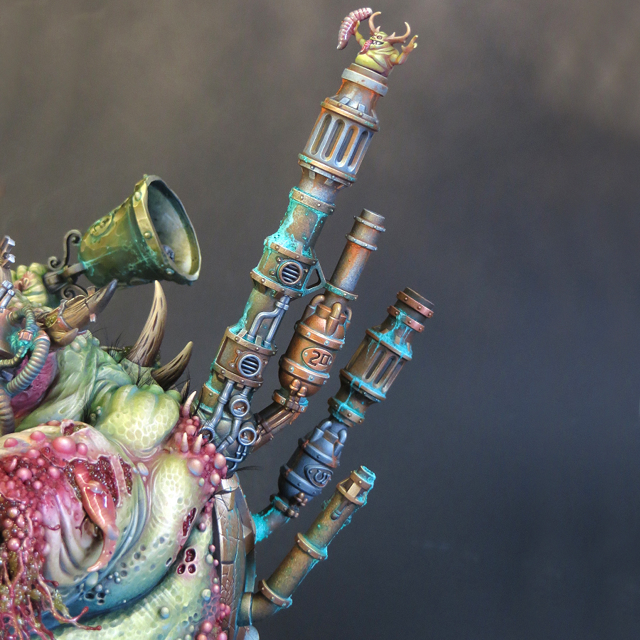
Fix the chimneys back into place.


Now things really started to near completion as the re-addition of the chimneys would complete the model’s silhouette. I’d removed the chimneys earlier to make them easier to paint and I’d expected their reattachment to be a tricky process. In the end it went very smoothly. The chimneys were pinned, then glued back into position, leaving relatively minor seams to cover. For the smaller chimney, there was a matter of adding some corrosion over the join. A little corrosion can hide a multitude of sins! 


For the larger chimney, I had to re-sculpt some of the bubbly flesh texture over the join and then fill some hairline cracks with dilute PVA. I also added a few bony spines to this. Overall I’m very happy with the result. In fact, I think this area works better than it did before I removed the chimneys! Painting this area was a matter of matching up the colours to my existing scheme.

I was now finally able to add a long planned feature to the model. Some time ago I decided that I wanted coarse bristles sprouting from the Daemon’s back and shoulders. I’ve used grass tufts and paintbrush bristles to create similar effects in the past. 


My first attempt, using grass tufts, was an instant fail! The ‘hair’ looked too fluffy. Fluffy is not what we want or expect from Nurgle! For ‘plan B’ I used false eyelashes for the hairs which have a curve to them and taper to a point. They proved to be perfect. I cut them into small clusters, or individual hairs, and glued them into place with PVA. Once again this was tricky work but the final effect is exactly what I wanted!

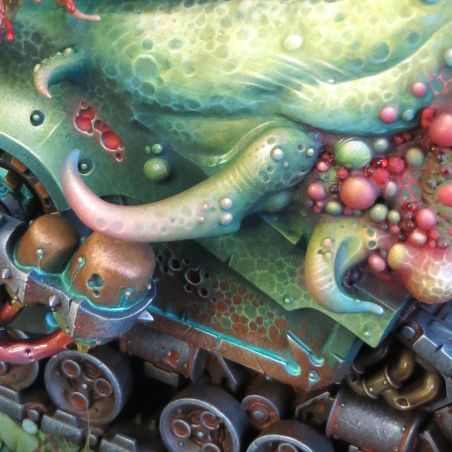
4. Painting the Tentacles


I’ve a notebook with seven years worth of ideas written down for this project. As my plans developed and changed I kept notes to make sure nothing was forgotten. But, by the time I started painting, there were far to many, sometimes conflicting, plans for one project. Much of my decision making has been around which ideas to implement and which to reject. As the scheme developed the process of editing my plans became easier.

The tentacles are an example of the ‘less is more’ approach I’ve taken in the later stages of this project. I’d initially envisioned them as a larger version of the tentacles on Gutrot Spume, complete with stripes and dripping slime. But I felt that the stripes would bring an unnecessary new element to the scheme which would make the tentacles stand out from the rest of the model in an unsatisfactory way. 


Rather than stripes, I’ve painted the same freehand texture as used on the sides and back of the model. This adds interest to the tentacles but ties them in to the overall scheme. I’ve used colour to make them pop against the rest of the model. Starting from green hues at the base they graduate through a pinkish flesh tone to blue tips. The blue is my old favorite Bering Blue, which I’ve used throughout the scheme. It’s at its most obvious on the tentacle tips.

5. Add drool.


I rejected the idea of slime dripping from the tentacles as being just too much! This also applied to most of my plans for adding extra slime and goo to the model. My tank from 1990 has a liberal application of slime made from PVE glue and then painted. I strongly felt that I already had enough slime and goo on my new model and any more would begin to dominate the painting.

But there was one area where I very much wanted to break out the microbeads and water effects. This was the mouth (the one in the Daemon’s head) where I felt the addition of drool would be beneficial. The mouth was one of the very first areas I painted and its been a long wait to be able to finish it! 


I decided to focus the effect to one side of the mouth rather than filling the jaws with stringy drool. This was done with that old favorite UHU glue. Once the glue had set (it goes rubbery rather than hard) I built up several layers of water effects and microbeads. Once dry I gave it three coats of gloss varnish.

In the final of these updates I’ll describe how I made and painted the base for my Daemon Engine.

Thursday, 29 September 2022

Project P30 - Part 15.

It's done!!!

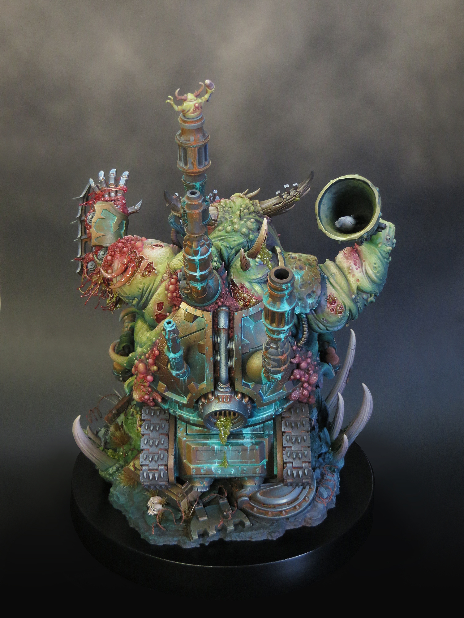
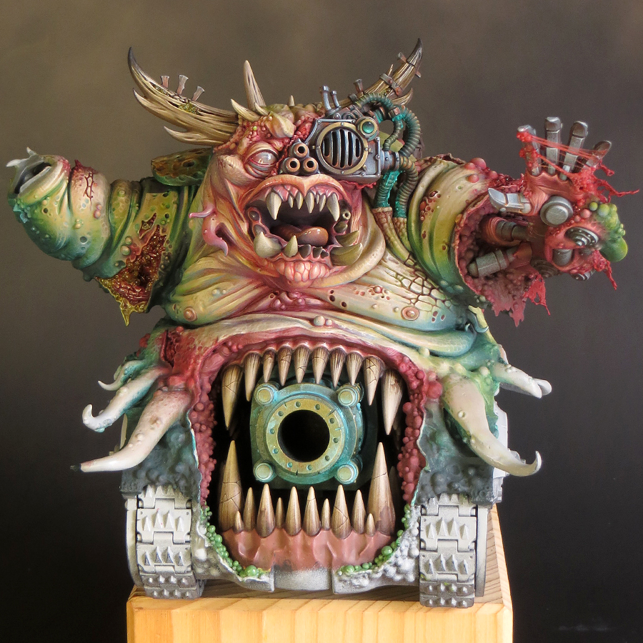
It’s been an intense few months of preparation and painting but I’ve finished my Daemon Engine in time for Golden Demon UK 2022, which is now upon us! I’m very proud of how this project has turned out because I’ve done the very best I can. It has been a brilliant experience but it’s now out of my hands and into the GD cabinet for judging. Fingers crossed!

So it’s time to reveal the finished Tank in its entirety. 

My planned pre-GD blog updates fell by the wayside. Once I’m back home and the GD dust has settled, I will upload a series of posts detailing the stages of this project to its completion.

Tuesday, 29 March 2022

Project P30 - Part 14.

So just when I though I’d be getting back into the swing of things, with a regular painting schedule, life had other ideas! We’d been planning some long-overdue house renovations (by long I mean 20 years!) and had scheduled them in for 2022. However the chance came to get the work done earlier and we took it. As a result our home was in complete upheaval, from October until mid-January, and there was no way on earth I could do any painting. Stressful as the disruption was it’s been great to finally get our bathroom and kitchen sorted and things are now getting back to normal, whatever that is.

The enforced hiatus has given me the opportunity to take stock and realise that I’ve undergone a big shift in attitude towards this project. Up until now I’ve been very focussed on getting the paint scheme for my Daemon Engine up and running. It’s been a sign of my uncertainty that I’ve concentrated on establishing the colours, textures, overall contrast and direction for the scheme but haven’t really looked beyond that.

Over the last month that has changed and I quite suddenly realised that I’ve now painted the bulk (no pun intended) of the flesh on this model. I have no firm idea of how long it will actually take to complete, but it feels like I’ve reached a sort of halfway point in the painting! I’m well aware that much of what remains to be done features fiddly mechanical details but I’ve most definitely moved forward into a new phase of the project.

When I started work on this project, back in February 2019, it was with the final model very much in mind. But as I’ve progressed, and especially since I’ve started painting, my thinking became more wrapped up with the process rather than the end goal. I think this was necessary because I needed to make a lot of decisions about what I was actually going to do with my scheme, but it did overwhelm my thinking.

With some major decisions made (I’m sure there are many more to come!) and considerable progress under my belt, I can now see my way ahead. So much so that I’ve started to work on a base for this model. The end of the project may be some way off but I think it’s a good time to start planning for it. The overall composition of this model and its base will make or break this project so there is no room for a last minute solution! I have plenty of time for planning and preparing a base and I fully intend to use it.

My thoughts on basing the model have greatly evolved over time. I’d thought of something quite large and elaborate, inspired by the type of basing you often see for historical tank kits. Thankfully I saw sense as that would have taken the project into diorama territory. What I now intend is to base the tank as though it were, and in many ways it is, a character model.

I’m not going to say too much about my basing plans until later in the project. But I must say a huge ‘thank you’ to Byron Orde who, through the course of a general discussion about basing, helped me to clarify my ideas. However, Byron went above and beyond that with some significant practical help towards getting this model onto the right base. I don’t like to blow my own trumpet but, with the help I’ve had from Byron, and if I can pull off all my plans, it’s going to be epic!

But all of that is in the future and for the moment I need to crack on with painting. I will go into more detail in my next posting but for the time being I will bring things up-to-date with a summary.

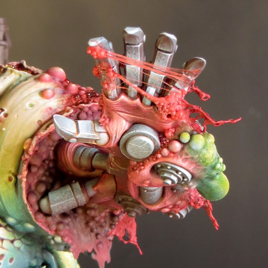
Back in October I painted the large horns on the Daemon’s head. This was straightforward but very fiddly. I then moved onto the mechanical left hand and arm. I’d made a good start on these when everything ground to a halt. 

At the end of February I was able to pick up my brushes again but decided not to go straight back to the hand. I decided to paint a sub-assembly to help me get back into the swing of things. For this I chose to paint the large chimney which I first had to detach from the model! This was not a fun job but well worth the bother as the chimney was much easier to paint as a separate element. 


With the chimney painted, I’ve now returned to painting the mechanical hand and arm.


Saturday, 2 October 2021

Project P30 - Part 13.

Ding Dong!


I’m back! Not that I’ve been away as such but I decided to take a bit of a break from painting my Daemon Engine. Things had gone very well, and I’d made excellent progress, but I felt that I was beginning to get a bit too relaxed with the project. To do my best work I need to keep on my toes and I think I was getting a bit complacent. The break in painting has given me the opportunity to reset and refresh the feeling of a challenge. 
 

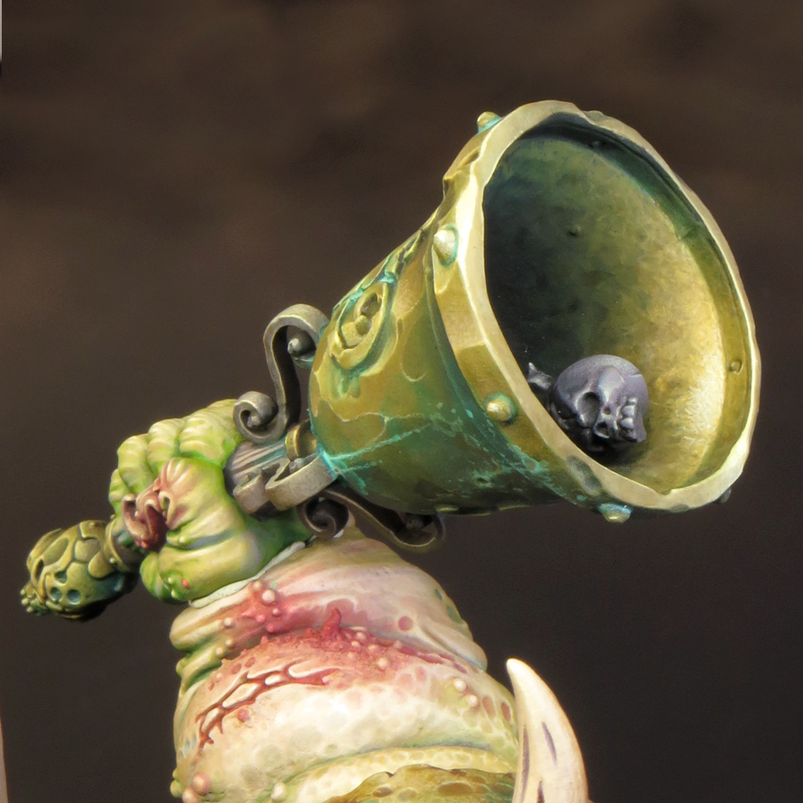
To get re-started I decided to paint the bell, which I’d been keeping back for just such an occasion. The bell was perfect to paint as a sub-assembly and, as it features distinct areas of flesh and metal, was also perfect to help me get back up to speed with the colour palette and techniques I’m using on this model.

Although this model will feature a variety of non-metallic metal (NMM) effects the majority of my metal will be painted in bronze tones. Often used for bells, cannon and in ancient armour, bronze seemed like the perfect choice for a model that features all of these. It also works very well with my overall colour palette not least because of the opportunity it gives me to use cool green hues in the verdigris effects.

As with all metals the colour of bronze, an alloy of copper and tin, will vary depending upon it’s exact composition, age and the conditions it’s been exposed to. Broadly speaking, bronze is a warm metallic hue along the lines of gold or brass; but slightly darker and browner than either, and less ‘orange’ than copper. In reality the colour bronze includes a wide range of tones and hues and can be achieved in many different ways.


I’d taken this into consideration when I created my initial colour palette but, as I‘ve now spent some time working with those colours, I decided to make some additions. The new colours are Balor Brown and Mournfang Brown both from Games Workshop and Ice Yellow from Vallejo Model Colour. The introduction of these colours has enabled me to create some warmer hues than my initial colour choices allowed. 
 

So far I’ve painted two distinct areas of bronze on my model: the back plate (including the shoulder) and the bell. Although both areas use colours from the same overall palette they have been treated quite differently. 

The back plate.


This is the single largest area of bronze on the model and much of it is in shadow. I decided that a warmer more saturated bronze would work best here, as it would have a strong contrast with the green hues in the adjacent areas of flesh and verdigris. In addition, a warmer and more saturated shadow colour gives more interest to the back of the model.


Base/shadows.


The base colour for this area is Rhinox Hide mixed with Boreal green and Black Leather. The additions serve to darken the Rhinox Hide.

Mid-tones.


I lightened the base colour with the addition of Mournfang Brown. As I moved into the mid-tones I increased the amount of the Mournfang and gradually began to add Balor Brown to my mix. The use of Mournfang Brown and Balor Brown give warmth and saturation to the final result.

Highlights.


As my colours go into the highlights, I introduced a mix of Balor Brown and Ice Yellow moving to pure ice yellow. The final highlights are Ice Yellow with a little white added. 
 

The use of Ice Yellow was a little risky as my global highlight colour is Flayed One Flesh and the introduction of a new highlight colour could cause a colour clash with previously painted areas. However, Ice yellow has, compared to Flayed One Flesh, a cooler more saturated yellow hue that works very well for bronze.

The bell.


Base/shadows


The base colour for the bell is a mix of Rhinox Hide, Boreal green and Black Leather. These are the same colours as on the back plate but there is less Rhinox Hide and more Boreal green and Black Leather in this mix. The resulting colour is darker, cooler and more desaturated.

Mid-tones


The biggest difference between the two bronze areas lies in the mid-tones. For the bell I have only used Balor Brown. This is mixed with the base colour in increasing amounts as the colour lightens. However, I have not used any pure Balor Brown on the bell.

Highlights.


As my colours have moved into the highlights, I’ve added Ice yellow to the Balor Brown/base colour mix. As with the back plate my highlights shift through pure Ice Yellow to an Ice Yellow/white mix. 
 

The final result for the bell is a bronze colour that is cooler, more desaturated and with shadows that are more blackened than the back plate.

The base/shadow mix of Rhinox Hide, Boreal green and Black Leather that I’m using on this model is one that I’ve often used before due to it’s flexibility. The mix gives a surprisingly dark result that I like to think of as ‘almost black’ and I can easily shift the temperature and saturation of this colour by altering the mix. 
 
A page from my notebook comparing my
'almost black' Black Leather/Boreal Green mix with Black

I’ll be adding more areas of bronze as my paint scheme progresses and I’m looking forward to creating more variations of this colour.

After painting the bell I turned my attention to the hand holding it; and what I thought would be relatively simple proved to be quite a challenge. As I said earlier part of my reason for painting the bell was to help me to get back up to speed with the colour palette. And it’s a good thing too. I forgot that my base colour for the flesh tones was a mix of two parts Rakarth Flesh with one part each of Bugman’s Glow and Sahara Yellow. Instead I used only Rakarth Flesh and it made a massive difference! The flesh tones were all far too cool and I had to glaze a lot of warm tones over this to balance things out. I’m now happy with the hand although I will almost certainly adjust it a little more once I glue it into place on the model.
 

As I’ve said before with this model nothing is finished until it’s all finished!