
As it turns out the hiatus in Project Nurgle has probably worked out for the best. It’s given me some extra time to plan out my ideas and bring them into sharper focus. My recent Golden Demon experience has reaffirmed that I have a better experience (and achieve far better results) if I take the time to do a job to my own satisfaction.
To that purpose, I’ve been doing the prep work on Gutrot Spume with some care by using a scalpel to scrape away the mould lines and then wet-sanding the scraped areas to smooth the surface. It’s fiddly and sometimes frustrating (I just want to get on with the painting); but it’s also a good way to study the mini and become familiar with it prior to painting. Like all the new plastic minis from GW the parts fit together in such a way that the joins are incorporated into the natural seams on the mini wherever possible. You could glue and then paint straight off, but a little bit of greenstuff in the joins really helps to finish off the assembly.
As I said last time, I’m not doing a lot of conversion work on Gutrot. But a few little touches here and there will help to emphasize the nautical theme and give him a more unique feel. In addition to the scratch built trident, I’ve added a bell to his belt and a few barnacles to the armour. Bells work well as both a Nurgle and a nautical motif, and I’ll be adding them to the Blightkings along with more barnacles and the occasional tentacle.


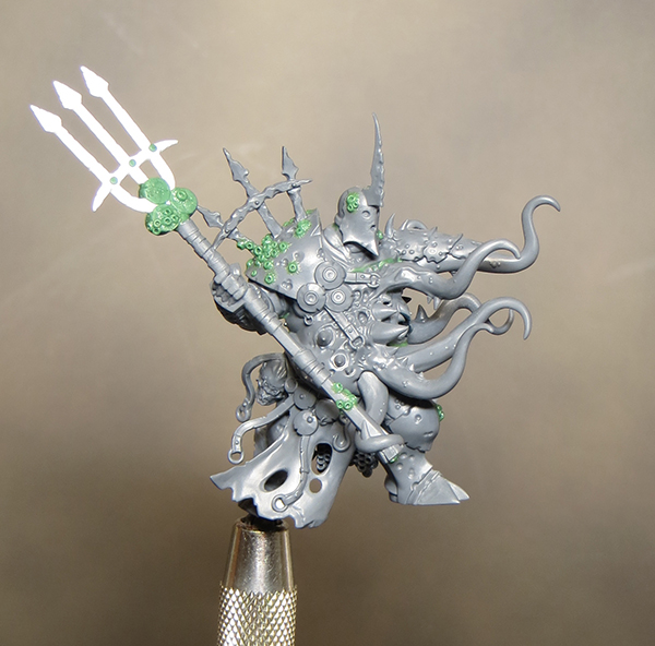
The biggest benefit I have gained from the delay has been developing my thoughts for the colour palette. With a Nurgle subject green will be a predominant colour; but I want to play on the nautical feel and include a lot of blue and turquoise tones within those greens. A touch of purple, here and there, will add some depth and nuance to the shading - and it’s also good for a bruised look. I want the flesh to be pale but I also thought it might be interesting to introduce some red tones. The idea for this came from looking at pictures of an octopus for tentacle reference and one of those pictures seemed to capture the feel I wanted for my colour palette. I don’t intend to copy exactly but rather use the image as an inspiration and a starting point in developing my own colour scheme.

I’m also experimenting with some new paints by trying out the scale colour paints from Scale 75. I’ve heard nothing but good about these paints so I’m really looking forward to seeing what I can do with them. I think it will be a good exercise to move away from my familiar tried and tested colours and discover some new alternatives. Having said that Vallejo dark sea blue is probably going to be a key colour in my palette – how could it not be!
The paints shown below are my initial selection of colours and may well be changed as I start to work with them. They serve to provide a starting point for me to develop my palette.
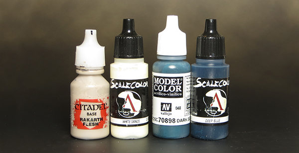 |
| Base Colour, Highlight & shade |
 |
| Green & blue tones mostly for the armour |
 |
| Flesh tones and warn shades to introduce contrast |