Wednesday 20 December 2017

C-Girl Akito – Painting worn leather

It’s time to get Akito down off the shelf and back onto the painting table. So far I’ve painted Akito around other projects but from now I’ll stick with her until she’s done. This was always my plan although it’s a little later in the year than I’d anticipated; but I’ve enjoyed taking my time on this bust.

That’s just as well because I’ve found that slowing down seems to be the best way to progress with the next phase of Akito’s paintjob. The leather jacket has taken my painting into new territory and I’ve had to focus a lot of time and attention on it. I’ve developed a routine of painting for a couple of hours each day and then reviewing and amending my work the next day before moving on to a new area. That makes for slow progress but progress nonetheless.

The Akito bust screams out for painted material and texture contrasts and, having put a lot of effort into painting smooth skin, it’s time to paint a lot of texture on the leather jacket. I’d intended to paint Akito’s clothing in predominantly black tones but, as always, my plans have evolved as the paintjob developed. I’m now painting the leather a very battered and worn brown. I think this is both a more interesting painting challenge and a more realistic approach to Akito’s costume. Her clothing will have a randomly put together feel as opposed to a carefully colour co-ordinated fashion choice. That seems more appropriate for this character.


I’ve been putting a lot of effort into painting textures in my recent projects and this bust feels like the next step. The larger scale gives a lot of scope for painting texture but it also creates a huge challenge! I’m right out of my comfort zone but that’s no bad thing as it’s keeping me on my toes. Simply stippling over the jacket, as I might in a smaller scale, will not create a distinctive enough texture. Stippling certainly has a place in this paintjob but too much stippling will only serve to create a generic texture. What’s needed here is something more nuanced and distinctive.


This has challenged me to experiment with the marks I make with my brush and I’ve had to work around the problem to find a solution. As I’ve painted the jacket I’ve developed an approach that, I think, is beginning to work. This is something I’ve found especially interesting as it reflects the ongoing development of my painting technique. Going back a few years my stippling was, quite literally, painting with dots now, however, it’s far more varied. More often than not when I stipple I allow the tip of the brush to skip and drag over the surface of the model making a combination of dots, dashes and scribbles.


My colour palette has also undergone some trial and error to find a workable solution. Although predominantly brown I’ve painted the jackets highlights in cooler blue/grey tones as if reflecting the sky while the shadows go to black. This is similar to a NMM technique as leather can be a shiny reflective material. However, this leather is extremely old and worn and, in the most worn areas, the material would be rough and unreflective. To create these areas I’ve used a yellow brown tone and fairly course brush marks.

Colour Palette  


Base:
Flat Black/Brown Leather mix (Scalecolour)

Mid Tones:
Brown Leather (Scalecolour), Brown Gray (Scalecolour), Rucksack Tan (P3), Bering Blue (Scalecolour)

Highlights:
Midtone colours + Purity White (Scalecolour)

Overall the painting of this bust has been a process of going back and forth to adjust the balance between the contrast, colours and textures. The jacket is still very much a work in progress but, after some fretting, I’m beginning to feel good about how it’s going.

Tuesday 5 December 2017

Project P30 - The tank

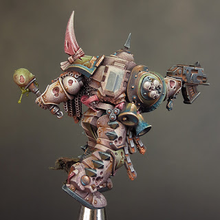
My Death Guard Plague Marine was begun as a test piece for my new Nurgle Predator but now it’s time to begin working on the Predator itself. I’m intending to play a very long game with this project and I think I’m going to need a lot of time! The prep, planning and construction are going to take a huge amount of work and I want to be able to sit back and consider every step with care. Beyond that there is the painting and that’s a big job by itself.


But every project must start somewhere and this one begins, as it did in 1990, with a tank. Before I can start experimenting with various configurations of parts I have to build the body of the tank. I’m going to keep this piece on the go while I concentrate on other projects. Sometimes I may bring it to the fore and eventually it will become my major project. But for the time being the Predator will be bubbling away in the background, which seems very appropriate!

Wednesday 29 November 2017

Project P30 - Death Guard Chaos Space Marine & Warhammer 40,000 Open Day 2017


When I started my Death Guard Marine it was with the intention of testing out some new colours for my Predator revamp. But to be honest, I also had the notion of finishing him in time for the Warhammer 40,000 Open Day 2017, on November 26th. If I could do that I could enter him in the Golden Demon painting competition.

This gave me a short-term target to help focus and shake off the last of the painting blues I experienced over my abandoned attempt at the White Dwarf Winners’ Challenge.

Taking on a comparatively simple single mini meant that I was able to give it the time and attention needed to do the job ‘properly’. I like to be able to sit back and consider what I’ve done and what I’m going to do next. For me the ‘thinking time’ gained when a mini is on the shelf is just as important as ‘painting time’. Refining my work can make the difference between a Bronze and a Gold, or a Gold and a Slayer Sword.

I think I can say with some confidence that I’ve got a good instinct for what it takes to win at the Golden Demons! Put very simply if you want to win you can’t cut any corners. But knowing what to do is not the same as doing it and it’s not getting any easier to win - quite the opposite! It may be a cliché to say the standard is going up, but I think it is - and that means I have to pull out all the stops and push my painting to he limit!

So all in all I had my work cut out with this mini right from the start. This was partly because of the new colour combinations but mostly because nothing came easily with this paintjob. However a little perseverance can go a long way and, as the 26th got closer, things began to come together.

One thing that developed quite late in the project was my use of blue in the overall colour scheme. I always intended to use blue, rather than green, verdigris effects but the more blue I added the more I liked it. As I said in my last post, I think the blue provides a colour contrast that makes the whole colour scheme come together and pop!


I decided to get some blue into the front mid-section of the mini, to break up the overall brown tone this area had. I could have repainted the chains as copper and added verdigris but I liked the rusty iron I’d done, so I decided to try something else. I added some etched brass straps between the chains and painted them blue. It was a fiddly job but well worth the effort. The straps not only introduced a much needed blue element but also provided some extra fine detail and movement to contrast with the heavy armoured form of the mini.


For the base I decided to create a bubbling ‘Nurglesque’ swamp within a fractured rocky ground. This is a development of the base I made for my Abyssal Warlord, which struck me as having some potential for a Nurgle themed mini. I will be doing a micro bead mega-tutorial in the near future and a description of how I made this base will be included in that.

The marine comes with a Nurgling companion and I decided to have him scampering through the swampy part of the base. The Nurgling made for a fun mini project in itself but, as the overall paint job on my Death Guard Marine came together, something about the Nurgling began to really bug me! I loved the dollop of gloop that sat on the end of the stick the Nurgling is carrying but I wasn’t happy with how I painted it. I just felt too cartoony for the overall look and feel of the mini. So out came the pliers and scalpel, off came the gloop and on went the microbeads! I find this sort of last minute change nerve-wracking but I think the new gloop fits the overall look of my mini far more successfully.


As with my Farseer I’ve used a resin plinth from Darkmessiah Bases but this time I chose a round rather than square plinth. The distinct double lines inset into these bases is an extremely stylish feature and I ‘m very pleased how my minis look on them!

The final touch was to create a label for the plinth and this should have been simple but I came close to messing up very badly! I decided to fix a 3-D icon onto the plinth and used a shield to do this. However the shield was flat and although it looked OK from the front there were ugly gaps either side as the plinth was round. I filled these gaps with microbead slime and a cheeky Nurgling but the whole thing still looked off to my eye! On top of the awkward composition I realized that the icon drew far too much attention away from the mini. I’d thoroughly over complicated what should have been very simple.


On the Friday morning before the show I took a deep breath and took the whole horrible lot off the plinth. It was a nasty fiddly job and I feared I was going to make a dreadful mess. Careful work was needed but I managed to remove the icon with only one small chip to the paintwork on the plinth. I then made a label for the plinth that, thankfully, covered up the chip. In retrospect I think this mini would have looked fine on a plain plinth but the new label was a huge improvement on the icon because less is almost always more!


I went into the competition with mixed feelings. I was very pleased with what I’d achieved but, with only one mini entered, I had all my eggs in one basket and I knew the competition was going to be tough! As always the tension built through the day but finally the top three single minis were placed on the top shelf and I knew I had a trophy in that category.

That was some relief but then a whole new sort of tension begins to build as you wait to find out just what you’ve got. It was Gold and I was one very happy painter. I find there is a slightly odd moment then, when the first rush of elation passes, and you remember that Gold means you are in the running for the Slayer Sword. Regardless of how many Slayer Swords I’ve won, it’s a moment that never fails to give me butterflies in my stomach!


And then it’s my name that’s being called out and I’m up on the stage holding my fifth Slayer Sword! It’s very hard to describe just how that feels. Winning my first two Swords was pretty overwhelming and the experience came in a dizzy rush. The feeling now is somewhat deeper and calmer but no less meaningful. I am tremendously proud and grateful that I have the skill and experience to excel in my hobby. As I said earlier, it’s not getting any easier to win, but that’s part of what makes it worth doing!

Wednesday 15 November 2017

Project P30 - Death Guard Chaos Space Marine Part 3

Previously my colour palettes for Nurgle themed minis have been built around a strong red/green contrast using saturated colours. While I may use this approach for some elements of my new Predator, overall I want to work with a more desaturated palette. It’s my gut instinct that, on a larger model like the Predator, a desaturated palette will be more effective. I suspect a strong saturated palette, like the one I used on Gutrot Spume, would give the Predator more of a ‘cartoony’ look than I want.


Although I didn’t set out to do this, my Death Guard uses a similar palette to the one used on my Tomb King. This is mostly because of the global highlight and shade colours I’ve used. The use of global highlight and shade colours ties the colour scheme together and helps to give the different coloured elements the feel of being in the same environment. It works equally well for both saturated and desaturated palettes.


My global shade colour is Black Leather from ScaleColour. As I said in my last posting, this is a desaturated purplish brown that mixes well with most other colours to create shade tones. My global highlight colour is Mojave White also from Scale colour. I often use Ivory for a global highlight and, in contrast to this, Mojave White is a slightly cooler and greyer looking colour that will help with the overall ‘dirty look’ I want to give my Death Guard. These global colours give me an interesting contrast between warm shadows and cooler highlights.


The pictures used below to illustrate my colour palette are far more close-up than I would normally show. I think this may be of interest in itself as you can see every brush mark and blemish I've made to create my textures!

The Colour Palette


Bone coloured armour 


Base: Rakarth Flesh (GW)

Shade: Black Leather (SC)

Highlight: Mojave White (SC)

The bone coloured armour is painted almost entirely with very fine stippling to give an overall texture. I started with a mid-tone base then added the shadows followed by highlights. I then went back and forth between the tones to adjust the overall balance. The final step was to paint the scratches and chips.


Green Armour 


Base: Death Guard Green (GW)

Shade: Black Leather (SC)

Highlight: Mojave White (SC)

The green armour was painted in much the same way as the bone coloured armour. I decided to try the new GW paint Death Guard Green and I’m very pleased I did. This is an extremely flexible colour sitting midway between light/dark and warm/cool. As a result it could form the basis of almost any green colour scheme and I’ll be experimenting further with Death Guard Green in the future.


Copper 


Base/Shade: Black Leather (SC)

Midtone: Ratskin Flesh (GW)

Highlight: Mojave White (SC)

The copper uses a palette of colours I developed earlier that includes Ratskin Flesh to bring a warm, almost pink, tone to it.


Verdigris


Sotek Green (GW), Baharroth Blue (GW), Black Leather (SC) & Ratskin Flesh (GW)

I was just going to have a little bit of verdigris on this mini but I decided to try a bluer tone than I’ve used before. The use of blue in the overall colour scheme has turned out to be crucial! The blue provides a saturated colour that harmonizes with the greens and contrasts with the browns and oranges. I think the blue makes the whole scheme come together and pop!
I’ve combined several blue tones for the verdigris by mixing Sotek Green with other colours from my palette. The addition of Black Leather creates a purple/blue tone while Ratskin Flesh creates a green/blue tone.


Flesh/tubes 


Base: Rakarth Flesh (GW)

Shade: Mayhem Red (SC)

Highlight: Mojave White (SC)

The fleshy parts of the mini are only a small part of the whole but the red and pink tones provide a nice touch of saturation in contrast to the armour and colour contrast with the blue and green.


Green Iron 


Base: Dark Sea Blue (V)

Highlight: Mojave White (SC)

The green iron areas were originally going to be a dark grey/black. But the subtle introduction of a green tone, through the use of Dark Sea Blue, brings more colour into the palette without adding too much extra colour contrast.


Black Iron 


Base: Dark Sea Blue/ Black Leather mix

Highlight: Mojave White

The combination of Dark Sea Blue and Black Leather is a very useful one. Mixed together these colours give a very dark neutral tone that, when mixed with Mojave White, creates an interesting range of greys. It’s possible to play with warm & cool tonal variations by varying the proportions of the colours used in the mix.


Rust 


Kalahari Orange (SC)
Windsor & Newton Designers Gouache – Orange Lake Deep/Olive Green mix

I decided to try something different with some of my rust effects this time. The use of Designers Gouache means that the paint, much like pigment powders, can be applied, left to dry and then adjusted with a clean damp brush. This has enabled me to achieve a greater degree of control and subtlety with my rust than I’ve done before. I can see that Designers Gouache, a relic from my schooldays, may well become a staple in my miniature painting from now on, and I’m looking forward to further experimentation with it!


Friday 27 October 2017

Project P30 - Death Guard Chaos Space Marine Part 2


I’d said this posting would be a more detailed look at my colour palette for the Death Guard Plague Marine but that will have to wait until next time! It’s half written but I’ve been too preoccupied with figuring out the said colour palette to write about it! When I last posted I thought things were pretty much sorted, but my use of blue for the verdigris shook things up.

This is pretty much the norm for me when I’m working with new, or unfamiliar, colour combinations; and it’s what makes trying new things out so interesting. I’m very happy with how the colours are working together now but I’ve really had to work hard at it! Almost every step of this paint job has presented some sort of challenge for me to resolve and, as a result, I’ve picked up a few new ideas for my Predator’s colour palette. Who’d have thought that blue and orange would play a key role in a Nurgle themed colour palette!

While my main focus was on sorting out the colours, I also gave a lot of attention to creating textures and material contrasts. This has been a worthwhile effort as it brings a lot of interest and a touch of realism to the paint job. I need to refine a few areas yet, but overall everything is coming together in a pleasing way.

For the time being here are a few up-to-date work in progress pictures of my marine.


Wednesday 4 October 2017

Project P30 - Death Guard Chaos Space Marine Part 1


It’s time to start work on one of my ‘exciting’ new projects because I think this one is going to take me quite a bit of time! I’ve already been thinking about this for a couple of years. At first it was simply an idea knocking around in the back of my head, something suggested by my friend Lee Hebblethwaite at the Golden Demon Winner’s day in 2014. But the idea took root and more recently I’ve been mulling over the practicalities.

2020 will see the 30th anniversary of my Nurgle Predator and my first Slayer Sword. It seems fitting to mark the occasion in some way and Lee's suggestion, that I create a new and updated version of the Predator, fits the bill. I’ve more than a few reservations about attempting this project as the Predator comes with a lot of history and emotional baggage. But it feels like the time is right and I’m confident I can bring something new to an updated version. So there you have it Project P30 has begun!


In fact I’ve already featured this project here when I posted the picture above back in August. These kits will form the basis of my new Predator. I’ve decided that there will be more machine elements visible on the new Predator to better illustrate the fusion of demon and tank. This will also give me a greater range of materials and textures to paint in contrast to the all over green flesh of my original.

This means that I have to develop and expand upon the colour scheme so, in order to begin that process, I’ve started painting a Death Guard Chaos Space Marine. This will give me the opportunity to explore the colours I’ve been thinking about. It will also give me the chance to paint one of the new Death Guard miniatures, which have been tempting me with their shiny newness!

I’ve decided to paint the majority of the armour in a bone colour. My usual approach to painting bone would be to work over a Rakarth Flesh base with a series of washes in a combination of brown and sepia tones. This is very effective but I felt it was the wrong approach for my Death Guard. I wanted a colder, dirtier quality to the bone colour on the armour. To achieve this I’ve incorporated Black Leather from Scalecolour into my palette.


This is the same colour that I used as a global shade colour on Gutrot Spume. It’s one of those strange, but useful, colours that isn’t quite one thing or the other. As best as I can describe it Black Leather is a dark, desaturated, purpleish brown. It mixes well with many other colours, both warm and cool, to make a shade tone and, in this instance, I’ve used it with Rakarth Flesh. The subtle purple tint it gives the shadows is exactly what I was looking for. It gives me a cooler bone colour than normal. But it's warm enough to keep the bone from looking too grey. This cooler purple tone will contrast with my rust effects and keep them distinct from the general layer of grime.


Against the bone I’ve used a cold dark green derived from, what else, Dark Sea Blue and a lighter warm green based on Death Guard Green. I will paint the metalics in NMM and for the majority of these I'll use a copper tone.

Work on the Marine is progressing nicely, and I’ve just about resolved the colour palette, so I now have to forge ahead and apply it to the entire mini.

Next time I’ll write about my overall colour palette for the Marine in greater detail and how it relates to the new Predator.

Friday 22 September 2017

C-Girl Akito - To the rescue!


“I can get down to some serious mini painting for myself! I’ve got some exciting projects in the pipeline and I’m looking forward to getting them underway!” 
… So much for good intentions!

I’ve had an unusually busy Summer and the only problem I have with it is that I’ve been busy doing things other than mini painting. In itself that’s not a serious problem but, as Summer turns into Autumn, I find myself feeling more than a little frustrated at the lack of painting action and extremely keen to get started.

So I began working on one of my ‘exciting projects’. Without going into detail things did not go well, in fact, they went very, very badly! It’s been many years since I gave up on a project but I think I may well have to with this one. At the moment thinking about it makes me feel pretty miserable; but I’m sure a pause will help me to reflect on my problems with this project and learn some valuable lessons.

In an effort to shake off the painting blues and get my mojo working I decided to switch projects and make some progress on Akito! So far it’s proving to be a successful strategy. I’m making some progress and most importantly enjoying myself. Having previously painted Akito’s face and the majority of the flesh tones it’s high time I blocked in some base colours and began to build the overall colour contrasts.

One advantage of the hiatus this project endured is the extra time I’ve had to consider my plans. I’d decided to create a strong contrast between the pale flesh and a predominantly dark costume. Set against that would have been a highly saturated hair colour graduating from yellow at the roots, through orange into red, and finishing with purple at the tips. This would have been very striking but, on reflection, I’ve decided to paint the hair strawberry pink. There are two reasons for this. I think the more saturated colours would be too bright and draw attention away from the rest of the bust. I also feel that the saturated colours would be too aggressive for the mood I want to give the piece. The weapon and costume are already fairly edgy and aggressive, so I’ve decided to contrast that with a soft, and admittedly slightly stereotypical, girly pink colour for the hair.

The choice of pink was inspired by a conversation during my workshop in Hull and a little online research has provided plenty of useful reference material. I was a little nervous when I came to paint the base layer for the hair as pink, much like red, can be a tricky colour to work with. It will be useful to have the base colour to hand when I come to shade and highlight the hair but the mix was fairly complicated, so my chances of exactly recreating it later in the project are slim. Therefore I decided to mix up a batch of paint in a dropper bottle. Thankfully I nailed the mix first time and got the exact shade (strawberry ice cream) that I wanted! My mix consists of Khorne Red, Flayed One Flesh, Karak Stone and Rakarth Flesh.


Once the base colours were blocked in I turned my attention to the bikini top. I’d decided to paint this as a synthetic neoprene type of material but a conversation during my Stockport workshop (there’s a trend developing here) helped me to refine my plans. Rather than the soft ‘rubbery’ sheen I had intended I decided to paint a high gloss, almost metallic, shine to the material. A little online research provided some good examples and suggested that I used an ultra fine stipple technique to replicate the texture of the shiny fabric. I’ve painted this in a cool blue/black that will contrast with the warm brown/black I plan to use on the jacket.

Although these are only base colours and in need of a great deal more work, this stage of the project has moved things on considerably. I now have a more highly developed vision of how I’m going to paint Akito and the bust itself looks a lot more completed. It’s been fiddly work but well worth the effort.

Thursday 10 August 2017

Summer is here!

The last few weeks have been pretty busy with one thing and another and it’s hard to believe that summer is now well underway. But, in spite of what the weather might indicate, it is; and that means it’s time for me to take stock and focus my energies on some new projects. My hobby activities for the first half of this year were dominated, in a good way, by workshops and competitions. With no new workshops planned until June next year I can get down to some serious mini painting for myself! I’ve got some exciting projects in the pipeline and I’m looking forward to getting them underway!

This could be the start of something big!

To Hull and Back! 


However for the next few weeks I have a pretty hectic schedule and my opportunities to update this blog may be limited so please bear with a brief hiatus. In the meantime here are a few pics from my ‘Monster Skin & Texture’ workshop, hosted by John Harrison’s Weekend Workshop in Hull last weekend. We were a small but dedicated group of painters and, from my perspective; I felt the weekend was a great success. I was thoroughly pleased and impressed with how everyone got to grips with both the theory and technical aspects of the course and made great progress with their Plaguebearers over the two days!


Still no pictures?

I’ve had quite a few messages about the missing pictures on this blog. Thank you for your support and concern. Unfortunately the job of replacing five years’ worth of pictures is going to take a long time, so please continue to bear with me. My primary focus will be on moving forward with this blog and keeping it regularly updated. But I will be going back through the archives and replacing the pics as and when I can. I will endeavor to get the tutorials done first.