Showing posts with label Colour palettes. Show all posts

Wednesday, 28 August 2024

Aeldari Voidscarred Corsair, Part Two

Painting the Felarch

As the first model of this project, the Felarch sets the overall colour palette and character for the rest of the models in the Corsair unit. This turned out to be problematic as the Felarch’s armour is quite ornate and proved to be a challenging subject for a new colour palette. However, going in at the deep end made me work a lot harder than I might have done if I’d started on a standard trooper. In the end, painting the Felarch forced me to thoroughly explore and refine my colour choices, which can only be a good thing.

I’d put a lot of time into planning the colour palette for my Corsairs but I made one major change before I even picked up a brush. My idea had been for an overall warm palette with a brown hue in the shadows but I decided to change this to a cool dark blue/green hue. I felt this would help in creating more of an overall colour contrast. It also lent itself to the atmosphere I wanted to create giving the model a more muted and sinister feel. 

Before I started painting, I experimented with lighting my model and took a series of reference photos. This has become a regular part of my painting process. These photos give me a fixed point to refer to as the paint scheme develops. They are an invaluable guide to the placement and general shape of the highlights and shadows. However, it’s important to remember that the photos don’t show how different materials will reflect light. Metal, fabric and flesh will each reflect light differently and not in the same way as a plastic model.

An example of my reference photos for lighting


The very first step was to put down a base layer of colour onto the primed mini. Yes I now prime my minis! It’s only taken me forty four years, but I find the base layer goes down better on primer than it does on unprimed plastic, quelle surprise!

For this scheme I worked mostly from dark to light so I used a black primer. Vallejo Black Primer Spray is my primer of choice and I’m very pleased with how it performed. The base colour is a dark blue/green. I used a mix of Scale Colour Black and Vallejo Dark Sea Blue at a 50/50 ratio. Pure black shadows can be visually boring and the addition of the Dark Sea Blue adds some nuance to them. It also helps create a smoother transition into the mid-tones than a pure black would.

Aelderai minis have an undersuit beneath their armour. For my Corsairs I decided to paint this a dark greenish grey. This will be a common feature that helps to tie all the models in the unit together. Perhaps not surprisingly, I used Dark Sea Blue for this and lightened it with Rakarth Flesh for the mid-tones and highlights. These two colours are an interesting combination that I will further explore elsewhere on the model. In the case of the Felarch there was very little of the under suit showing so I quickly moved on to painting the armour.

Painting the gold armour


Inspired by John Blanche’s artwork I decided to paint the Felarch’s armour a NMM gold. In fact, it would be more accurate to describe my approach as painting a NMM yellow! Many of John’s drawings featured a strong yellow wash to represent gold and I wanted to bring something of this to my models. However, this is more about taking inspiration and seeing where it leads me than it’s about trying to copy.

Working from a dark blue/green base up to a yellow mid-tone inevitably results in murky green hues. I decided to play into this because I have a preference for cool greenish gold hues. To create this transition I used US Olive Drab from Vallejo Model Colour. I could have simply mixed the base colour with my yellow for a similar effect; but the Olive Drab gave me a little more variety in the shadows, especially when going back over earlier work with glazes.

To transition into the yellow mid-tones I introduced Sahara Yellow. This is a deep yellow with a slight greenish hue that worked well with the Olive Drab. I worked the mid-tones up to pure Sahara Yellow and then began to create the highlights. To do this I used Tenere Yellow from Scalecolour although Vallejo’s Ice Yellow would work equally well. For the final extreme spot highlights I used pure white. 


Part of the trick in painting NMM is to create contrasts by placing deep shadows next to extreme highlights. This is something I have to push myself to do, as my default setting is to create smooth transitions. Ultra sharp edge highlights also help to sell the illusion of a hard polished metal surface and the pure white spot highlights are an important part of the effect.

So far I’d worked in a systematic step-by-step process going from dark to light, however in an unsatisfying monochromatic effect. The transitions need to be further refined and the colour palette needs to be expanded to help create the illusion of a reflective surface. All subsequent work on the armour will be a matter of going back and forth between the shadows, mid-tones and highlights constantly tweaking and refining until I’m satisfied with the result. The techniques used are mostly layering and glazing but there is also some ultra fine stippling used to blend the transitions.

Introducing colour nuances to the armour


To counter the monochromatic look I introduce colour nuances. These help to create the illusion that the armour is reflecting colours from both the immediate vicinity and wider environment. For the environmental reflections I usually pick a warm and a cool colour. In simple terms these represent colours reflected from the ground and the sky. 


For my warm nuances I used Citadel Layer Wild Rider Red while Citadel Base Thousand Son Blue provided the cool nuances. Both of these colours are very saturated and need to be mixed with the mid-tone colours. This will desaturate them and help to incorporate them into the overall colour palette. The mix ratios vary depending on their placement. Knocking the colours back like this helps to make them look like reflections on the metal surface, as opposed to being splashes of colour. 


The colour reflections from the model’s immediate vicinity are taken from elements of the Felarch’s costume. These are Citadel Layer Xereus Purple reflected from the lining of his cloak and a mix of Vallejo Model Color Dark Sea Blue and Citadel Base Rakarth Flesh reflected from the sashes. As with the environmental reflections its important to mix these colours with the mid-tones used on the armour. Placement of these reflections will depend upon the model but where an area is close to the armour it is likely that it’s colour will be reflected there. 

Finalising the paint scheme on the armour took quite a bit of time and effort. As is often the case when using a new colour palette there was a lot of trial and error to get through, and the process was not straightforward. However, all the hard work has paid off resulting in a scheme that I’m very satisfied with. There is every indication that painting gold armour on other models in the unit will now be a more straightforward process. 


Saturday, 2 October 2021

Project P30 - Part 13.

Ding Dong!


I’m back! Not that I’ve been away as such but I decided to take a bit of a break from painting my Daemon Engine. Things had gone very well, and I’d made excellent progress, but I felt that I was beginning to get a bit too relaxed with the project. To do my best work I need to keep on my toes and I think I was getting a bit complacent. The break in painting has given me the opportunity to reset and refresh the feeling of a challenge. 
 

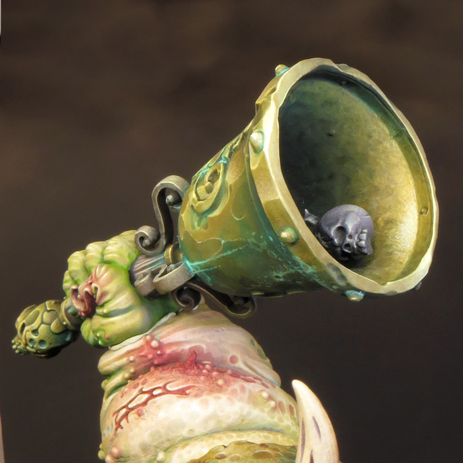
To get re-started I decided to paint the bell, which I’d been keeping back for just such an occasion. The bell was perfect to paint as a sub-assembly and, as it features distinct areas of flesh and metal, was also perfect to help me get back up to speed with the colour palette and techniques I’m using on this model.

Although this model will feature a variety of non-metallic metal (NMM) effects the majority of my metal will be painted in bronze tones. Often used for bells, cannon and in ancient armour, bronze seemed like the perfect choice for a model that features all of these. It also works very well with my overall colour palette not least because of the opportunity it gives me to use cool green hues in the verdigris effects.

As with all metals the colour of bronze, an alloy of copper and tin, will vary depending upon it’s exact composition, age and the conditions it’s been exposed to. Broadly speaking, bronze is a warm metallic hue along the lines of gold or brass; but slightly darker and browner than either, and less ‘orange’ than copper. In reality the colour bronze includes a wide range of tones and hues and can be achieved in many different ways.


I’d taken this into consideration when I created my initial colour palette but, as I‘ve now spent some time working with those colours, I decided to make some additions. The new colours are Balor Brown and Mournfang Brown both from Games Workshop and Ice Yellow from Vallejo Model Colour. The introduction of these colours has enabled me to create some warmer hues than my initial colour choices allowed. 
 

So far I’ve painted two distinct areas of bronze on my model: the back plate (including the shoulder) and the bell. Although both areas use colours from the same overall palette they have been treated quite differently. 

The back plate.


This is the single largest area of bronze on the model and much of it is in shadow. I decided that a warmer more saturated bronze would work best here, as it would have a strong contrast with the green hues in the adjacent areas of flesh and verdigris. In addition, a warmer and more saturated shadow colour gives more interest to the back of the model.


Base/shadows.


The base colour for this area is Rhinox Hide mixed with Boreal green and Black Leather. The additions serve to darken the Rhinox Hide.

Mid-tones.


I lightened the base colour with the addition of Mournfang Brown. As I moved into the mid-tones I increased the amount of the Mournfang and gradually began to add Balor Brown to my mix. The use of Mournfang Brown and Balor Brown give warmth and saturation to the final result.

Highlights.


As my colours go into the highlights, I introduced a mix of Balor Brown and Ice Yellow moving to pure ice yellow. The final highlights are Ice Yellow with a little white added. 
 

The use of Ice Yellow was a little risky as my global highlight colour is Flayed One Flesh and the introduction of a new highlight colour could cause a colour clash with previously painted areas. However, Ice yellow has, compared to Flayed One Flesh, a cooler more saturated yellow hue that works very well for bronze.

The bell.


Base/shadows


The base colour for the bell is a mix of Rhinox Hide, Boreal green and Black Leather. These are the same colours as on the back plate but there is less Rhinox Hide and more Boreal green and Black Leather in this mix. The resulting colour is darker, cooler and more desaturated.

Mid-tones


The biggest difference between the two bronze areas lies in the mid-tones. For the bell I have only used Balor Brown. This is mixed with the base colour in increasing amounts as the colour lightens. However, I have not used any pure Balor Brown on the bell.

Highlights.


As my colours have moved into the highlights, I’ve added Ice yellow to the Balor Brown/base colour mix. As with the back plate my highlights shift through pure Ice Yellow to an Ice Yellow/white mix. 
 

The final result for the bell is a bronze colour that is cooler, more desaturated and with shadows that are more blackened than the back plate.

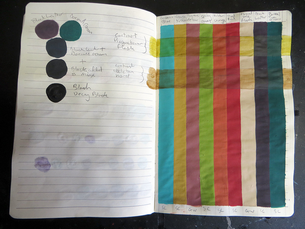
The base/shadow mix of Rhinox Hide, Boreal green and Black Leather that I’m using on this model is one that I’ve often used before due to it’s flexibility. The mix gives a surprisingly dark result that I like to think of as ‘almost black’ and I can easily shift the temperature and saturation of this colour by altering the mix. 
 
A page from my notebook comparing my
'almost black' Black Leather/Boreal Green mix with Black

I’ll be adding more areas of bronze as my paint scheme progresses and I’m looking forward to creating more variations of this colour.

After painting the bell I turned my attention to the hand holding it; and what I thought would be relatively simple proved to be quite a challenge. As I said earlier part of my reason for painting the bell was to help me to get back up to speed with the colour palette. And it’s a good thing too. I forgot that my base colour for the flesh tones was a mix of two parts Rakarth Flesh with one part each of Bugman’s Glow and Sahara Yellow. Instead I used only Rakarth Flesh and it made a massive difference! The flesh tones were all far too cool and I had to glaze a lot of warm tones over this to balance things out. I’m now happy with the hand although I will almost certainly adjust it a little more once I glue it into place on the model.
 

As I’ve said before with this model nothing is finished until it’s all finished!


Saturday, 27 March 2021

Project P30 - Part 10

Painting skin tones in three (painfully complicated) steps!

 
Over the last few weeks I’ve established a good routine where I’m able to paint for a few hours every day and it feels like I’m making steady progress. There is still a lot to be resolved with regards to how I use my colour palette, but the more I get done the more developed my ideas become. I am especially happy with how well the flesh tones are coming together. 
 

When I started painting, I thought that my plans for the flesh tones had gone out of the window in favour of something similar to what I’ve done before. However, as I’ve explored my colour palette, and the surfaces involved in painting the flesh, things have become a bit more interesting for me. Although the flesh tones I’m painting are similar to those in earlier projects, I’ve been able to incorporate the pale tones and cool hues I intended. The result is a more complex and nuanced Nurgle flesh than I’ve painted before. 


Overall this is a very satisfying outcome. It’s keeping me challenged and interested during the painting process and the results feel appropriate to a model of this size and scope. I think a straightforward application of my Plaguebearer flesh tones would have looked far too basic on this model! 
 
This Nurgling was painted to give me a change of pace
and will be added to the Tank (along with others of it's kind) later on.
 
I’ve already shown the colour swatch from my notebook but lets now look at the actual palette I’m using for my flesh tones. 


Global Shadow colours.

Black Leather
Boreal Green

These two colours are used in all of the shadows. The exact proportions I use in the mix vary depending upon the values of hue, temperature, tone and saturation I want. Broadly speaking, the shadows tend to be cooler than the mid-tones and highlights. To adjust the nature of my shadow colours, Black Leather will warm things up and desaturate while the green will give a cooler but more saturated colour. Boreal Green is, like many blue and green hues, a very pigmented colour and should be used cautiously. A little bit of Boreal Green will go a very long way!

Global Highlight colours.


Flayed One Flesh
Purity White
 
Flayed One Flesh is currently my favourite highlight colour it makes for bright, warm highlights. When I want to push things a little further I use Purity White. It is a slightly translucent soft white that will not overpower a colour mix. I’ve found that, although I need a little white in my highlight mix, here and there, I need to be very sparing with its use.

Mid-tones.

Bugmans Glow 
Bering Blue
Sherwood Green
Blood Red
Sahara Yellow
Rakarth Flesh

There are quite a few colours in my mid-tone range but I am not necessarily using them all together at the same time. As with the shadows, I will vary things to adjust the values of the colour I want. I’ve found that pale flesh tones look very good if they contain elements of blue, red and yellow, so I’ve included these colours in my mid-tones. Green is there to introduce a Nurglish element and Sherwood Green is a favourite colour in my Nurgle schemes. It’s a yellow green that works very well in warmer flesh tones and compliments the cooler Boreal Green I’ve used in the shadows

Bering Blue is my blue of choice for flesh tones. It is a subtle desaturated hue that will not overpower other colours in a mix. I especially like using it to create cool reflections within my shadows, adding extra nuance to those areas. 


As well as serving as a base colour for my flesh tones, Rakarth Flesh is a useful addition to the mid-tones. It’s inclusion helps to unify all the colours into a convincing whole. It may not be obvious but there is nearly always a little Rakarth mixed in with my mid-tones.

As my title suggests painting the fleshtones on my Demon Engine is a complicated process! It involves a lot of going back and forth to adjust the values of my colours. One thing it most definitely isn’t is a regular step-by-step process. Naturally enough some areas are difficult to get right while others fall into place more easily; but the overall process can be loosely described as having three stages. It usually takes me between eight and twelve hours, spread over several painting sessions, to be satisfied with my work on a particular area.

The first stage is the most systematic as I block in the overall placement of my highlights and shadows. This will provide some structure to my painting. I will adjust the characteristics of my colours but the placement of highlight, mid-tone or shadow is fixed. In addition to the tonal values I will make initial decisions about the hue, saturation and temperature of my colours. 


It’s during the second painting session, having taken the time to sit back and study my work, when I will fine tune the colour values. I am considering the area I am working on and it’s relationship to the model as a whole, to influence my choices. This work is carried out with a succession of glazing, stippling and thin layers. It is a process of going back and forth between colour values, using different techniques, in no specific order. This is by far the longest (and potentially most frustrating) part of the process, if things don’t go well. I will also begin to consider and introduce texture. 


Once again I will take time to step back from painting and consider my next moves. Time spent thinking about painting is at least as important as time spent painting. Step three is where I will finesse my work. Any adjustments to the colour values are usually subtle and most changes will involve refining the textures and transitions. 


To be honest I’m thoroughly enjoying myself as I push all this paint around!


Wednesday, 24 February 2021

Project P30 - Part 8. Lets get the painting started!


I wondered if I’d ever get to this stage but, at long last, I’m painting my Demon Tank! However, before the ‘fun’ could start, there was one last little bit of preparation to be done. I had to wash the model prior to priming it. This was to remove any grease and dust that had built up during the construction of the model. It’s essential to have a clean surface before you apply any paint. I first masked off the belly-mouth and then set to with an electric toothbrush and dish soap. Once I’d given the model a careful scrub, I gently rinsed it off under cool running water. This was a terrifying process as it had the potential to do quite a bit of damage but everything went very well.

The size of this model presented a challenge to me in that I would have to handle it quite a bit during painting. That, combined with the large surface area, meant that priming the model would be essential! I first gave the underside and deeper recesses a coat of black and then sprayed the whole model with several light coats of Tamiya Fine Surface Primer. This is another potentially tricky job but the primer gave me an excellent result!


And so to painting!


Painting this model feels like going on a bit of an adventure. The physical challenges presented by the size of the model are something totally new to me. Add to that the nostalgia, and expectations involved in revisiting my first great success, and the result is a project unlike any I’ve taken on before! That’s the main reason why my colour palette uses a lot of tried and tested favourites. I do believe that stepping out of your comfort zone provides a positive challenge, but I like to pick my challenges carefully. The size and scope of the model is a major challenge in itself. By using a tried and tested palette of colours I’ll be able to draw on my experience with them to resolve the overall paint scheme. After all the entire point of this project is that it’s a coming together of old and new.

As I’ve said I’d expected the size of the model to be something of a challenge and I wasn’t wrong! I started off by attaching a painting handle to the model but took that off straight away. It shifted the centre of balance and made the model too big and awkward to hold during painting. So I am carefully holding the model in my gloved hand while I paint it. The tank weighs very little, which is a great help, but I’ve had to adapt my painting technique and posture to its size.

I’m used to working up close to the surface I’m painting. I usually brace my hand by holding the model on my desk and my brush hand is usually also braced on the desk, or sometimes against the hand holding the model. It’s a very stable set up and allows me a lot of control over my brush. However, in my usual painting position, there isn’t now enough space for the model and my hands between my eyes and the desk! I’ve had to get myself a taller stool so that I can sit a little higher. I also have to adapt to bracing my brush hand against the model rather than my desk.

This new set up is taking quite a bit of getting used to as it’s far more difficult to keep my hands stable during painting. There are some tricky angles involved in getting my brush into contact with the model’s surface and I have to handle the model while I paint it. Challenging as this may all be, I’d anticipated these issues as a part of the project and, so far, there has been nothing that a little patience and perseverance can’t overcome. In fact, I’m enjoying this project because of the challenges not in spite of them!

As usual I decided to start off by painting the face. This is going to set the tone and character of the model. It’s also a relatively small area that contains a lot of contrasting surfaces. So it will give me the opportunity to decide how I am going to resolve many of the material contrasts at an early stage. My usual habit is to work on a fairly small area at a time but, on a model of this size, I think that would be a mistake. Therefore, I decided to work over a larger area, which included the face and chest, by starting out fairly roughly and then gradually refining the painted surfaces as the project evolves. 


After painting a base of Rakarth Flesh, my first layers of paint were applied with a size 4 brush, roughing out the areas of light and shade. I then began to lay down a series of glazes to add and adjust the colour nuances. My next move was to focus on smaller areas to begin refining my work. However, I made sure to keep moving around the overall area I was painting, and not to linger on one spot for too long. This enabled me to balance things out over a larger area than I might normally do and resolve the overall skin tones.

By starting out big and bold I’ve been able to avoid getting stuck on one small area. My overall approach is one of going back and forth between different areas and different tones. This is a very different way of working from a structured step by step approach but it feels appropriate for this model.

I’m very glad that I’d taken the decision to think through my colour palette in advance because it saved me a lot of time and helped me to work swiftly at the early stages. However, as expected, once I started to work with my chosen palette I felt the need to adapt it. I had some definite ideas about the direction I was going to take but, as my work progressed, so did my ideas. As I’ve said before, the good thing about starting out with a plan is that it gives you a structure to work within but it also enables you to vary from that structure in an organised way.

I’d planned to use a cooler blue/green hue on much of the model but, as I progressed, that felt wrong. So I’ve used more of the yellow/green hues from my palette in the flesh tones. I turned to my old favourite of Bering Blue to bring some subtle blue tones to the flesh. I think is a more successful choice than my original option of turquoise. However, I think the blue/green hues will come into play as the project progresses. 


I’d thought that the overall look and feel of my colour palette would be very different to anything I’d done before but, in reality, it’s turning out to have a familiar feel to it. As has already been pointed out on Instagram, my flesh tones have much in common with both my Plaguebearers and my Troggoth. Although it’s not what I’d intended to do, I’m actually very happy with this. It feels like a more natural progression from my earlier work and a truer reflection of my style and instincts.

This project has been in planning for many years so it’s been on my mind as I’ve worked on many other models. Consequently many of my models contain things that I was trying out in preparation for the Demon Tank. My Death Guard, Horticulus Slimux, Kastelan Robot and Sloppity Bile Piper may all have an influence before I’m finished. I don’t want this project to nothing more than a ‘Sproket’s greatest hits’ but it is intended to look back over my past work while, hopefully, continuing my journey to be a better painter. 


I think I’m off to a good start but there is a long way to go yet!

Friday, 5 February 2021

Project P30 - Part 7


So here we are in 2021 and let’s all hope it’s a better year than 2020! For the last few months I’ve been very quiet with regards to painting sculpting and being online because I simply wasn’t ‘in the mood’. That’s not to say I was down or depressed but rather my energy and enthusiasm were directed elsewhere. I rediscovered my love for Lego and spent a lot of my time building a version of Hogwarts Castle to sit on the top shelf of my desk. I didn’t especially need a new hobby but lockdown seemed like a good time to start one. 


I chose a crazy time to put my tank onto the back burner because I was on the verge of completing the construction/sculpting phase. However, I think this pause proved to be an unexpectedly good thing because this was exactly the right time to stop and think. Not that I haven’t spent an awful lot of time thinking about this model already, but this was different. 


Up to this point my design for the tank had existed as an idea but not a completed three-dimensional object. But now I was able to have the entire model in my hands and, as a result, my plans began to evolve.

With the addition of the long awaited chimneys I finally had the overall composition fixed. This meant that I was able to consider all the elements of the model in context. I quickly decided to adjust the angle of the arm swinging the bell. By doing this I was able to raise the bell up. It was a relatively simple change but it opens up the overall composition and makes the pose look more active. After all, if your model is ringing a dirty great bell you want it to look like its giving it some welly! 


My idea had been to paint an updated version of my 1990 Nurgle Predator’s paint scheme. It would consist of a stippled green flesh tone with metallic details. However, I began to feel that this would not be enough. Regardless of how well I painted the model I think it would look very basic in the 1990 scheme.

Miniature painting has come a long way since 1990 and I need to reflect that in my new paint scheme. I want to create a scheme with more drama and contrast than the old one. The new scheme will reflect the range of materials and surfaces present on the model and most especially the transitions between machine and flesh. These areas will be treated differently in terms of colour and texture and the transitions between them should help to tell the story of a Demon engine manifesting itself as flesh.

The next step was to create an initial colour palette. Things will probably change as the project progresses but I need a starting point. The colours in my palette need to fulfil the following roles:
Base colour,
Shade,
Highlight,
Mid-tones,
Spot colours,
Nuance colours,
Metallic colours,
Neutrals.

Bearing all of this in mind I began by lining up the colours I thought I might use. I then set about testing different combinations in my notebook. You can see my test swatches in the photo below. The first is at the bottom and they progress up the page. 


As you can see, it was during this process that I moved away from my mostly green 1990 colour palette. My new palette gradually became more varied and saturated as my ideas developed. I’ve decided to create a much paler flesh tone than I’d initially planned and graduate this into a dark (almost black) colour on the tank parts. I will also use a cooler palette of greens than I did on my old tank. The overall colour palette will have a lot more variety than my 1990 one but this is a large model and it can take it.

The next step was to paint a full-page colour swatch to see all my colours together. My initial reaction was to realize how similar this scheme looks to the one I used on Gutrot Spume. However this is a misleading impression. It doesn’t reflect the intended paint scheme in terms of the relative proportions of the colours or how the colours will mix together. Many of the subtler relationships between the colours will have to be resolved during painting. I think my colour selection will give me a good starting point to work from but it’s important to be flexible! 


My tank is now in the final stages of preparation for painting. I’ve photographed it for lighting reference. Washed it to remove any dust and grease, left over from its construction, and mounted it onto a painting handle. The final bit of preparation is to give it a light spraying of primer.

Then, finally, I will begin painting the tank!