When I started my Death Guard Marine it was with the intention of testing out some new colours for my Predator revamp. But to be honest, I also had the notion of finishing him in time for the Warhammer 40,000 Open Day 2017, on November 26th. If I could do that I could enter him in the Golden Demon painting competition.
This gave me a short-term target to help focus and shake off the last of the painting blues I experienced over my abandoned attempt at the White Dwarf Winners’ Challenge.
Taking on a comparatively simple single mini meant that I was able to give it the time and attention needed to do the job ‘properly’. I like to be able to sit back and consider what I’ve done and what I’m going to do next. For me the ‘thinking time’ gained when a mini is on the shelf is just as important as ‘painting time’. Refining my work can make the difference between a Bronze and a Gold, or a Gold and a Slayer Sword.
I think I can say with some confidence that I’ve got a good instinct for what it takes to win at the Golden Demons! Put very simply if you want to win you can’t cut any corners. But knowing what to do is not the same as doing it and it’s not getting any easier to win - quite the opposite! It may be a cliché to say the standard is going up, but I think it is - and that means I have to pull out all the stops and push my painting to he limit!
So all in all I had my work cut out with this mini right from the start. This was partly because of the new colour combinations but mostly because nothing came easily with this paintjob. However a little perseverance can go a long way and, as the 26th got closer, things began to come together.
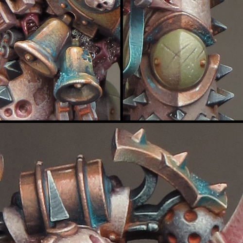
One thing that developed quite late in the project was my use of blue in the overall colour scheme. I always intended to use blue, rather than green, verdigris effects but the more blue I added the more I liked it. As I said in my last post, I think the blue provides a colour contrast that makes the whole colour scheme come together and pop!

I decided to get some blue into the front mid-section of the mini, to break up the overall brown tone this area had. I could have repainted the chains as copper and added verdigris but I liked the rusty iron I’d done, so I decided to try something else. I added some etched brass straps between the chains and painted them blue. It was a fiddly job but well worth the effort. The straps not only introduced a much needed blue element but also provided some extra fine detail and movement to contrast with the heavy armoured form of the mini.


For the base I decided to create a bubbling ‘Nurglesque’ swamp within a fractured rocky ground. This is a development of the base I made for my Abyssal Warlord, which struck me as having some potential for a Nurgle themed mini. I will be doing a micro bead mega-tutorial in the near future and a description of how I made this base will be included in that.
The marine comes with a Nurgling companion and I decided to have him scampering through the swampy part of the base. The Nurgling made for a fun mini project in itself but, as the overall paint job on my Death Guard Marine came together, something about the Nurgling began to really bug me! I loved the dollop of gloop that sat on the end of the stick the Nurgling is carrying but I wasn’t happy with how I painted it. I just felt too cartoony for the overall look and feel of the mini. So out came the pliers and scalpel, off came the gloop and on went the microbeads! I find this sort of last minute change nerve-wracking but I think the new gloop fits the overall look of my mini far more successfully.

As with my Farseer I’ve used a resin plinth from Darkmessiah Bases but this time I chose a round rather than square plinth. The distinct double lines inset into these bases is an extremely stylish feature and I ‘m very pleased how my minis look on them!
The final touch was to create a label for the plinth and this should have been simple but I came close to messing up very badly! I decided to fix a 3-D icon onto the plinth and used a shield to do this. However the shield was flat and although it looked OK from the front there were ugly gaps either side as the plinth was round. I filled these gaps with microbead slime and a cheeky Nurgling but the whole thing still looked off to my eye! On top of the awkward composition I realized that the icon drew far too much attention away from the mini. I’d thoroughly over complicated what should have been very simple.
On the Friday morning before the show I took a deep breath and took the whole horrible lot off the plinth. It was a nasty fiddly job and I feared I was going to make a dreadful mess. Careful work was needed but I managed to remove the icon with only one small chip to the paintwork on the plinth. I then made a label for the plinth that, thankfully, covered up the chip. In retrospect I think this mini would have looked fine on a plain plinth but the new label was a huge improvement on the icon because less is almost always more!

I went into the competition with mixed feelings. I was very pleased with what I’d achieved but, with only one mini entered, I had all my eggs in one basket and I knew the competition was going to be tough! As always the tension built through the day but finally the top three single minis were placed on the top shelf and I knew I had a trophy in that category.
That was some relief but then a whole new sort of tension begins to build as you wait to find out just what you’ve got. It was Gold and I was one very happy painter. I find there is a slightly odd moment then, when the first rush of elation passes, and you remember that Gold means you are in the running for the Slayer Sword. Regardless of how many Slayer Swords I’ve won, it’s a moment that never fails to give me butterflies in my stomach!

And then it’s my name that’s being called out and I’m up on the stage holding my fifth Slayer Sword! It’s very hard to describe just how that feels. Winning my first two Swords was pretty overwhelming and the experience came in a dizzy rush. The feeling now is somewhat deeper and calmer but no less meaningful. I am tremendously proud and grateful that I have the skill and experience to excel in my hobby. As I said earlier, it’s not getting any easier to win, but that’s part of what makes it worth doing!