Mummy Mania - Painting the Tomb King part 3
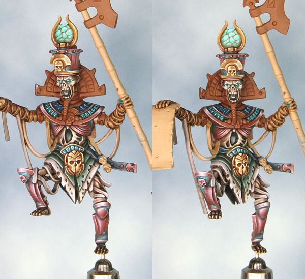
The overall colour scheme for my Tomb King has started to come together with the addition of a few small areas of blue. The blue helps to open expand range of colours used without throwing something wildly different into the mix. It is close enough to the green so as not to jar the eye but increases the overall contrast between the warm copper tones and the blue/green tones.
Progress is painfully slow at the moment but I'm pleased with the results I'm getting and that (for me) is the more important thing.


outstanding work!
ReplyDeleterealllly nice blends, and the pallete really hangs together well
I still feel that the copper is a mite red, but its hwere your contrast comes from, so i wouldnt listen to me :)
Love the colour scheme - everything works together in beautiful harmony.
ReplyDeleteGlad you are enjoying the process too, it always comes through in a model when the painter has enjoyed the project and that is very evident here.
Looki forward to the finished piece.
Cheers,
Andrew
very good!, go details, congratulations I envy the level piece of you (sorry I'm not very good in English) Greetings
ReplyDelete