

Thursday 22 May 2014
5th Dimension: Coming Soon...
Tuesday 20 May 2014
Squarg the Frog Rider - Part 3
With the frog all but done, I’ve turned my attention to it’s rider – Squarg.
I decided to paint Squarg with a yellow/brown flesh tone. In part to contrast with the frog and in part because I used to paint all my GW Night Goblins this colour back in the 1980’s. I’ve never understood the received wisdom that all Orcs and Goblins should be green!
I started off painting Squarg’s flesh in a similar way to that of the frog by building up layers of translucent colour. Once I’d reached a flesh tone I was happy with, I built up some stronger highlights and shadows to give his features definition. As I was doing this I also worked some red tones into his nose, ears and lips. This prevents the flesh looking monochrome and helps to give it life.
At this stage I felt there was still something missing, so I enriched some of the shadows around the eyes and nose with purple. This made a huge difference! Although the colour doesn’t look purple on the mini it’s presence made the face come alive.
It’s a basic application of colour theory to use complimentary colours (yellow & purple in this case) to liven up a colour scheme. What really surprised me was how effective such a subtle application of colour turned out to be!


Thursday 8 May 2014
Squarg the Frog Rider - Part 2
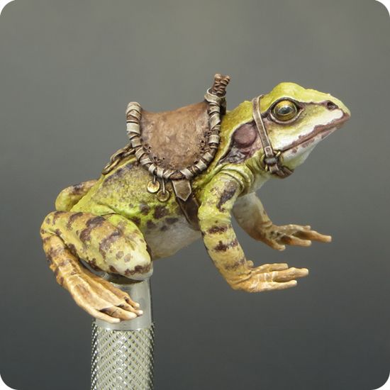
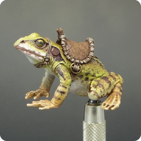
I've been steadily working on my frog mini over the past two weeks since I posted my last pictures. He is now finished. So it's time to post some up-to date pics of the work on 'Project Squarg'. I've continued to paint the frog with sucessive layers of transparent glazes and I'm very pleased with the result.

The leather of the harness and saddle has been painted by the conventional layering of highlights and shadows, but an extra layer of weathering was then applied with GW washes. Although most of this work will be covered up by the rider, it gave me the opportunity to test out the effect. Squarg himself will be featuring a fair bit of worn leather because I want to give him lots of character.
I'm a big fan of NMM but I think it would look too cartoonish for what I'm trying to achieve on this particular mini. It's a long time since I've used metalic paint and it's just as tricky as I remember. But I'm pleased with how it has turned out on the frog's harness. I intend to use true metalics on my next project so the limited areas of metal on Squarg will serve as useful practise.


In the week after Easter I didn't feel in a painting mood. Rather than forcing the issue, I switched my attention to constructing the base for this project. I had an idea of what I wanted to achieve, so I assembled the materials I needed and experimented with the composition.
The core of the base is a wooden cube that I have carved with a dremmel. I built up the under-structure with cork. To introduce a bit of character, and texture, I glued pieces of bark (picked up on a country walk) onto this sub-structure. Next I filled in the gaps with milliput. The tree and branch elements, made from assorted plant roots, were then glued onto the base and blended in with more milliput. Like Squarg, the mushrooms and toadstools come from Blacksmith Miniatures. There is still quite a bit of work to do, I want to build up more and varied textures before I paint the base. But I think I've made a good start.

The leather of the harness and saddle has been painted by the conventional layering of highlights and shadows, but an extra layer of weathering was then applied with GW washes. Although most of this work will be covered up by the rider, it gave me the opportunity to test out the effect. Squarg himself will be featuring a fair bit of worn leather because I want to give him lots of character.
I'm a big fan of NMM but I think it would look too cartoonish for what I'm trying to achieve on this particular mini. It's a long time since I've used metalic paint and it's just as tricky as I remember. But I'm pleased with how it has turned out on the frog's harness. I intend to use true metalics on my next project so the limited areas of metal on Squarg will serve as useful practise.

In the week after Easter I didn't feel in a painting mood. Rather than forcing the issue, I switched my attention to constructing the base for this project. I had an idea of what I wanted to achieve, so I assembled the materials I needed and experimented with the composition.
The core of the base is a wooden cube that I have carved with a dremmel. I built up the under-structure with cork. To introduce a bit of character, and texture, I glued pieces of bark (picked up on a country walk) onto this sub-structure. Next I filled in the gaps with milliput. The tree and branch elements, made from assorted plant roots, were then glued onto the base and blended in with more milliput. Like Squarg, the mushrooms and toadstools come from Blacksmith Miniatures. There is still quite a bit of work to do, I want to build up more and varied textures before I paint the base. But I think I've made a good start.

Tuesday 6 May 2014
Painting Jason and the Golden Fleece – an overview
Here's my long promised report on painting Jason for Salute. The intention is to fill in a few of the gaps from my earlier posts. They were a bit short on detail due to the pressures of ill health and a looming deadline!
The miniature
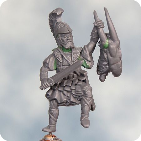
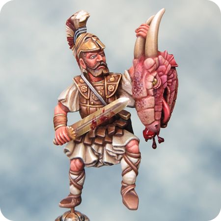
Jason is not an especially dynamic miniature and some areas are a bit chunky but what, in my opinion, saves the mini are the ‘extras’ that come with him.
Jason comes with the options of an arm holding up either a severed hydra’s head or a shield. There is also a fallen statue as a part of the base. While Jason himself is a little bit bland, the extras are the best and most detailed parts of the kit. Straightaway I decided to use as many of these parts as possible and particularly to make a feature of the hydra’s head.
When I first took a quick look at the mini I assumed that the statue’s head was a spare helmet-less head for Jason. This planted the seed of an idea. A little bit of chop and swap surgery was performed and my Jason had a new head. Similarly some careful cutting, drilling and pinning enabled me to re-position the hand holding the hydra’s head to better advantage.

The colour scheme
To be honest I didn’t think things through in advance this time. Instead I figured out the colour scheme as I went along. I knew that gold/bronze tones would feature and that Jason’s tunic would be white, but I was initially undecided on what colour to paint Jason’s leather armour . The mini is based on the film ‘Jason and the Argonauts’ so black would seem the logical choice, but as the paint job progressed I became less sure.
It was with the hydra’s head that I fixed the colour scheme. My initial idea was that it would be a greenish grey with red accents. As soon as I started painting the head I decided that red was the way to go and ended up using colours very similar to those on my Scourge wings. It’s often the way that regardless of how much I think things through I’ll end up following a gut feeling about my colour choices and adapt my ideas as I go along.
With the introduction of a significant amount of red into the colour scheme I decided to stay with an exclusively warm palette and paint the leather armour brown and gold.

The base
Jason’s base was made and painted a year ago in preparation for Salute 2013. I had intended to use it for my Dark Eldar Hellion but decided (wisely I think) against it at the last minute.
The shape of the rock suggested an off-centre positioning for Jason. As this could result in an interesting composition, I went with the idea and assembled the elements of the scene accordingly. Although the base was ‘finished’ it required quite a bit of reworking to adapt it to the golden fleece scenario. The addition of the tree (made from pieces of root) went surprisingly smoothly and it integrated into a split in the rocks as though I’d always intended it. The integration of Jason into the scene was a little trickier and I had to carve out a lot of material to make it work. Fortunately I’d built a lot of the groundwork with cork and it was possible for me to dig out and rebuild the area for Jason to stand on. I used cork in the same way on my Scourge base and I find it to be a really useful and flexible basing material.
I also needed to repaint the ground. Partly to cover up and incorporate the changes but also because the orange colour I had used was far too strong for the base’s new purpose. I didn’t want to cover up all of the orange so I decided on using a sucession of washes and glazes. I mixed up some golden brown tones and built up layers of colour until I was happy with the result. As the rock element were heavily dry-brushed I decided against using any dry brushing on the other groundwork . I like the look that dry brushing can give but it needs to be combined and contrasted with other textures. It is very easy to have too much dry brushing on a model!

The Shield
I decided to use Jason’s sheild as a decorative element and as a way of incorporating some freehand decoration in the overall composition. The idea to feature a ram’s head design was inspired by the design on the sail of the Argo in the film. The actual design used in the film looked to me to be more 1960’s than Bronze Age so I came up with one of my own that I felt was more in keeping with the period.
Painting freehand designs can be a daunting prospect. It helps a great deal to mark in an outline or guide marks prior to painting. As the design was to be painted onto a smooth shield there was an even better option available that I learnt about back in the 1990s. I drew the design onto a piece of lightweight (layout) paper and then glued that onto the surface of the shield. This is an especially helpful technique as I wanted to get my ram’s head design as perfectly symmetrical as possible. To that end, I decided to go one further and construct the design in Adobe Illustrator, a programme I use on a daily basis in my role as a designer/illustrator. With the illustration constructed I was able to reduce it down to the correct size and print it out ready for pasting onto the shield.
It would be nice to think that having gone to all the effort of creating the image in Illustrator I could just glue it in place and be done with the job. Not so. Although the print out was a huge help as a guide to painting, the image, even when printed at the best possible quality, wasn’t crisp or clear enough to use on its own. I also think that even the best printed image stuck onto a mini will look exactly like what it is – a printed image stuck onto a mini.
Regardless of whether you are printing out your design or hand-drawing it you will need to fix it onto the shield seamlessly. First cut the design out to the size and shape of the shield. Next you will need to sand down the edges of the paper from the back and it is as fiddly as it sounds. The idea here is to create as thin and tapered an edge as possible. If you get this right, the paper will stick onto the shield with a seamless edge. To fix the paper onto the shield I used slightly diluted Vallejo matt varnish. I soaked the paper in the varnish solution for a couple of minutes to soften it. Then, using a clean paintbrush, positioned it onto the shield smoothing out any air bubbles or wrinkles. Once dry an extra coat of matt varnish will help to fix the design and seal the paper ready for over painting.

The miniature
Jason is not an especially dynamic miniature and some areas are a bit chunky but what, in my opinion, saves the mini are the ‘extras’ that come with him.
Jason comes with the options of an arm holding up either a severed hydra’s head or a shield. There is also a fallen statue as a part of the base. While Jason himself is a little bit bland, the extras are the best and most detailed parts of the kit. Straightaway I decided to use as many of these parts as possible and particularly to make a feature of the hydra’s head.
When I first took a quick look at the mini I assumed that the statue’s head was a spare helmet-less head for Jason. This planted the seed of an idea. A little bit of chop and swap surgery was performed and my Jason had a new head. Similarly some careful cutting, drilling and pinning enabled me to re-position the hand holding the hydra’s head to better advantage.
The colour scheme
To be honest I didn’t think things through in advance this time. Instead I figured out the colour scheme as I went along. I knew that gold/bronze tones would feature and that Jason’s tunic would be white, but I was initially undecided on what colour to paint Jason’s leather armour . The mini is based on the film ‘Jason and the Argonauts’ so black would seem the logical choice, but as the paint job progressed I became less sure.
It was with the hydra’s head that I fixed the colour scheme. My initial idea was that it would be a greenish grey with red accents. As soon as I started painting the head I decided that red was the way to go and ended up using colours very similar to those on my Scourge wings. It’s often the way that regardless of how much I think things through I’ll end up following a gut feeling about my colour choices and adapt my ideas as I go along.
With the introduction of a significant amount of red into the colour scheme I decided to stay with an exclusively warm palette and paint the leather armour brown and gold.
The base
Jason’s base was made and painted a year ago in preparation for Salute 2013. I had intended to use it for my Dark Eldar Hellion but decided (wisely I think) against it at the last minute.
The shape of the rock suggested an off-centre positioning for Jason. As this could result in an interesting composition, I went with the idea and assembled the elements of the scene accordingly. Although the base was ‘finished’ it required quite a bit of reworking to adapt it to the golden fleece scenario. The addition of the tree (made from pieces of root) went surprisingly smoothly and it integrated into a split in the rocks as though I’d always intended it. The integration of Jason into the scene was a little trickier and I had to carve out a lot of material to make it work. Fortunately I’d built a lot of the groundwork with cork and it was possible for me to dig out and rebuild the area for Jason to stand on. I used cork in the same way on my Scourge base and I find it to be a really useful and flexible basing material.
I also needed to repaint the ground. Partly to cover up and incorporate the changes but also because the orange colour I had used was far too strong for the base’s new purpose. I didn’t want to cover up all of the orange so I decided on using a sucession of washes and glazes. I mixed up some golden brown tones and built up layers of colour until I was happy with the result. As the rock element were heavily dry-brushed I decided against using any dry brushing on the other groundwork . I like the look that dry brushing can give but it needs to be combined and contrasted with other textures. It is very easy to have too much dry brushing on a model!

The Shield
I decided to use Jason’s sheild as a decorative element and as a way of incorporating some freehand decoration in the overall composition. The idea to feature a ram’s head design was inspired by the design on the sail of the Argo in the film. The actual design used in the film looked to me to be more 1960’s than Bronze Age so I came up with one of my own that I felt was more in keeping with the period.
Painting freehand designs can be a daunting prospect. It helps a great deal to mark in an outline or guide marks prior to painting. As the design was to be painted onto a smooth shield there was an even better option available that I learnt about back in the 1990s. I drew the design onto a piece of lightweight (layout) paper and then glued that onto the surface of the shield. This is an especially helpful technique as I wanted to get my ram’s head design as perfectly symmetrical as possible. To that end, I decided to go one further and construct the design in Adobe Illustrator, a programme I use on a daily basis in my role as a designer/illustrator. With the illustration constructed I was able to reduce it down to the correct size and print it out ready for pasting onto the shield.
It would be nice to think that having gone to all the effort of creating the image in Illustrator I could just glue it in place and be done with the job. Not so. Although the print out was a huge help as a guide to painting, the image, even when printed at the best possible quality, wasn’t crisp or clear enough to use on its own. I also think that even the best printed image stuck onto a mini will look exactly like what it is – a printed image stuck onto a mini.
Regardless of whether you are printing out your design or hand-drawing it you will need to fix it onto the shield seamlessly. First cut the design out to the size and shape of the shield. Next you will need to sand down the edges of the paper from the back and it is as fiddly as it sounds. The idea here is to create as thin and tapered an edge as possible. If you get this right, the paper will stick onto the shield with a seamless edge. To fix the paper onto the shield I used slightly diluted Vallejo matt varnish. I soaked the paper in the varnish solution for a couple of minutes to soften it. Then, using a clean paintbrush, positioned it onto the shield smoothing out any air bubbles or wrinkles. Once dry an extra coat of matt varnish will help to fix the design and seal the paper ready for over painting.

Subscribe to:
Posts (Atom)