
Once Christmas was over I had some extra time off work and, at long last, the opportunity and enthusiasm to get some painting done. Although it took a couple of days to get up to speed, I was soon back into the swing of things and thoroughly enjoying myself painting.

I’m still very pleased with how the Scale75 paints are working out. Especially with how they dry to a matt finish even when a few layers have been built up. They handle quite differently to what I’m use to. In particular it seems to me that they need a little extra time to dry to the point where they are stable enough to be painted over without lifting up. That took a bit of getting used to but it hasn’t proved to be a problem so far.
When picking colours it’s all too easy to fall back on the old favourites and that isn’t a bad thing in itself. After all if you know something works why shouldn’t you use it. But it’s also good to step out from your comfort zone from time to time and having a new range of colours to work with has really opened up the opportunities for experimentation. I’m exploring how these colours act and react together and that has led me to some colour combinations I wouldn’t have previously considered using.
I’ve always known that green would be a key colour in my palette (It’s Nurgle – how could it not be) but I’ve been pleasantly surprised by how it is becoming the colour that unifies the overall scheme. My flesh tones are built around a red/green contrast with pale flesh tones in the highlights and deep purples in the shadows. I’d planned that the deep purple tones would be a common shade colour bringing unity to the scheme, and so it is. When I picked a bright turquoise to base coat the armour, I knew I was taking a bit of a risk. The purple tones in the shadows helped; but, in the early stages, the colour wasn’t really working and I felt it contrasted too much with the flesh.
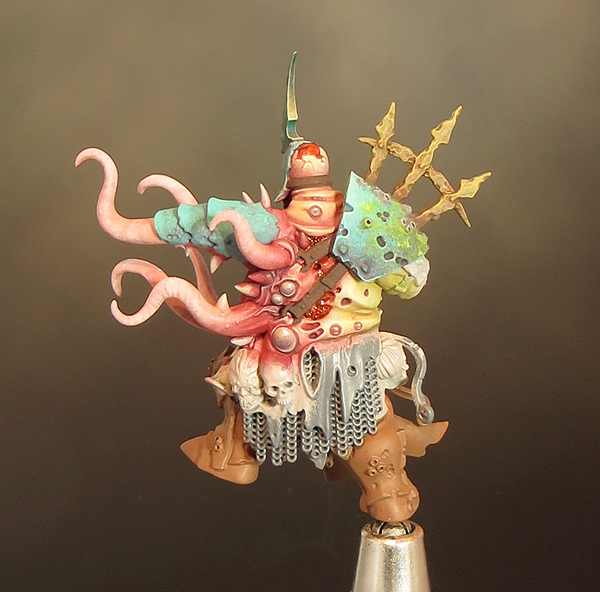

A bit more time spent working on the turquoise armour has really paid off! The shadows are now more nuanced with the addition of a vibrant blue and the highlights have also come alive with the addition of a light cool grey in the mix. But it’s in the mid tones that the ‘magic’ has happened. The addition of a little sponged and stippled green has transformed the armour. The green has brought some much needed texture and gives the armour a mottled blue/green finish that helps to create the ‘undersea’ feel I’ve been aiming for. As it is the same green that I used in the flesh it also helps to link the armour colour into the overall palette.
There is still plenty of work to do as I’m working across many different areas at the same time. But with the last couple of days work I feel the colour scheme has come together to give me the look and feel I want.
Gutrot Spume is a mini that cries out for some special effects and I’ve always planned for a whole layer of slime, gore and debris above and beyond the paint job. I would normally leave such effects until after the mini was painted but this time I‘m following a more organic process and incorporating some of the effects as I go along. The first such addition is a little bloody gore to enhance the flesh tones.
To do this I’ve used the combination of GW water effects and Tamiya clear colours. Tamiya clear smoke is a colour I’ve used in my blood mix for some time but I wanted to experiment further so I mixed a blood colour using the clear smoke, red and yellow with a little water effects. These colours are very strong and mixing in the water effects makes them a little more subtle. The mix gives me a sort of coloured gloss varnish that adds to the depth and realism of the flesh areas and provides a great contrast to the matt areas. To further enhance the gore factor I’ve added a few clear micro beads into the blood mix. This is something I’ve seen done before on nurgle minis and it can add a very nasty (in a good way) extra dimension to the gore.
He looks great. Very nice choice of colours - but then I´m a bit partial to cyan...
ReplyDeleteEverybody's doing Blightknights these days, but very few if any do them like this...
ReplyDeleteImpressive sight to see this organic pianting process with parts very well advanced and some still bare !
This marine theme is a splendid idea and I cannot wait to see this one completed.
Your base coats are so smooth and precise that it looks like the plastic came in that color. How do you do it?
ReplyDeleteThe trick is to take the time to paint the basecoat just as carefully as the highlights & shading. I allways dilute the paint (Citadel Base) and build up several very thin coats. It will look like a patchy uneven mess at first but it improves with each coat. It's important to let each coat dry thoroughly before you apply the next or you'll end up pushing the paint around and it will get even patchier!
DeleteDo you thin your paints with water or some sort of thinning agent like "Lahmian Medium"? Also, I see some grey on the skirt/chain mail in the back, are you using a paint on or spray grey primer? The texture on the armor adds SO much character to it, it's absolutely wonderful. Was this a result of stippling?
DeleteI thin all my paint & washes with tap water.
DeleteBrace yourself for a shock but I don't use a primer! I just go in with a basecoat of GW base paints. I will often apply this in stages so the grey you can see is unpainted plastic.
This way of working is unusual and my lack of primer scandalises a lot of people but it works for me.
Woah! Heresy! I feel like primer helps paint cling to models for me, but I'm definitely going to give not priming a try. A assume you then use some sort of matte finish on your models so the paint doesn't chip off of them easily?
DeleteNot priming does entail a few risks - not least the paint might not adhering to the mini in the first place and chipping once the mini is finished! I started working this way when I experimented with improving the smoothness of my finished minis. I found that the less paint I had building on a mini up the smoother & crisper the result.
DeleteI used to apply three heavy coats of satin varnish to give a smooth finish nowadays I will apply a little matt medium to take out any shine if it's needed. Other than that I don't apply any surface protection - more Heresy!
Again this can be a risky strategy but my minis are all display pieces and most are mounted onto plynths. The plinths get a lot of prep and are painted with car paint so they can take all the handling the finished piece will get.
Have you got a complete paint list for this amazing model, I'd love to see
ReplyDeleteHi, sorry I never published a complete paint list as such. I was pretty much making it up as I went along on this project. However the colours for the boat are here: https://sproketsmallworld.blogspot.com/2015/08/project-nurgle-part-17-painting-gutrots.html
DeleteI did also post the colours used on the armour:
All the colours I’ve used are scale colour paints from Scale 75 but I think you could get the same effect with equivalent colours from other ranges.
Base colour/mid tone: Caribbean Blue
Shade: Black Leather + Caribbean Blue
Deep Shade: Black Leather
Highlight :Nacar
Glaze/stipple colours: Sherwood Green, Autumn Green, Boreal Green, Sky Blue