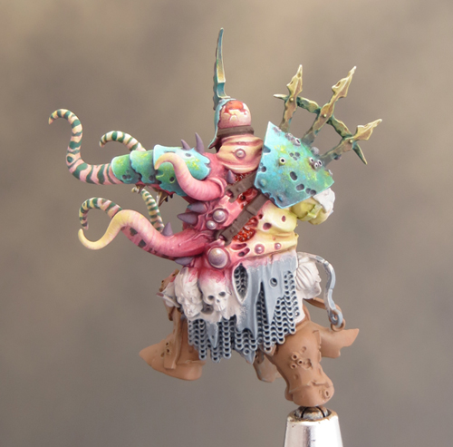
I've a (little) bit more progress to show for another week's painting. The paint scheme is coming together and I've finished the large shoulder guard and helmet. The tentacles are also coming along well but painting them is slow fiddly work. To break up the tedium of painting seven identical tentacles I’m interspersing them with work on other areas.
Good weather at the weekend meant that I've finally had good natural light enabling me to take some pictures that shows the colours on Gutrot more accurately.
To be honest I’ve not been 100% certain that things were going well or that the finished mini would see the light of day! Gutrot Spume is providing me with a very different painting experience from my usual approach. That’s been due, in part, to the cold induced hiatus; but mostly to the process of working out an entirely new colour palette. It’s taken time to become familiar with these new colours and things have felt very unresolved.
For someone who is used to working an area up to it’s finished state before moving on to the next one, that’s been an uncomfortable experience. But this last weekend things really seemed to come together and I’m feeling much better about how the paint job for Gutrot is coming together. So I decided it was time to tackle the tentacles!
It might be stating the obvious but the tentacles are a major feature of this mini and as such require special attention. I decided early on that I wanted to achieve a graduated effect down the length of the tentacle overlaid with irregular banding in a contrasting colour. This was strongly influenced by the results of a search for octopus reference pictures. I wanted to bring some real world influences to what is a very fantastical mini.
The underlying graduation is deep pink through to pale green and uses the basic skin tones from Gutrot. To contrast this I painted the banding in a deep green. It’s fiddly work, and creating an irregular effect is deceptively tricky, but I’m delighted with how it’s working out! Somehow those green stripes have made all the difference for me.
The deep green from the banding has turned out to be another key colour in the overall scheme. I’ve used a little of it to glaze over some of the mid tones and shadows in the armour and it’s provided a vital finishing touch. The deep green somehow ties together the blue, yellow-green, purple and turquoise. I never would have imagined that I’d be using so many colours in such a small area, but I really like the complex and nuanced feel that they give.
Gutrot no longer feels like a project that I’m trying to figure out how to proceed with. There is a lot more work to do, and plenty of opportunities for things to go wrong, but I’m confident and happy about the direction I’m taking.
At the start of December I was looking forward to ‘picking up my paint brushes and making some steady progress’. So much for good intentions! A combination of asthma and the general pre-Christmas rush meant that I couldn’t get any painting done before the holiday. All in all a very frustrating situation but sometimes you just have to roll with the punches.
Once Christmas was over I had some extra time off work and, at long last, the opportunity and enthusiasm to get some painting done. Although it took a couple of days to get up to speed, I was soon back into the swing of things and thoroughly enjoying myself painting.
I’m still very pleased with how the Scale75 paints are working out. Especially with how they dry to a matt finish even when a few layers have been built up. They handle quite differently to what I’m use to. In particular it seems to me that they need a little extra time to dry to the point where they are stable enough to be painted over without lifting up. That took a bit of getting used to but it hasn’t proved to be a problem so far.
When picking colours it’s all too easy to fall back on the old favourites and that isn’t a bad thing in itself. After all if you know something works why shouldn’t you use it. But it’s also good to step out from your comfort zone from time to time and having a new range of colours to work with has really opened up the opportunities for experimentation. I’m exploring how these colours act and react together and that has led me to some colour combinations I wouldn’t have previously considered using.
I’ve always known that green would be a key colour in my palette (It’s Nurgle – how could it not be) but I’ve been pleasantly surprised by how it is becoming the colour that unifies the overall scheme. My flesh tones are built around a red/green contrast with pale flesh tones in the highlights and deep purples in the shadows. I’d planned that the deep purple tones would be a common shade colour bringing unity to the scheme, and so it is. When I picked a bright turquoise to base coat the armour, I knew I was taking a bit of a risk. The purple tones in the shadows helped; but, in the early stages, the colour wasn’t really working and I felt it contrasted too much with the flesh.


A bit more time spent working on the turquoise armour has really paid off! The shadows are now more nuanced with the addition of a vibrant blue and the highlights have also come alive with the addition of a light cool grey in the mix. But it’s in the mid tones that the ‘magic’ has happened. The addition of a little sponged and stippled green has transformed the armour. The green has brought some much needed texture and gives the armour a mottled blue/green finish that helps to create the ‘undersea’ feel I’ve been aiming for. As it is the same green that I used in the flesh it also helps to link the armour colour into the overall palette.
There is still plenty of work to do as I’m working across many different areas at the same time. But with the last couple of days work I feel the colour scheme has come together to give me the look and feel I want.
Gutrot Spume is a mini that cries out for some special effects and I’ve always planned for a whole layer of slime, gore and debris above and beyond the paint job. I would normally leave such effects until after the mini was painted but this time I‘m following a more organic process and incorporating some of the effects as I go along. The first such addition is a little bloody gore to enhance the flesh tones.
To do this I’ve used the combination of GW water effects and Tamiya clear colours. Tamiya clear smoke is a colour I’ve used in my blood mix for some time but I wanted to experiment further so I mixed a blood colour using the clear smoke, red and yellow with a little water effects. These colours are very strong and mixing in the water effects makes them a little more subtle. The mix gives me a sort of coloured gloss varnish that adds to the depth and realism of the flesh areas and provides a great contrast to the matt areas. To further enhance the gore factor I’ve added a few clear micro beads into the blood mix. This is something I’ve seen done before on nurgle minis and it can add a very nasty (in a good way) extra dimension to the gore.