Friday, 23 June 2017
Painting the Abyssal Warlord - resolving the overall colour palette
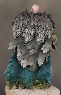
I’ve spent some of my recent hobby time finishing and refining the areas of the Abyssal Warlord that I’ve painted so far. For the most part that’s involved picking out details like the rivets and chains and working some painted texture into the skull and loincloth. I’ve also painted the back of the legs prior to attaching the cloak.
Although the cloak covers up most of the back it is possible to see between it and the warlord, so those areas need some attention and I’d decided it would be easiest to treat them as sub-assemblies. This also gave me the chance to paint the inside of the cloak.
Once this was done it was time to take a deep breath and glue the cloak onto the body. I’ve used a rapid epoxy glue for this as it gave me a strong bond between slightly ‘gappy’ parts. Making sure that I’m fixing bare metal to bare metal, I like to apply glue to each surface and let it become tacky before bringing the parts together. It also helps to lightly score the metal surfaces with a craft knife as this provides a better grip for the glue. Once the glue has set there is just a little gap filling and fur sculpting using green stuff to finish the job.
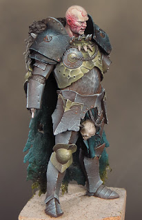
With the cloak now in place I’ve been able to resolve the overall colour palette. The fabric parts of the cloak are painted in a dark turquoise, Despair Green from Scalecolour’s Fantasy Games range, to match the loincloth. More importantly I’ve used the same colour as the blue/green tint in my blacks. This turquoise is the most saturated colour in my palette and provides a contrast to both the steel and gold tones in the armour. It also helps to bring something of an under-sea or ‘abyssal’ atmosphere to the model.
Despair Green is an interesting colour to work with. I’d normally choose that old favourite Dark Sea Blue to bring a blue/green tint to my blacks but I decided to experiment with a more saturated colour. As it turns out Despair Green is a very saturated and highly pigmented colour!
This means a little can go a very long way and it will easily overpower other colours when mixed with them. A good example of this is on the loincloth where I mixed Dryad Bark and Despair Green for the shadows. The dark brown desaturates and darkens the green but the result is still very much a shade of green. I think Despair Green will prove be a useful colour and I’m looking forward to experimenting with it further.
Overall I’ve gone for a palette of relatively cool colours on the Warlord. It’s worth noting that to contrast with this I’ve used a warm base colour (Dryad Bark). It’s role is quite subliminal in the finished effect, as it features mostly in the shadows, but it helps to unify the other colours.
The gold areas of the armour provide a bold colour contrast with the other parts of the model. I decided on gold quite early in the project but it was clear that I would have to experiment with the colour. A ‘traditional’ warm gold would not work at all on this project. Furthermore, a warm gold would be out of place in the palette I’m using and it would also feel out of place for the atmosphere I’m trying to create. What I needed was a cold sinister looking gold!
As it happens the colour mix for this type of gold is very simple, deceptively so! It’s possible to create a very effective NMM cold gold using just three colours: black, yellow and ivory. I’ve also included a little Dryad Bark in my mix to tie the gold into the overall scheme.
The yellow I’ve chosen to use is Sahara Yellow from Scalecolour. This is a relatively desaturated yellow ochre with the slightest hint of green to it. That greenish tone is the thing that gives the gold it’s cold and sinister quality.
Strong contrasts are vital to an effective NMM effect and the gold incorporates tones from pure black to pure ivory. The tricky part is getting the saturation right. Both the black and ivory will serve to desaturate the yellow and this is exactly what often happens. It’s important to keep the extreme ends of the tonal range to a minimum and use the least amount of black and ivory you can get away with.
It’s in the mid tone areas that the saturation is created. I find it’s almost always necessary to first establish the extreme ends of the tonal range and then go back and forth to balance out the mid tones and saturation. Considering that just three colours are involved in the mix it’s a surprisingly tricky balance to achieve. The Abyssal Warlord is progressing nicely and the addition of his sword and shield will see the model completed. I’m working out my ideas for a base but before I make that there is the matter of painting a freehand design onto his shield. That’s something I’ve not done for a long time and I’m very much looking forward to it!
Subscribe to:
Post Comments (Atom)


Amazing work as usual!!
ReplyDeleteI wasn't able to make your class in June, but hope to get to your contrast session in November!
That is just astounding - beautiful work, man!
ReplyDeleteBeautiful - I love the texture you've created on the metal areas.
ReplyDelete