After all the upset and upheaval that happened over the summer it feels very good to be painting minis again! I’ve not been able to establish a regular routine for my painting as yet but that’s to be expected. With Mark at home recovering (and not yet fully able to enjoy his retirement) life is still a bit topsy-turvy for us both.
Bearing this in mind I decided to start a ‘fun’ project that would not require too much concentration and time. Horticulus Slimux and Mulch most certainly will and I’ll need to be fully back up-to-speed before I return to them. As it happens I already had a Sloppity Bilepiper assembled and base coated because I’d intended to paint him before the Isharan Tidecaster grabbed my attention. The Sloppity Bilepiper is the perfect mini for my current needs.
As well as being a fun miniature it hads the advantage of providing me with some familiar Nurgley subject matter. That meant that I could just dive right in and get painting. I’ve used the same techniques on the Bilepiper’s flesh tones as I used on all my other Plaguebearers. The only real difference is in the colour palette I’ve used. Instead of featuring green as the dominant colour I’ve experimented with a yellow flesh tone. Yellow can be used as a happy cheerful colour and it somehow seemed appropriate for a creature infected with the comedic fever of the Chortling Murrain!
In practice the colours used vary little from the combination of red/pink, blue and yellow over a Rakarth Flesh base that I’ve used before for my ‘human’ flesh tones (see below). The difference is in the proportions of those colours. I’ve built up a series of glazes going from yellow (Games Workshop Iyanden Darksun) through red (Scale Colour Antares Red) to a dark brown (Scale Colour Black Leather). This gave me my global shadows and colours. I then built up the highlights over the glazes using a combination of Iyanden Darksun and Flayed One Flesh (Games Workshop). In addition to the highlights this stage is where I build up the textures.
With the bulk of the highlights and shading done I then went back to fine tune everything with further glazes and highlighting. At this point I’ve use a little of the red from the Scale Colour Inktense range to increase the saturation in some of the shadows and mid-tones.
Fingers crossed this project will help ease me back into a more regular painting routine and serve as a stepping stone to my bigger projects.
Showing posts with label Scale75. Show all posts
Sunday, 7 October 2018
Monday, 26 March 2018
A fishy tale!
Last summer I painted the Abyssal Warlord from Scale 75 for my workshop at Element Games. Although he started out as a demo mini I decided to try and finish him to competition standard, and I was pretty pleased with how he turned out. I took the finished model along to the Golden Demon winner’s day, at Games Workshop HQ in Nottingham, to get some feedback from my fellow painters.
Having successfully smuggled a non-GW model in, without setting off the alarm at the gates, I put him out on display. The reaction was very good but there was one bit of very helpful feedback. Put simply, the rings that attached his cloak to his armour were the weak link in the paint job and didn’t match up to the rest of the model.
I believe that we are all our own toughest critics and deep down we always know when something isn’t up to scratch! However, I’m very good at deceiving myself, and it’s all too easy to think that it’s ok and no one will notice. Thank goodness someone did notice and gave me a, much needed, push to sort it out!
The root of the problem was in the casting, which wasn’t great in this area. However it’s my job to spot such issues before I’ve glued the parts together and base coated them – my bad!
This required a little thought so I put the Warlord in the cabinet and took plenty of time to ponder the issue. I decided the solution was to remove the offending rings and replace them so that I could then repaint the area. It would be straight forward enough to replace them and sculpt some new fur and fixings. Straightforward in principle but bloody fiddly to do!
I took a little more time to think through a plan of action and I’m very glad I did. I gradually began to rethink my idea of replacing the rings like for like. This seemed to me to be an opportunity to add something a little extra. My thoughts came together very slowly but, in the end, I decided to work with the fish theme already on this model and put fish head terminals onto the cloak.
At this point I remembered the fish familiar in the Silver Tower box and I had my solution. The fish familiar was the perfect size and, because it’s made from plastic, easy to cut and carve to fit. With Horticulous Slimux done I decided this week was a good time to get the Warlord out and make the changes to him.
The Warlord is a weighty, top-heavy model and this made the whole process much harder than it should have been. To cope with this I had to proceed very (even for me) slowly and carefully.
I began by carving away the old rings and a little of the adjoining fur. It was a horrible job but by proceeding with extreme caution I managed to remove the unwanted parts without causing extra damage to the paintwork. Then I had to cut the fish down to size by removing the head, filing off the back half of it’s face and re-carving this surface to fit onto the Warlord’s shoulders.
I glued the new, pre-painted, fish head terminals onto the Warlord’s shoulders with epoxy glue and, once this had set, sculpted new fur to connect the old and new parts. I finished off by repainting the fur to blend the old and new together.
To say the least it was a tricky change to make, and I hate doing this sort of work on a ‘finished’ mini at the best of times! But I think the effort has paid off and I’m very pleased with the result. The new fish head terminals add to the under-sea theme and I think they also improve the overall composition. They help to bring extra focus to the face by framing it with areas of the cold gold. They also create a subtle triangle of gold within the overall colour composition that I find very satisfying!
Thanks to Ellis Kaye for giving me the feedback that prompted me to make the changes!
Having successfully smuggled a non-GW model in, without setting off the alarm at the gates, I put him out on display. The reaction was very good but there was one bit of very helpful feedback. Put simply, the rings that attached his cloak to his armour were the weak link in the paint job and didn’t match up to the rest of the model.
I believe that we are all our own toughest critics and deep down we always know when something isn’t up to scratch! However, I’m very good at deceiving myself, and it’s all too easy to think that it’s ok and no one will notice. Thank goodness someone did notice and gave me a, much needed, push to sort it out!
The root of the problem was in the casting, which wasn’t great in this area. However it’s my job to spot such issues before I’ve glued the parts together and base coated them – my bad!
This required a little thought so I put the Warlord in the cabinet and took plenty of time to ponder the issue. I decided the solution was to remove the offending rings and replace them so that I could then repaint the area. It would be straight forward enough to replace them and sculpt some new fur and fixings. Straightforward in principle but bloody fiddly to do!
I took a little more time to think through a plan of action and I’m very glad I did. I gradually began to rethink my idea of replacing the rings like for like. This seemed to me to be an opportunity to add something a little extra. My thoughts came together very slowly but, in the end, I decided to work with the fish theme already on this model and put fish head terminals onto the cloak.
At this point I remembered the fish familiar in the Silver Tower box and I had my solution. The fish familiar was the perfect size and, because it’s made from plastic, easy to cut and carve to fit. With Horticulous Slimux done I decided this week was a good time to get the Warlord out and make the changes to him.
The Warlord is a weighty, top-heavy model and this made the whole process much harder than it should have been. To cope with this I had to proceed very (even for me) slowly and carefully.
I began by carving away the old rings and a little of the adjoining fur. It was a horrible job but by proceeding with extreme caution I managed to remove the unwanted parts without causing extra damage to the paintwork. Then I had to cut the fish down to size by removing the head, filing off the back half of it’s face and re-carving this surface to fit onto the Warlord’s shoulders.
I glued the new, pre-painted, fish head terminals onto the Warlord’s shoulders with epoxy glue and, once this had set, sculpted new fur to connect the old and new parts. I finished off by repainting the fur to blend the old and new together.
To say the least it was a tricky change to make, and I hate doing this sort of work on a ‘finished’ mini at the best of times! But I think the effort has paid off and I’m very pleased with the result. The new fish head terminals add to the under-sea theme and I think they also improve the overall composition. They help to bring extra focus to the face by framing it with areas of the cold gold. They also create a subtle triangle of gold within the overall colour composition that I find very satisfying!
Thanks to Ellis Kaye for giving me the feedback that prompted me to make the changes!
Wednesday, 15 November 2017
Project P30 - Death Guard Chaos Space Marine Part 3
Previously my colour palettes for Nurgle themed minis have been built around a strong red/green contrast using saturated colours. While I may use this approach for some elements of my new Predator, overall I want to work with a more desaturated palette. It’s my gut instinct that, on a larger model like the Predator, a desaturated palette will be more effective. I suspect a strong saturated palette, like the one I used on Gutrot Spume, would give the Predator more of a ‘cartoony’ look than I want.
Although I didn’t set out to do this, my Death Guard uses a similar palette to the one used on my Tomb King. This is mostly because of the global highlight and shade colours I’ve used. The use of global highlight and shade colours ties the colour scheme together and helps to give the different coloured elements the feel of being in the same environment. It works equally well for both saturated and desaturated palettes.
My global shade colour is Black Leather from ScaleColour. As I said in my last posting, this is a desaturated purplish brown that mixes well with most other colours to create shade tones. My global highlight colour is Mojave White also from Scale colour. I often use Ivory for a global highlight and, in contrast to this, Mojave White is a slightly cooler and greyer looking colour that will help with the overall ‘dirty look’ I want to give my Death Guard. These global colours give me an interesting contrast between warm shadows and cooler highlights.
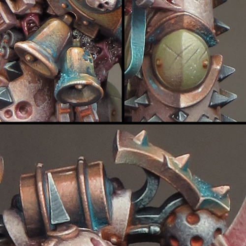
The pictures used below to illustrate my colour palette are far more close-up than I would normally show. I think this may be of interest in itself as you can see every brush mark and blemish I've made to create my textures!
Shade: Black Leather (SC)
Highlight: Mojave White (SC)
The bone coloured armour is painted almost entirely with very fine stippling to give an overall texture. I started with a mid-tone base then added the shadows followed by highlights. I then went back and forth between the tones to adjust the overall balance. The final step was to paint the scratches and chips.
Shade: Black Leather (SC)
Highlight: Mojave White (SC)
The green armour was painted in much the same way as the bone coloured armour. I decided to try the new GW paint Death Guard Green and I’m very pleased I did. This is an extremely flexible colour sitting midway between light/dark and warm/cool. As a result it could form the basis of almost any green colour scheme and I’ll be experimenting further with Death Guard Green in the future.
Midtone: Ratskin Flesh (GW)
Highlight: Mojave White (SC)
The copper uses a palette of colours I developed earlier that includes Ratskin Flesh to bring a warm, almost pink, tone to it.
Sotek Green (GW), Baharroth Blue (GW), Black Leather (SC) & Ratskin Flesh (GW)
I was just going to have a little bit of verdigris on this mini but I decided to try a bluer tone than I’ve used before. The use of blue in the overall colour scheme has turned out to be crucial! The blue provides a saturated colour that harmonizes with the greens and contrasts with the browns and oranges. I think the blue makes the whole scheme come together and pop!
I’ve combined several blue tones for the verdigris by mixing Sotek Green with other colours from my palette. The addition of Black Leather creates a purple/blue tone while Ratskin Flesh creates a green/blue tone.
Shade: Mayhem Red (SC)
Highlight: Mojave White (SC)
The fleshy parts of the mini are only a small part of the whole but the red and pink tones provide a nice touch of saturation in contrast to the armour and colour contrast with the blue and green.
Highlight: Mojave White (SC)
The green iron areas were originally going to be a dark grey/black. But the subtle introduction of a green tone, through the use of Dark Sea Blue, brings more colour into the palette without adding too much extra colour contrast.
Highlight: Mojave White
The combination of Dark Sea Blue and Black Leather is a very useful one. Mixed together these colours give a very dark neutral tone that, when mixed with Mojave White, creates an interesting range of greys. It’s possible to play with warm & cool tonal variations by varying the proportions of the colours used in the mix.
Windsor & Newton Designers Gouache – Orange Lake Deep/Olive Green mix
I decided to try something different with some of my rust effects this time. The use of Designers Gouache means that the paint, much like pigment powders, can be applied, left to dry and then adjusted with a clean damp brush. This has enabled me to achieve a greater degree of control and subtlety with my rust than I’ve done before. I can see that Designers Gouache, a relic from my schooldays, may well become a staple in my miniature painting from now on, and I’m looking forward to further experimentation with it!
Although I didn’t set out to do this, my Death Guard uses a similar palette to the one used on my Tomb King. This is mostly because of the global highlight and shade colours I’ve used. The use of global highlight and shade colours ties the colour scheme together and helps to give the different coloured elements the feel of being in the same environment. It works equally well for both saturated and desaturated palettes.
My global shade colour is Black Leather from ScaleColour. As I said in my last posting, this is a desaturated purplish brown that mixes well with most other colours to create shade tones. My global highlight colour is Mojave White also from Scale colour. I often use Ivory for a global highlight and, in contrast to this, Mojave White is a slightly cooler and greyer looking colour that will help with the overall ‘dirty look’ I want to give my Death Guard. These global colours give me an interesting contrast between warm shadows and cooler highlights.
The pictures used below to illustrate my colour palette are far more close-up than I would normally show. I think this may be of interest in itself as you can see every brush mark and blemish I've made to create my textures!
The Colour Palette
Bone coloured armour
Base: Rakarth Flesh (GW)
Shade: Black Leather (SC)
Highlight: Mojave White (SC)
The bone coloured armour is painted almost entirely with very fine stippling to give an overall texture. I started with a mid-tone base then added the shadows followed by highlights. I then went back and forth between the tones to adjust the overall balance. The final step was to paint the scratches and chips.
Green Armour
Base: Death Guard Green (GW)
Shade: Black Leather (SC)
Highlight: Mojave White (SC)
The green armour was painted in much the same way as the bone coloured armour. I decided to try the new GW paint Death Guard Green and I’m very pleased I did. This is an extremely flexible colour sitting midway between light/dark and warm/cool. As a result it could form the basis of almost any green colour scheme and I’ll be experimenting further with Death Guard Green in the future.
Copper
Base/Shade: Black Leather (SC)
Midtone: Ratskin Flesh (GW)
Highlight: Mojave White (SC)
The copper uses a palette of colours I developed earlier that includes Ratskin Flesh to bring a warm, almost pink, tone to it.
Verdigris
Sotek Green (GW), Baharroth Blue (GW), Black Leather (SC) & Ratskin Flesh (GW)
I was just going to have a little bit of verdigris on this mini but I decided to try a bluer tone than I’ve used before. The use of blue in the overall colour scheme has turned out to be crucial! The blue provides a saturated colour that harmonizes with the greens and contrasts with the browns and oranges. I think the blue makes the whole scheme come together and pop!
I’ve combined several blue tones for the verdigris by mixing Sotek Green with other colours from my palette. The addition of Black Leather creates a purple/blue tone while Ratskin Flesh creates a green/blue tone.
Flesh/tubes
Base: Rakarth Flesh (GW)
Shade: Mayhem Red (SC)
Highlight: Mojave White (SC)
The fleshy parts of the mini are only a small part of the whole but the red and pink tones provide a nice touch of saturation in contrast to the armour and colour contrast with the blue and green.
Green Iron
Base: Dark Sea Blue (V)
Highlight: Mojave White (SC)
The green iron areas were originally going to be a dark grey/black. But the subtle introduction of a green tone, through the use of Dark Sea Blue, brings more colour into the palette without adding too much extra colour contrast.
Black Iron
Base: Dark Sea Blue/ Black Leather mix
Highlight: Mojave White
The combination of Dark Sea Blue and Black Leather is a very useful one. Mixed together these colours give a very dark neutral tone that, when mixed with Mojave White, creates an interesting range of greys. It’s possible to play with warm & cool tonal variations by varying the proportions of the colours used in the mix.
Rust
Kalahari Orange (SC)
Windsor & Newton Designers Gouache – Orange Lake Deep/Olive Green mix
I decided to try something different with some of my rust effects this time. The use of Designers Gouache means that the paint, much like pigment powders, can be applied, left to dry and then adjusted with a clean damp brush. This has enabled me to achieve a greater degree of control and subtlety with my rust than I’ve done before. I can see that Designers Gouache, a relic from my schooldays, may well become a staple in my miniature painting from now on, and I’m looking forward to further experimentation with it!
Monday, 17 July 2017
The Abyssal Warlord - finished
I love that feeling of having just finished a project! It's high time too as, although very busy and achieving plenty, I've not actually finished very much this year! But the Abyssal Warlord is now done and I'm very happy with the result.
This model feels like a consolidation of the techniques I've been experimenting with over the last year or so: the tentacles and weedy slime are a clear call back to Gutrot Spume and the textured NMM, like the use of the black tones, is something I’ve been working on over several projects.
I’ve felt for some time that I develop as a painter by having periods of experimentation followed by periods of consolidation. This probably means it's time to stretch myself and try something new. So it’s a good thing my next project will be finishing the Akito bust!
I’ll be posting a step-by-step guide on how to create the splash effect shortly. Although it looks similar to the effect I used on Gutrot it was not achieved in the same way, and I think it’s well worth sharing.
This model feels like a consolidation of the techniques I've been experimenting with over the last year or so: the tentacles and weedy slime are a clear call back to Gutrot Spume and the textured NMM, like the use of the black tones, is something I’ve been working on over several projects.
I’ve felt for some time that I develop as a painter by having periods of experimentation followed by periods of consolidation. This probably means it's time to stretch myself and try something new. So it’s a good thing my next project will be finishing the Akito bust!
I’ll be posting a step-by-step guide on how to create the splash effect shortly. Although it looks similar to the effect I used on Gutrot it was not achieved in the same way, and I think it’s well worth sharing.
Wednesday, 12 July 2017
Painting the Abyssal Warlord - a weighty issue!
If I’m not very careful to take regular breaks during my painting sessions I’m prone to a fair degree of shoulder pain on account of an old injury. So I make a point of taking time away from my models to move about and stretch. This has proven to be an effective solution and I can happily paint away with no trouble. Until I started painting the Abyssal Warlord that is!
What I didn’t take into account was that, as a white metal kit, the Warlord weighs a lot more than a plastic or resin model. My regular stretch breaks were not adequate and as a result I’ve had to endure a month and a half of shoulder pain. The lesson I’ve learned is to treat each model individually and pace myself accordingly. I’ve been able to carry on painting but only by restricting myself too much shorter painting sessions with this model. The weight also makes the Warlord awkward to handle as he’s very top heavy and painting him became a bit of a chore!
That’s a shame because in all other respects I think he’s a great model to paint and I’ve been very happy with how my paint job is developing. So I persevered and, once the cloak was attached making him even heavier, I was finally able to work on the sword and shield. This came as a great relief because I’d decided to paint these as sub assemblies so there were no more weight/balance issues.
I chose to paint both the sword and the shield predominantly in black. I made this decision based on how the overall colour palette and contrast were shaping up. I could have gone with the gold but rejected it on the grounds of it being too glitzy! Equally I could have gone with the steel but I felt this would be too much of the same tone as the rest of the armour.
The shield was something I’d been looking forward to. As a large flat surface it provided the perfect opportunity to paint a freehand design. This is something I’ve been itching to have a go at for some time. I’d considered doing it for my Farseer but, somehow, it didn’t feel right on him. Similarly I was going to paint an elaborate freehand on the Megaboss but decided to do something more appropriately Orky instead.
My choice of design was fairly straightforward. I wanted to develop the abyssal, deep sea, theme already featured on this model. So something fishy seemed appropriate especially because of the fish head motif on his armour. For the same reason, an anglerfish seemed like the best choice and so I searched online for suitable reference. Although there were plenty of photos to choose from what I found most useful in the end were tattoo designs. These had already undergone a process of stylisation which made them more appropriate to my needs. No single design was exactly right but I was able to take inspiration from a couple and combine them into something I liked.
My final anglerfish design incorporates an ‘S’ curve in it’s body with the head at the bottom. I had initially thought to have the head at the top but I found it more pleasing to sit the head in the curve of the shield’s lower edge. To tie it in with the overall scheme, I’ve painted the fish in the same blue as the cloak and the loincloth. The eyes have been picked out with the yellow/green tone that I used for the gold.
I was surprised at how quick it was to paint the fish. Starting off with a few guidelines, pencilled in white onto the black background, I gradually built up the design from a fairly rough start. As the design developed I resolved the form and contrast until I was happy with the result. The fish design became increasingly spiky, as this felt appropriate to the feel of the model.
With the sword and shield now glued in position there are just a few finishing touches to paint and then the Warlord will be ready for basing. With that end in sight I’ve started work on a base creating a hard cracked surface by gluing very thin sheets of milliput onto cork. The cracks are created by pressing through the brittle milliput into the flexible cork with a metal tool.
I’m now in the final stages of this project and very much enjoying the process of bringing it all together. And my shoulder is feeling much better too!
Friday, 23 June 2017
Painting the Abyssal Warlord - resolving the overall colour palette
I’ve spent some of my recent hobby time finishing and refining the areas of the Abyssal Warlord that I’ve painted so far. For the most part that’s involved picking out details like the rivets and chains and working some painted texture into the skull and loincloth. I’ve also painted the back of the legs prior to attaching the cloak.
Although the cloak covers up most of the back it is possible to see between it and the warlord, so those areas need some attention and I’d decided it would be easiest to treat them as sub-assemblies. This also gave me the chance to paint the inside of the cloak.
Once this was done it was time to take a deep breath and glue the cloak onto the body. I’ve used a rapid epoxy glue for this as it gave me a strong bond between slightly ‘gappy’ parts. Making sure that I’m fixing bare metal to bare metal, I like to apply glue to each surface and let it become tacky before bringing the parts together. It also helps to lightly score the metal surfaces with a craft knife as this provides a better grip for the glue. Once the glue has set there is just a little gap filling and fur sculpting using green stuff to finish the job.
With the cloak now in place I’ve been able to resolve the overall colour palette. The fabric parts of the cloak are painted in a dark turquoise, Despair Green from Scalecolour’s Fantasy Games range, to match the loincloth. More importantly I’ve used the same colour as the blue/green tint in my blacks. This turquoise is the most saturated colour in my palette and provides a contrast to both the steel and gold tones in the armour. It also helps to bring something of an under-sea or ‘abyssal’ atmosphere to the model.
Despair Green is an interesting colour to work with. I’d normally choose that old favourite Dark Sea Blue to bring a blue/green tint to my blacks but I decided to experiment with a more saturated colour. As it turns out Despair Green is a very saturated and highly pigmented colour!
This means a little can go a very long way and it will easily overpower other colours when mixed with them. A good example of this is on the loincloth where I mixed Dryad Bark and Despair Green for the shadows. The dark brown desaturates and darkens the green but the result is still very much a shade of green. I think Despair Green will prove be a useful colour and I’m looking forward to experimenting with it further.
Overall I’ve gone for a palette of relatively cool colours on the Warlord. It’s worth noting that to contrast with this I’ve used a warm base colour (Dryad Bark). It’s role is quite subliminal in the finished effect, as it features mostly in the shadows, but it helps to unify the other colours.
The gold areas of the armour provide a bold colour contrast with the other parts of the model. I decided on gold quite early in the project but it was clear that I would have to experiment with the colour. A ‘traditional’ warm gold would not work at all on this project. Furthermore, a warm gold would be out of place in the palette I’m using and it would also feel out of place for the atmosphere I’m trying to create. What I needed was a cold sinister looking gold!
As it happens the colour mix for this type of gold is very simple, deceptively so! It’s possible to create a very effective NMM cold gold using just three colours: black, yellow and ivory. I’ve also included a little Dryad Bark in my mix to tie the gold into the overall scheme.
The yellow I’ve chosen to use is Sahara Yellow from Scalecolour. This is a relatively desaturated yellow ochre with the slightest hint of green to it. That greenish tone is the thing that gives the gold it’s cold and sinister quality.
Strong contrasts are vital to an effective NMM effect and the gold incorporates tones from pure black to pure ivory. The tricky part is getting the saturation right. Both the black and ivory will serve to desaturate the yellow and this is exactly what often happens. It’s important to keep the extreme ends of the tonal range to a minimum and use the least amount of black and ivory you can get away with.
It’s in the mid tone areas that the saturation is created. I find it’s almost always necessary to first establish the extreme ends of the tonal range and then go back and forth to balance out the mid tones and saturation. Considering that just three colours are involved in the mix it’s a surprisingly tricky balance to achieve. The Abyssal Warlord is progressing nicely and the addition of his sword and shield will see the model completed. I’m working out my ideas for a base but before I make that there is the matter of painting a freehand design onto his shield. That’s something I’ve not done for a long time and I’m very much looking forward to it!
Thursday, 11 May 2017
Busy Times! – Part 2
2017 continues, as expected, to keep me very, very busy! But that was the whole idea behind becoming a full time hobbyist anyway. The only down side is that I’ve had to put Akito on the back burner for the time being. But it won’t be too long before I can give her my full concentration.
I've already experimented with a couple of Games Workshop products, Stirland Battlemire and Typhus corrosion, and was able to replicate the texture effects I get with bicarb. I'm going to try sealing the affected bicarb with a spirit based varnish and hope that will protect it from changes in humidity.
The following pictures might be of interest. Picture 1 shows the worst of the white 'frosting' that appeared on my minis. Now this is where it gets a bit weird because the white 'frosting' has vanished! Picture 2 is more recent but there is no apparent damage to the painted surface and no trace of the white. Not even a hint of it having flaked off and left loose particles on the base!
I'm very happy that my minis now look OK (for the moment at least) but I'm still not going to use bicarb again!
I didn’t quite enjoy Salute as much as previous years, which is no reflection on the show! I started off the day feeling fine and frisky but I’ve had a busy few weeks, and in the afternoon, it all caught up with me – big time!
My energy levels plummeted, which was a shame, but thankfully it didn’t ruin the day. I got to spend some quality time with my mates and met a whole bunch of painting friends, old and new, which is always the best thing about these events. The fact that I didn’t take in as much of the show as usual meant that I wasn’t tempted to spend my money, so there is a silver lining to be found there too.
It's been 27 years since I last had my models in the cabinet at Warhammer Southampton so when I spent the day at Warhammer Southampton, on Saturday 29th April, I made up for lost time! I showcased my miniatures and ran some demonstrations of the techniques I’ve used on my Golden Demon winners. I also got to judge a painting competition! It was great to meet everyone and I’d like to say a big “thank you” to Rod and his team for making me so welcome!
I wanted an armoured figure for the workshop as I’ve decided to focus on the materials, techniques and theory that I use when painting non-metallic metals. This is something I first explored on my Scourge miniatures but I’ve continued to develop my approach, most recently on my Megaboss.
The Abyssal Warlord is proving to be, as I hoped, a joy to paint.
Tickets are now available for my painting masterclass at Element Games HERE but they are selling out fast!
Carefully does it!
I’m very happy to report that Gutrot Spume has been repaired. I used plastic glue to 'weld' the broken parts together in a strong bond and, thankfully, it all went like a dream! I also remembered that I had some parts, including a helmet, from a spare Gutrot. So I've been able to replace the broken tip from the crest on his helmet. Once the parts were reattached a retouch to the paint on the affected areas completed the job. Gutrot is as good as new - I'm glad that's over!The Bicarbonate of Soda crisis – an update.
I've decided not to freak out over the white frosting that appeared on some of my minis where I'd used bicarbonate of soda mixed in with the paint. Instead I'm going to calmly monitor the situation and look into alternatives for future projects and fix for the minis.I've already experimented with a couple of Games Workshop products, Stirland Battlemire and Typhus corrosion, and was able to replicate the texture effects I get with bicarb. I'm going to try sealing the affected bicarb with a spirit based varnish and hope that will protect it from changes in humidity.
The following pictures might be of interest. Picture 1 shows the worst of the white 'frosting' that appeared on my minis. Now this is where it gets a bit weird because the white 'frosting' has vanished! Picture 2 is more recent but there is no apparent damage to the painted surface and no trace of the white. Not even a hint of it having flaked off and left loose particles on the base!
I'm very happy that my minis now look OK (for the moment at least) but I'm still not going to use bicarb again!
Salute 2017
I’ve been waiting a whole year to enter Abalam into the painting comp at Salute and was rewarded with Bronze in the large scale category! A very satisfying result for what was a relatively speedy project. Although it means my quest to win Gold for a bust is still unfulfilled. But there is always next year and I have great hopes for Akitio.I didn’t quite enjoy Salute as much as previous years, which is no reflection on the show! I started off the day feeling fine and frisky but I’ve had a busy few weeks, and in the afternoon, it all caught up with me – big time!
My energy levels plummeted, which was a shame, but thankfully it didn’t ruin the day. I got to spend some quality time with my mates and met a whole bunch of painting friends, old and new, which is always the best thing about these events. The fact that I didn’t take in as much of the show as usual meant that I wasn’t tempted to spend my money, so there is a silver lining to be found there too.
Warhammer Southampton Showcase
It's been 27 years since I last had my models in the cabinet at Warhammer Southampton so when I spent the day at Warhammer Southampton, on Saturday 29th April, I made up for lost time! I showcased my miniatures and ran some demonstrations of the techniques I’ve used on my Golden Demon winners. I also got to judge a painting competition! It was great to meet everyone and I’d like to say a big “thank you” to Rod and his team for making me so welcome!
Sproket's Painting Masterclass at Element Games 3rd and 4th June.
I’ve had my eye on the Abyssal Warlord for some time and I think he is going to be a great workshop model! The model has several options for its weapons, head and costume, giving a degree of flexibility in it’s construction. It’s a well-designed model with plenty of detail and texture but, overall, it’s clear and uncluttered. This provides plenty of opportunity for creativity when painting it.I wanted an armoured figure for the workshop as I’ve decided to focus on the materials, techniques and theory that I use when painting non-metallic metals. This is something I first explored on my Scourge miniatures but I’ve continued to develop my approach, most recently on my Megaboss.
The Abyssal Warlord is proving to be, as I hoped, a joy to paint.
Tickets are now available for my painting masterclass at Element Games HERE but they are selling out fast!
Wednesday, 20 January 2016
Painting Commodore Borgossa – part 3
As promised back in December here is a more detailed description of how I finished painting Commodore Borgossa. You can see the finished bust on Putty & Paint HERE.
The Face
I chose a desaturated mid-grey/green as a base colour for Borgossa’s face. This gave me a muted foundation that helped to prevent the subsequent colours becoming too saturated, which might have happened with a lighter base colour. The shading and highlights were built up with translucent layering and glazes. Much of the apparent colour on the face is the combination of several layers of translucent colour rather than something that was mixed on a palette.
The eyes
I decided to give Borgossa a ‘dead eye’ by extending the scar sculpted across this mouth up across the rest of his face. This may not be the most original thing to have done, but it seemed to suit both the character and the sculpt. I used pictures of the actor Kirk Douglas from the movie ‘The Vikings’ as reference for the eyes, and this was a great help in getting some life into them. I also applied a spot of gloss to the eyes once they were painted. I’m always wary of going too glossy on a finished model; but, in this case, the varnish gives the eyes a sparkle that works with the painted reflections to great effect!
Clothing
Painting the clothing was a fairly straightforward task but I had to remember to keep the saturation down at all times. I’m constantly surprised by just how far you can push the desaturation of your colours without compromising the colourfulness of your work. One example of this is the ‘gold’ decoration on Borgossa’s waistcoat. The effect is achieved with the use of just three colours (grey, yellow ochre and ivory) but grey is the most used colour by a wide margin!
The blue/grey and maroon colours used in the clothing were picked to complement and contrast with the green flesh tone. They bring some extra interest to the piece but don’t detract from the face. For the textures I decided to paint a silky shine on the waistcoat and give the coat a slightly courser texture. In the end, I used a stipple texture on the coat as this seemed to best complement the slight stippled texture in the sculpt.
Metallics
One of the targets I’ve set myself for 2016 is to experiment with true metallics. The buckle and buttons on Borgossa’s costume were a good opportunity to do this. By painting them in true metallic they contrast with the materials around them and help to sell the overall illusion of reality. Although I like to paint non-metallic metals, I’m currently of the opinion that true metallics work better for larger scale projects.
Fishtail
The fishtail decoration in Borgossa’s hat proved to be the most difficult part of the project for me to get right. In my first efforts I attempted to use a metallic foundation and glaze over that with inks. The effect was interesting but, no matter what I tried, I couldn’t get it to look like it belonged with the rest of the piece. In the end I used the same blue and maroon colours as Borgossa’s costume and these proved to be successful! The fishtail now feels like a part of the whole and is colourful without being distracting.
Base
I usually prefer to base my models on plain black resin plinths but I wanted to try something a little different with Borgossa. In this case I decided to use a tall wooden plinth and to burn and stain it to resemble an old ship’s timber. I’ve seen tutorials where bases are burnt using a cigarette lighter but this proved to be too subtle. The wood was quite hard and burnt very slowly. Taking my plinth (and my life) in my hands, I burnt it in the flame on my gas cooker hob. This proved to be more successful and gave a more dramatic effect.
Obviously working with fire is hazardous and all due caution was taken with regards to ventilation and avoiding injury. In addition I found it very useful to have a large basin of cold water close to hand to extinguish the flames and cool the wood down - it became very hot!
Painting the hat.
The leather texture on Borgossa’s hat was painted with a combination of several basic techniques.
Step 1. Base coat using GW Baneblade Brown.
Step 2. Initial texture.
To begin creating the texture, I daubed & stippled the hat with a darker brown using a combination of brushes and sponges. The process was fairly random, although I concentrated the texture effects on the areas I wanted to be darker. I then went over this with a stippled highlight of GW Baneblade Brown mixed with Valleyo ivory. The highlights begin the process of creating definition for the shape of the hat.
In addition to brushes, I used a combination of both natural & synthetic sponges to create a more varied texture. Try to avoid only using one surface of the sponge as this runs the risk of inadvertently creating a repeating texture.
Step 3. Wash.
The first stages are fairly rough and random but that will help to create an interesting texture. The following stages will tie everything together and refine the texture. The first step towards this is an overall wash of ink. I used scale colour chestnut ink for this and it totally transformed the overall effect for the better.
I found it necessary to dilute the ink as inks can give a very intense layer of colour and it’s easy to over-do the effect.
Step 4. Refining the texture and highlights.
Returning to my base and highlight colours, I began to refine the details and texture with further stippling and glazes. It's all about brushes this time! It's quite good to use a couple of different sizes to help vary the marks. As well as Windsor & Newton series 7 I like to use Windsor & Newton Scepter Gold II brushes for a lot of the stippling. They are a sable/synthetic mix and a bit stiffer (& cheaper) than pure sable, which works well for stippling.
This stage involves a bit of going back and forth between the shades used but it’s worth the effort. It is also during this stage that I picked out and enhanced the sculpted textures and damage on the hat. The trick here is to enhance and add to the sculpted detail in a complementary way. The final step is to add a few carefully applied glazes to enrich the colour and tie all the details together.
The Face
I chose a desaturated mid-grey/green as a base colour for Borgossa’s face. This gave me a muted foundation that helped to prevent the subsequent colours becoming too saturated, which might have happened with a lighter base colour. The shading and highlights were built up with translucent layering and glazes. Much of the apparent colour on the face is the combination of several layers of translucent colour rather than something that was mixed on a palette.
The eyes
I decided to give Borgossa a ‘dead eye’ by extending the scar sculpted across this mouth up across the rest of his face. This may not be the most original thing to have done, but it seemed to suit both the character and the sculpt. I used pictures of the actor Kirk Douglas from the movie ‘The Vikings’ as reference for the eyes, and this was a great help in getting some life into them. I also applied a spot of gloss to the eyes once they were painted. I’m always wary of going too glossy on a finished model; but, in this case, the varnish gives the eyes a sparkle that works with the painted reflections to great effect!
Clothing
Painting the clothing was a fairly straightforward task but I had to remember to keep the saturation down at all times. I’m constantly surprised by just how far you can push the desaturation of your colours without compromising the colourfulness of your work. One example of this is the ‘gold’ decoration on Borgossa’s waistcoat. The effect is achieved with the use of just three colours (grey, yellow ochre and ivory) but grey is the most used colour by a wide margin!
The blue/grey and maroon colours used in the clothing were picked to complement and contrast with the green flesh tone. They bring some extra interest to the piece but don’t detract from the face. For the textures I decided to paint a silky shine on the waistcoat and give the coat a slightly courser texture. In the end, I used a stipple texture on the coat as this seemed to best complement the slight stippled texture in the sculpt.
Metallics
One of the targets I’ve set myself for 2016 is to experiment with true metallics. The buckle and buttons on Borgossa’s costume were a good opportunity to do this. By painting them in true metallic they contrast with the materials around them and help to sell the overall illusion of reality. Although I like to paint non-metallic metals, I’m currently of the opinion that true metallics work better for larger scale projects.
Fishtail
The fishtail decoration in Borgossa’s hat proved to be the most difficult part of the project for me to get right. In my first efforts I attempted to use a metallic foundation and glaze over that with inks. The effect was interesting but, no matter what I tried, I couldn’t get it to look like it belonged with the rest of the piece. In the end I used the same blue and maroon colours as Borgossa’s costume and these proved to be successful! The fishtail now feels like a part of the whole and is colourful without being distracting.
Base
I usually prefer to base my models on plain black resin plinths but I wanted to try something a little different with Borgossa. In this case I decided to use a tall wooden plinth and to burn and stain it to resemble an old ship’s timber. I’ve seen tutorials where bases are burnt using a cigarette lighter but this proved to be too subtle. The wood was quite hard and burnt very slowly. Taking my plinth (and my life) in my hands, I burnt it in the flame on my gas cooker hob. This proved to be more successful and gave a more dramatic effect.
Obviously working with fire is hazardous and all due caution was taken with regards to ventilation and avoiding injury. In addition I found it very useful to have a large basin of cold water close to hand to extinguish the flames and cool the wood down - it became very hot!
Painting the hat.
The leather texture on Borgossa’s hat was painted with a combination of several basic techniques.
Step 1. Base coat using GW Baneblade Brown.
Step 2. Initial texture.
To begin creating the texture, I daubed & stippled the hat with a darker brown using a combination of brushes and sponges. The process was fairly random, although I concentrated the texture effects on the areas I wanted to be darker. I then went over this with a stippled highlight of GW Baneblade Brown mixed with Valleyo ivory. The highlights begin the process of creating definition for the shape of the hat.
In addition to brushes, I used a combination of both natural & synthetic sponges to create a more varied texture. Try to avoid only using one surface of the sponge as this runs the risk of inadvertently creating a repeating texture.
Step 3. Wash.
The first stages are fairly rough and random but that will help to create an interesting texture. The following stages will tie everything together and refine the texture. The first step towards this is an overall wash of ink. I used scale colour chestnut ink for this and it totally transformed the overall effect for the better.
I found it necessary to dilute the ink as inks can give a very intense layer of colour and it’s easy to over-do the effect.
Step 4. Refining the texture and highlights.
Returning to my base and highlight colours, I began to refine the details and texture with further stippling and glazes. It's all about brushes this time! It's quite good to use a couple of different sizes to help vary the marks. As well as Windsor & Newton series 7 I like to use Windsor & Newton Scepter Gold II brushes for a lot of the stippling. They are a sable/synthetic mix and a bit stiffer (& cheaper) than pure sable, which works well for stippling.
This stage involves a bit of going back and forth between the shades used but it’s worth the effort. It is also during this stage that I picked out and enhanced the sculpted textures and damage on the hat. The trick here is to enhance and add to the sculpted detail in a complementary way. The final step is to add a few carefully applied glazes to enrich the colour and tie all the details together.
Subscribe to:
Posts (Atom)