Showing posts with label ScaleColour. Show all posts

Thursday, 14 May 2020

Creating a colour scheme. Part 2 of 3.


In Part One I wrote about colour theory, first taking a look at the values, or characteristics, of Hue, Saturation, Tone and Temperature. An understanding of this is key to building a successful colour scheme using colour contrast.

This time I’m taking a look at colour schemes and colour palettes and how, from my point of view, they differ from each other. Then I will describe the different roles colour can play within a palette.

What is a colour scheme?


When I talk about a colour scheme I’m referring to the overall visual impression created by the colours on a model. There is no limit to how many, or how few, colours can feature in a scheme; but you should be able to understand a colour scheme at a glance. An effective colour scheme can be described in fairly simple terms.

If a colour scheme is complex you should still be able to understand its overall nature at a glance with the nuances becoming apparent when you study it more closely.

Let’s look at some examples.


My Abyssal Warlord has a desaturated blue and yellow colour scheme.

Although not directly opposite one another on the colour wheel, blue and yellow are hues with a strong degree of contrast. I have lessened that contrast by desaturating the hues. I further adjusted the nuances by using a relatively cool yellow as it has a slight green tint. Similarly, where I’ve used a more saturated blue it has a greener hue and a darker tone.

By adjusting the characteristics of Hue, Saturation, Tone and Temperature, I’ve controlled the colour contrast between the blue and yellow and balanced my colour scheme.


Gutrot Spume has a saturated green and red colour scheme.

This is a bold complementary colour scheme. As I showed in Part 1, I’ve adjusted the saturation and temperature of my colours to bring balance.

Another vital element of my scheme are the neutral colours. These help by providing a low contrast backdrop for the reds and greens.


My Isharan Tidecaster has a scheme of dark, saturated blue/green with contrasting yellow details.

The (analogous) blue and green are the main or primary colours of this scheme. The dark, desaturated, yellow is a secondary colour.


My Sloppity Bile Piper has a yellow and purple colour scheme.

Yellow and purple are complementary colours. Again, by making adjustments to their characteristics, I’ve controlled the nature of their contrast. In addition, yellow is clearly the primary colour in this scheme. Creating a hierarchy of primary, secondary and (sometimes) tertiary colours is another way to bring balance to a scheme.

In all the examples above you can clearly see that I’ve used additional colours to those I’ve mentioned but, although they all have a part to play, they are not dominant colours in the scheme, and they are less apparent in the overall visual impression.

Colour hierarchy.


In Part 1 I described how having hues of equal saturation and tone will create a clashing effect. Similarly having equal quantities of different colours in a scheme may make it visually confusing.

By creating a hierarchy of colours that features a main, or primary colour, in contrast with secondary and tertiary colours, you will create a visually clearer scheme.

Your choice of these colours will greatly affect the nature of your scheme. Colour contrast is dependent on context, so the same primary colour may look very different against different combinations of secondary and tertiary colours. Understanding the characteristics of a colour will greatly help in your choice and use of it.

Deciding how the colours in a scheme fall in the hierarchy will also alter the final result. In the following illustrations I’ve used the same red, blue and green colour scheme but, in each example, I’ve switched their positions in the hierarchy.

Used in equal quantities the three colours are rather garish and clashing.
Red (primary) with blue (secondary) and green (tertiary)
Blue (primary) with green (secondary) and red (tertiary)
Green (primary) with red (secondary) and blue (tertiary)
Although it wasn’t my intention, taken together, the three illustrations feature schemes that could be used for Khorne, Tzeentch and Nurgle themed models, even though they all use the same three colours! This shows just how much colour hierarchy can change the overall appearance of a model.

What is a colour palette?


When I talk about a colour palette I’m referring to the actual colour of the paints I use on a model. The colour palette for a model will be closely related to its colour scheme but they are not the same thing! A colour palette is the physical medium I use to create a colour scheme.

A palette usually contains more colours than a scheme many of which may not be apparent at a glance. This is because the colours in a palette often have a specific role and may be hidden in the mix of colours or, in the case of a base coat, underneath other colours. Even though they are not always immediately obvious, the colours in a palette should all contribute to the final look in one way or another.

Building a colour palette.


The combination of roles within your palette can vary from model to model, but the examples below are those I use most often in my own work:
  • Base colour,
  • Shade,
  • Highlight,
  • Mid-tones,
  • Spot colours,
  • Nuance colours,
  • Metallic colours,
  • Neutrals.
There are no rules about how many, or how few, colours you can have in a palette, however, it’s easier to create a clearer and more cohesive colour scheme if you try to limit the number of colours. To achieve this, it’s helpful to remember that many of the colours in a palette will be suitable for more than one role.


Once again I’m using Gutrot Spume as an example! Although the colour scheme is a simple red/green contrast, the palette is one of the most varied I’ve ever used. There are many colours on Gutrot that add extra nuance and visual interest to the model without altering the overall scheme.

In truth another reason for the huge range of colors is that I was using Scalecolour paints for the first time and was experimenting with unfamiliar colours. Some of the colours above were picked out but hardly used. There was one additional colour that played a major role that isn’t shown, but I will come to that later.


In the picture above you can see the palette of colours I used to paint my Rockgut Troggoth. Like Gutrot’s, this palette may seem quite large but it includes all the colours used on the Troggoth, the base and the Goblin.

The top row shows the colours used for the Trogoth’s flesh tones. The second row shows additional colours used for the rock and dark cloth. The third row is for the metallic colours and washes used on the Goblin’s sickle. The final row shows the colours used for the Goblin’s flesh tones and some of the greenery on the base.

That’s the palette but I would describe the scheme as a red/brown and blue/grey scheme with a green spot colour, featuring an overall warm/cool colour contrast.

Choosing a base colour.


A base colour is quite literally the foundation of your paint job and your choice of base colour will have a massive impact on the final result. If your model features light and/or saturated colours, a lighter base colour may be the best option. If you want a dark moody feel then a dark base colour will help. You approach to painting is also a factor, for example, do you prefer to paint from dark to light of vice versa? Or maybe you prefer to start with a mid-tone and work out to the shadows and highlights at the same time.


I used a light base colour for my frog from Squarg the Frog Rider. I painted the flesh with a series of glazes and the base colour reflects light through these translucent layers. The base is a warm neutral colour (Rakarth Flesh from Games Workshop) which is in harmony with the overall naturalistic colour scheme.


My Farseer has a dark, almost pure black, base colour. I decided to paint the majority of the Farseer by going from dark to light and, in addition, the dark base created a helpful deep shadow in the hard to reach recesses. When I paint a dark base I usually use the same colour as my shadow colour.


The base colour for my Troggoth is a mid-tone but, equally important, it is a warm pink hue. This warmth underlies all the flesh tones and adds greatly to the finished look. I’ve also used the base colour in the mid-tones.


If your model features areas of strong colour contrast you may want to use a different base colour for each area.

Using global highlight and shade colours.


This refers to using one colour for all of your shadows and another for all of your highlights. This doesn’t mean that all the shadows on a model need to be exactly the same colour. Instead it means that they will all have your shade colour in the mix, to a greater or lesser degree. The same principle applies to the highlights.

Using global highlight and shade colours unifies a colour scheme and helps to create a feeling of the wider environment your model is situated in. The model, and all of the colours on it, will be lit by the same light, so all of your shadows and highlights should relate to this. Consider two important points: is your character inside or outside and is the overall lighting warm or cool?

The temperature of your global highlight and shade colours is the main factor to consider. Different combinations of warm and cool will create very different atmospheres.

A common example is a character situated outside with warm highlights from the sunlight and cool shadows reflected from the blue sky.


My earlier models (below) were painted without any global highlight and shade colours. All the reds are shaded with dark red. All the greens are shaded with dark green. And so on. This is a very ‘old school’ approach and can create a less realistic, graphic or even a cartoon-like style. Not that there is anything wrong with that but, if you are going to paint in that style, it should be a conscious choice.


Mid-tones.


There are no rules about how many colours you can use for your mid-tones and, if you so wish, you could pick a totally different paint colour for each of them.

My own preference is to try and use less paint colours in my palette and mix them to create intermediate tones and hues. I also like to incorporate my highlight, shade and base colours into the mid-tones to unify the overall colour scheme. But be careful to avoid over-mixing because this may result in a dull desaturated colour scheme.

Once I’ve established the overall tonal range on a model I often go back to my mid-tones to restore any saturation that may have be lost during the painting process.

Spot and nuance colours.


A spot colour can be used to add extra drama and contrast by drawing attention the details on a model. In the overall hierarchy, spot colours are tertiary colours as there will be much less of them than the primary and secondary colours.

Nuance colours also add drama and contrast to a palette but are far less obvious than spot colours. I often apply nuance colours as a glaze, or thin layer of paint, giving an extra pop of colour to a shadow or a flesh tone. Very often these nuance colours are in a complimentary hue to the area they are painted on to. I often use them to represent a colour reflected from a nearby surface but, sometimes, they have no obvious source and are simply there to add ‘nuance’ to the scheme!


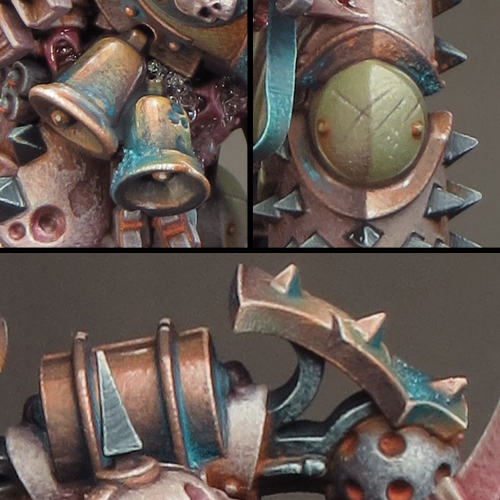
In the examples above you can see how I’ve added red and blue/grey nuances to my flesh tones. Adding nuances to flesh tones can enhance the illusion of life in them.


I’ve added nuances of purple and green to the Tidecaster’s clothing while there is a little blue on the gold armour. The Scourge’s armour and equipment have nuances of orange and blue.

Metallics.


Always consider metallics in the context of your overall scheme. The characteristics of Hue, Saturation, Tone and Temperature apply to metallics as much as to any other colours.

Neutrals.


Strictly speaking, in the context of colour schemes, neutral means “lacking or being without colour” or, in other words, unsaturated with colour. But the characteristics of Hue, Saturation, Tone and Temperature can still be applied to neutral colours. Therefore a better description would be something like “a hue that appears to be without colour.”

The neutral colours are black, white and grey. However, there are quite literally many shades (and hues) of grey, and even black and white are more complex than they may at first seem. In reality the term neutral can include a wide range of desaturated colours such as beige, ivory and taupe.


The tone of a neutral colour is the easiest characteristic to see as it applies to how light or dark a neutral colour is. On the other hand, hue and temperature are sometimes quite hard to tell apart because they can be very subtle.

Broadly speaking the more saturated colours are the less neutral they become. However, as is always the case, context is everything and a colour that acts as a neutral within one scheme may not do so in another.

When choosing neutrals for a colour palette make sure that their characteristics of Hue, Saturation, Tone and Temperature relate to your overall colour scheme in exactly the way you want them to. Used successfully neutrals are a great foil for other colours and colour contrasts.


The neutral colours on Gutrot Spume provide a backdrop to the saturated complementary colours.


The black on my Farseer has a cool desaturated blue/green hue that sets off the more saturated colours. The light grey outer robe adds a strong tonal contrast to the scheme without adding to the hues. However, I’ve used a subtle combination of warm and cool grays on the robe to give it more interest than one type of grey alone.

Build your knowledge.


Over time you’ll discover colours that become your favorite ‘go to’ options and that’s no bad thing. Becoming familiar with a colour and understanding it’s characteristics will enable you to use it to good effect.

However, it’s very easy to always use the same familiar colours and get stuck in a creative rut! I think it’s important to experiment and try out new colours in your palettes. Use them alongside your trusted favorites and gradually expand you range of options.

Coming next …


In the final part of this trilogy, I will look at how and why I picked the colour scheme for my Kastelan Robot.


Sunday, 7 October 2018

Sloppity Bilepiper Part 1

After all the upset and upheaval that happened over the summer it feels very good to be painting minis again! I’ve not been able to establish a regular routine for my painting as yet but that’s to be expected. With Mark at home recovering (and not yet fully able to enjoy his retirement) life is still a bit topsy-turvy for us both.

Bearing this in mind I decided to start a ‘fun’ project that would not require too much concentration and time. Horticulus Slimux and Mulch most certainly will and I’ll need to be fully back up-to-speed before I return to them. As it happens I already had a Sloppity Bilepiper assembled and base coated because I’d intended to paint him before the Isharan Tidecaster grabbed my attention. The Sloppity Bilepiper is the perfect mini for my current needs.


As well as being a fun miniature it hads the advantage of providing me with some familiar Nurgley subject matter. That meant that I could just dive right in and get painting. I’ve used the same techniques on the Bilepiper’s flesh tones as I used on all my other Plaguebearers. The only real difference is in the colour palette I’ve used. Instead of featuring green as the dominant colour I’ve experimented with a yellow flesh tone. Yellow can be used as a happy cheerful colour and it somehow seemed appropriate for a creature infected with the comedic fever of the Chortling Murrain!


In practice the colours used vary little from the combination of red/pink, blue and yellow over a Rakarth Flesh base that I’ve used before for my ‘human’ flesh tones (see below). The difference is in the proportions of those colours. I’ve built up a series of glazes going from yellow (Games Workshop Iyanden Darksun) through red (Scale Colour Antares Red) to a dark brown (Scale Colour Black Leather). This gave me my global shadows and colours. I then built up the highlights over the glazes using a combination of Iyanden Darksun and Flayed One Flesh (Games Workshop). In addition to the highlights this stage is where I build up the textures.


With the bulk of the highlights and shading done I then went back to fine tune everything with further glazes and highlighting. At this point I’ve use a little of the red from the Scale Colour Inktense range to increase the saturation in some of the shadows and mid-tones.

Fingers crossed this project will help ease me back into a more regular painting routine and serve as a stepping stone to my bigger projects.

Wednesday, 15 November 2017

Project P30 - Death Guard Chaos Space Marine Part 3

Previously my colour palettes for Nurgle themed minis have been built around a strong red/green contrast using saturated colours. While I may use this approach for some elements of my new Predator, overall I want to work with a more desaturated palette. It’s my gut instinct that, on a larger model like the Predator, a desaturated palette will be more effective. I suspect a strong saturated palette, like the one I used on Gutrot Spume, would give the Predator more of a ‘cartoony’ look than I want.


Although I didn’t set out to do this, my Death Guard uses a similar palette to the one used on my Tomb King. This is mostly because of the global highlight and shade colours I’ve used. The use of global highlight and shade colours ties the colour scheme together and helps to give the different coloured elements the feel of being in the same environment. It works equally well for both saturated and desaturated palettes.


My global shade colour is Black Leather from ScaleColour. As I said in my last posting, this is a desaturated purplish brown that mixes well with most other colours to create shade tones. My global highlight colour is Mojave White also from Scale colour. I often use Ivory for a global highlight and, in contrast to this, Mojave White is a slightly cooler and greyer looking colour that will help with the overall ‘dirty look’ I want to give my Death Guard. These global colours give me an interesting contrast between warm shadows and cooler highlights.


The pictures used below to illustrate my colour palette are far more close-up than I would normally show. I think this may be of interest in itself as you can see every brush mark and blemish I've made to create my textures!

The Colour Palette


Bone coloured armour 


Base: Rakarth Flesh (GW)

Shade: Black Leather (SC)

Highlight: Mojave White (SC)

The bone coloured armour is painted almost entirely with very fine stippling to give an overall texture. I started with a mid-tone base then added the shadows followed by highlights. I then went back and forth between the tones to adjust the overall balance. The final step was to paint the scratches and chips.


Green Armour 


Base: Death Guard Green (GW)

Shade: Black Leather (SC)

Highlight: Mojave White (SC)

The green armour was painted in much the same way as the bone coloured armour. I decided to try the new GW paint Death Guard Green and I’m very pleased I did. This is an extremely flexible colour sitting midway between light/dark and warm/cool. As a result it could form the basis of almost any green colour scheme and I’ll be experimenting further with Death Guard Green in the future.


Copper 


Base/Shade: Black Leather (SC)

Midtone: Ratskin Flesh (GW)

Highlight: Mojave White (SC)

The copper uses a palette of colours I developed earlier that includes Ratskin Flesh to bring a warm, almost pink, tone to it.


Verdigris


Sotek Green (GW), Baharroth Blue (GW), Black Leather (SC) & Ratskin Flesh (GW)

I was just going to have a little bit of verdigris on this mini but I decided to try a bluer tone than I’ve used before. The use of blue in the overall colour scheme has turned out to be crucial! The blue provides a saturated colour that harmonizes with the greens and contrasts with the browns and oranges. I think the blue makes the whole scheme come together and pop!
I’ve combined several blue tones for the verdigris by mixing Sotek Green with other colours from my palette. The addition of Black Leather creates a purple/blue tone while Ratskin Flesh creates a green/blue tone.


Flesh/tubes 


Base: Rakarth Flesh (GW)

Shade: Mayhem Red (SC)

Highlight: Mojave White (SC)

The fleshy parts of the mini are only a small part of the whole but the red and pink tones provide a nice touch of saturation in contrast to the armour and colour contrast with the blue and green.


Green Iron 


Base: Dark Sea Blue (V)

Highlight: Mojave White (SC)

The green iron areas were originally going to be a dark grey/black. But the subtle introduction of a green tone, through the use of Dark Sea Blue, brings more colour into the palette without adding too much extra colour contrast.


Black Iron 


Base: Dark Sea Blue/ Black Leather mix

Highlight: Mojave White

The combination of Dark Sea Blue and Black Leather is a very useful one. Mixed together these colours give a very dark neutral tone that, when mixed with Mojave White, creates an interesting range of greys. It’s possible to play with warm & cool tonal variations by varying the proportions of the colours used in the mix.


Rust 


Kalahari Orange (SC)
Windsor & Newton Designers Gouache – Orange Lake Deep/Olive Green mix

I decided to try something different with some of my rust effects this time. The use of Designers Gouache means that the paint, much like pigment powders, can be applied, left to dry and then adjusted with a clean damp brush. This has enabled me to achieve a greater degree of control and subtlety with my rust than I’ve done before. I can see that Designers Gouache, a relic from my schooldays, may well become a staple in my miniature painting from now on, and I’m looking forward to further experimentation with it!


Friday, 23 June 2017

Painting the Abyssal Warlord - resolving the overall colour palette


I’ve spent some of my recent hobby time finishing and refining the areas of the Abyssal Warlord that I’ve painted so far. For the most part that’s involved picking out details like the rivets and chains and working some painted texture into the skull and loincloth. I’ve also painted the back of the legs prior to attaching the cloak.


Although the cloak covers up most of the back it is possible to see between it and the warlord, so those areas need some attention and I’d decided it would be easiest to treat them as sub-assemblies. This also gave me the chance to paint the inside of the cloak.

Once this was done it was time to take a deep breath and glue the cloak onto the body. I’ve used a rapid epoxy glue for this as it gave me a strong bond between slightly ‘gappy’ parts. Making sure that I’m fixing bare metal to bare metal, I like to apply glue to each surface and let it become tacky before bringing the parts together. It also helps to lightly score the metal surfaces with a craft knife as this provides a better grip for the glue. Once the glue has set there is just a little gap filling and fur sculpting using green stuff to finish the job.


With the cloak now in place I’ve been able to resolve the overall colour palette. The fabric parts of the cloak are painted in a dark turquoise, Despair Green from Scalecolour’s Fantasy Games range, to match the loincloth. More importantly I’ve used the same colour as the blue/green tint in my blacks. This turquoise is the most saturated colour in my palette and provides a contrast to both the steel and gold tones in the armour. It also helps to bring something of an under-sea or ‘abyssal’ atmosphere to the model.

Despair Green is an interesting colour to work with. I’d normally choose that old favourite Dark Sea Blue to bring a blue/green tint to my blacks but I decided to experiment with a more saturated colour. As it turns out Despair Green is a very saturated and highly pigmented colour!


This means a little can go a very long way and it will easily overpower other colours when mixed with them. A good example of this is on the loincloth where I mixed Dryad Bark and Despair Green for the shadows. The dark brown desaturates and darkens the green but the result is still very much a shade of green. I think Despair Green will prove be a useful colour and I’m looking forward to experimenting with it further.

Overall I’ve gone for a palette of relatively cool colours on the Warlord. It’s worth noting that to contrast with this I’ve used a warm base colour (Dryad Bark). It’s role is quite subliminal in the finished effect, as it features mostly in the shadows, but it helps to unify the other colours.

The gold areas of the armour provide a bold colour contrast with the other parts of the model. I decided on gold quite early in the project but it was clear that I would have to experiment with the colour. A ‘traditional’ warm gold would not work at all on this project. Furthermore, a warm gold would be out of place in the palette I’m using and it would also feel out of place for the atmosphere I’m trying to create. What I needed was a cold sinister looking gold!

As it happens the colour mix for this type of gold is very simple, deceptively so! It’s possible to create a very effective NMM cold gold using just three colours: black, yellow and ivory. I’ve also included a little Dryad Bark in my mix to tie the gold into the overall scheme.


The yellow I’ve chosen to use is Sahara Yellow from Scalecolour. This is a relatively desaturated yellow ochre with the slightest hint of green to it. That greenish tone is the thing that gives the gold it’s cold and sinister quality.

Strong contrasts are vital to an effective NMM effect and the gold incorporates tones from pure black to pure ivory. The tricky part is getting the saturation right. Both the black and ivory will serve to desaturate the yellow and this is exactly what often happens. It’s important to keep the extreme ends of the tonal range to a minimum and use the least amount of black and ivory you can get away with.

It’s in the mid tone areas that the saturation is created. I find it’s almost always necessary to first establish the extreme ends of the tonal range and then go back and forth to balance out the mid tones and saturation. Considering that just three colours are involved in the mix it’s a surprisingly tricky balance to achieve. The Abyssal Warlord is progressing nicely and the addition of his sword and shield will see the model completed. I’m working out my ideas for a base but before I make that there is the matter of painting a freehand design onto his shield. That’s something I’ve not done for a long time and I’m very much looking forward to it!

Thursday, 1 December 2016

Ironjaws Megaboss part 7

Once I’d finished his black armour the main part of the Megaboss was looking more complete. There are quite a few details to attend to but the outstanding major elements are the axe and the dracoth skull on his shoulder.


I decided to turn my attention to the skull. As the single most striking element of the mini, it’s the thing that first drew my attention to it. And, as much as I’ve enjoyed painting the armour, the skull has always looked like it was going to be the fun part of the job!

I haven’t been disappointed. Painting the skull was a thoroughly enjoyable experience and I’m very pleased with the result. A major part of the painting process went into resolving the textures. I wanted the skull to have a slightly rough, gnarly looking texture. In addition to the bone texture, I wanted to add chips and scratches. A lot of fun was had resolving these textures and figuring out the balance between then.


My colour palette for the skull is one I often use for bone.

Base colour:

Games Workshop - Rakarth Flesh

Shade:

The Army Painter Quickshade - Strong Tone & Soft Tone
Games Workshop – Rhinox Hide

Mid-tones:

The Army Painter Quickshade - Soft Tone

Highlights:

Games Workshop - Rakarth Flesh
Scalecolour Fantasy & Games – Purity White

The shading is built up with a series of glazes using the The Army Painter Quickshades. Rhinox Hide adds a bit more depth and opacity to the colour of the horns. This combination gives me a good range of yellow/brown and red/brown shades to play with.

I built the highlights on top of the mid-tones by gradually adding white to the Rakarth Flesh. The final highlights are pure white. Once the highlights were dry, I glazed a little dilute soft tone quickshade here and there to soften the effect and tie everything together.