Showing posts with label LeBeN Studio. Show all posts

Friday, 22 April 2016

Salute 2016

Last weekend saw my fourth trip up to London for Salute and to be honest it rather crept up on me! The main focus of my efforts for the last year and a half has been ‘Project Nurgle’ for the Golden Demons. I was a bit caught out by the announcement that the Golden Demons would fall in May this year. I had anticipated that the Demons would be held in the Autumn and had to adjust my plans.

I’d intended to paint a fantasy character miniature for Salute but doing that would have put a lot of pressure on the, now shorter, ‘Project Nurgle’ time scale. So I shifted all my attention to getting ready for the ‘Demons’.

I decided some time ago that I would hold Gutrot Spume back for a ‘grand debut’, alongside the Plaguebearers, at the Demons. That left me with a choice between Commodore Borgossa and Abalam for Salute.

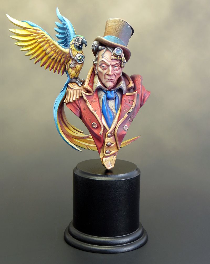
There was much dithering on my part as only one entry is allowed per category but, with a little help from my painting friends, I decided it had to be Borgossa.

I entered Borgossa into the largescale category, which includes busts, and then spent the rest of the day browsing the stands and chatting. The chance to meet up with other painters is always one of the chief highlights of these events. As is usual for Salute the day went astonishingly quickly and, before I’d had time to get around all the stands, the competition results were announced!


Borgossa took the second place in his category! That rewarded my efforts over the last year to gain experience of painting larger scale minis and busts.

One of the judges was Peter Bell and he was kind enough to give me some useful feedback on Borgossa, which I hope I can incorporate into subsequent projects. In short, the overall paintjob on Borgossa was let down by the maroon jacket which didn’t match up to the texture work on the other areas.

It’s a bit of a relief that it was the jacket. I felt that there was something lacking but I’d not been able to pin down what the problem was!

Hindsight is all well and good but I need to sharpen my instincts, and hopefully, I will do so as I gain more experience painting larger scale pieces.

Wednesday, 10 February 2016

Looking back... and forward.

About his time last year I’d reconciled myself to a less productive 2015, at least in terms of the number of minis I’d get finished. I decided to concentrate on quality and enjoy myself obsessing over Gutrot Spume. Gutrot was painted with an eye to entering the Golden Demon competition, whenever that happened; and I’d resolved to quite literally push the boat out for him.

As it turned out 2015 was a far more productive year than I had predicted! After a slow start, Gutrot came together and was finally finished in September. I’d already taken time out to paint Mole, but once Gutrot was done, I switched up in scale to paint Commodore Borgossa, and most recently Abalam Prince of Hell. I also started painting a unit of Plague bearers as part of the preparations for my Weekend Workshop in Cardiff.


And now we finally have a date for the next Warhammer Fest and the 2016 Golden Demons! Sunday, May 15, at the Rico Arena in Coventry. It’s been a long wait!

With Abalam finished, all bar his plinth, I am turning my attention to the next project. I was going to paint another mini for Salute (April 16) and then return to the unit of Plague bearers, but the Golden Demon announcement has changed everything. The Plague bearers have jumped right back up to the top of my painting priorities. Remembering 2014’s last minute Haemonculus, I want to try and complete them without putting too much pressure on myself.

Project Nurgle is all GO….again.

Wednesday, 20 January 2016

Painting Commodore Borgossa – part 3

As promised back in December here is a more detailed description of how I finished painting Commodore Borgossa. You can see the finished bust on Putty & Paint HERE.

 The Face

I chose a desaturated mid-grey/green as a base colour for Borgossa’s face. This gave me a muted foundation that helped to prevent the subsequent colours becoming too saturated, which might have happened with a lighter base colour. The shading and highlights were built up with translucent layering and glazes. Much of the apparent colour on the face is the combination of several layers of translucent colour rather than something that was mixed on a palette. 


The eyes 

I decided to give Borgossa a ‘dead eye’ by extending the scar sculpted across this mouth up across the rest of his face. This may not be the most original thing to have done, but it seemed to suit both the character and the sculpt. I used pictures of the actor Kirk Douglas from the movie ‘The Vikings’ as reference for the eyes, and this was a great help in getting some life into them. I also applied a spot of gloss to the eyes once they were painted. I’m always wary of going too glossy on a finished model; but, in this case, the varnish gives the eyes a sparkle that works with the painted reflections to great effect! 


Clothing 

Painting the clothing was a fairly straightforward task but I had to remember to keep the saturation down at all times. I’m constantly surprised by just how far you can push the desaturation of your colours without compromising the colourfulness of your work. One example of this is the ‘gold’ decoration on Borgossa’s waistcoat. The effect is achieved with the use of just three colours (grey, yellow ochre and ivory) but grey is the most used colour by a wide margin! 


The blue/grey and maroon colours used in the clothing were picked to complement and contrast with the green flesh tone. They bring some extra interest to the piece but don’t detract from the face. For the textures I decided to paint a silky shine on the waistcoat and give the coat a slightly courser texture. In the end, I used a stipple texture on the coat as this seemed to best complement the slight stippled texture in the sculpt. 

Metallics 

One of the targets I’ve set myself for 2016 is to experiment with true metallics. The buckle and buttons on Borgossa’s costume were a good opportunity to do this. By painting them in true metallic they contrast with the materials around them and help to sell the overall illusion of reality. Although I like to paint non-metallic metals, I’m currently of the opinion that true metallics work better for larger scale projects. 

Fishtail 

The fishtail decoration in Borgossa’s hat proved to be the most difficult part of the project for me to get right. In my first efforts I attempted to use a metallic foundation and glaze over that with inks. The effect was interesting but, no matter what I tried, I couldn’t get it to look like it belonged with the rest of the piece. In the end I used the same blue and maroon colours as Borgossa’s costume and these proved to be successful! The fishtail now feels like a part of the whole and is colourful without being distracting. 


Base 

I usually prefer to base my models on plain black resin plinths but I wanted to try something a little different with Borgossa. In this case I decided to use a tall wooden plinth and to burn and stain it to resemble an old ship’s timber. I’ve seen tutorials where bases are burnt using a cigarette lighter but this proved to be too subtle. The wood was quite hard and burnt very slowly. Taking my plinth (and my life) in my hands, I burnt it in the flame on my gas cooker hob. This proved to be more successful and gave a more dramatic effect. 


Obviously working with fire is hazardous and all due caution was taken with regards to ventilation and avoiding injury. In addition I found it very useful to have a large basin of cold water close to hand to extinguish the flames and cool the wood down - it became very hot! 

Painting the hat.

The leather texture on Borgossa’s hat was painted with a combination of several basic techniques.

Step 1. Base coat using GW Baneblade Brown. 


Step 2. Initial texture. 

To begin creating the texture, I daubed & stippled the hat with a darker brown using a combination of brushes and sponges. The process was fairly random, although I concentrated the texture effects on the areas I wanted to be darker. I then went over this with a stippled highlight of GW Baneblade Brown mixed with Valleyo ivory. The highlights begin the process of creating definition for the shape of the hat. 

In addition to brushes, I used a combination of both natural & synthetic sponges to create a more varied texture. Try to avoid only using one surface of the sponge as this runs the risk of inadvertently creating a repeating texture. 

Step 3. Wash. 

The first stages are fairly rough and random but that will help to create an interesting texture. The following stages will tie everything together and refine the texture. The first step towards this is an overall wash of ink. I used scale colour chestnut ink for this and it totally transformed the overall effect for the better. 


I found it necessary to dilute the ink as inks can give a very intense layer of colour and it’s easy to over-do the effect. 

Step 4. Refining the texture and highlights. 

Returning to my base and highlight colours, I began to refine the details and texture with further stippling and glazes. It's all about brushes this time! It's quite good to use a couple of different sizes to help vary the marks. As well as Windsor & Newton series 7 I like to use Windsor & Newton Scepter Gold II brushes for a lot of the stippling. They are a sable/synthetic mix and a bit stiffer (& cheaper) than pure sable, which works well for stippling. 


This stage involves a bit of going back and forth between the shades used but it’s worth the effort. It is also during this stage that I picked out and enhanced the sculpted textures and damage on the hat. The trick here is to enhance and add to the sculpted detail in a complementary way. The final step is to add a few carefully applied glazes to enrich the colour and tie all the details together. 

Friday, 11 December 2015

Painting Commodore Borgossa – part 2

Borgossa is finished! 


 I’d been working at a fairly leisurely pace but, in spite of that, the bust didn’t seem to take all that long to paint. I had a similar experience with Uncle John - so it seems to me that larger scales are quicker to paint than smaller ones! 

I thoroughly enjoyed myself on this project. The change of subject and scale provided me with a stimulating challenge, I’ll certainly be painting more busts in the (very) near future. I’m delighted with the result I’ve achieved, but I feel that there is still so much more that I can learn; and I’m itching to have another go painting in a larger scale. Project Nurgle hasn’t been forgotten, but there’s room for another project over Christmas and the New Year break before I go back to it. 

 
Unfortunately my time for writing blog posts is very restricted at the moment. So rather than delay, I’ve decided to post the pics of Borgossa now and write a more detailed piece when I’ve more time. When I do get around to it I’ll be focussing on texture and in particular the leather hat. 


Tuesday, 24 November 2015

Painting Commodore Borgossa - part 1

As I said earlier, as much as I’m enjoying ‘Project Nurgle’ I feel that it’s time to take a break and work on something different for a while. That something is Commodore Borgossa from LeBeN miniatures. I‘d planned to start painting this bust after Euro Millitaire in 2014; but a trip to Warhammer Fest, and the release of Gutrot Spume, took my painting in another direction. 


There’s a wonderful selection of miniatures depicting orc and goblin pirates available from a variety of companies. In my opinion Borgossa is up there with the best of them! Less brutal than the orc sculpts and less comical than most goblins, he comes across as a distinct individual. The sculpt depicts, I think, both experience and cunning intelligence. This is not someone you would wish to risk crossing either swords or wits with. 


Commodore Borgossa is only my second proper attempt at painting a bust and as such posed a stimulating set of challenges. My first bust was Uncle John from Infamy Miniatures and, although I’m very happy with how he turned out, there were definitely some issues around how I chose to paint him. At the time I was experimenting with Valleyo paints and had great difficulty controlling their level of gloss. This was particularly noticeable on a larger piece like a bust. My colour palette also proved to be problematic. I painted Uncle John in a bright palate of contrasting colours giving the piece a strong visual impact. Unfortunately I think this, combined with a clean and ‘cartoony’ style of painting, resulted in the wrong sort of impact. Seeing my version of Uncle John displayed next to other painted busts, at both Euro Militaire and Salute, I was stuck by how out of place he looked. I don’t believe in painting something a certain way just because it’s in vogue and everyone else is doing it but, to put it bluntly, my Uncle John looked like a toy next to the other busts! Clearly there were lessons to be learned from the experience. 

The issue around controlling the finished gloss was my own fault and not one of bad or faulty paint. It’s important that a painter understands the inherent qualities of the materials he is using and employs them appropriately. This is something I’ve tried to pay especial attention to over the past year. With the addition of Scalecolour paints and inks to my toolbox, I feel I now have a good range of finishes available to me. More importantly, I’m mindful of how I use those finishes in my projects. 

To avoid an overly bright colour palette, I need to pay close attention to saturation and contrast. As someone whose instincts run towards a more colourful approach, I’m constantly surprised by just how far you can push the desaturation of your colours without compromising the colourfulness of your work. 

The quality of the cast on the Commodore Borgossa bust was near perfect, with no air bubbles and almost no sign of any mould lines. As a result the preparation time prior to painting was minimal, and that’s never going to be a bad thing in my book! The kit comes in four parts and I decided to begin painting before I assembled them. This allowed me greater access and ease of handling. 


For Commodore Borgossa I want to put my past experiences to good use. So I’ve decided to set myself the goal of achieving a more realistic and less 'cartoony' result than I’ve previously done in my painting. 

Friday, 19 September 2014

Finishing Uncle John

With the parrot painted it was time to assemble the separate elements and finish off the Uncle John bust. As often seems to be the case everything came together very quickly in the end! My biggest concern was with how well the parrot would fit but, after a couple of dodgy test fittings, it slipped into place almost perfectly. There was a very slight space under the feet but a little dilute PVA flowed into the crack and filled the gap. 

I’d prepared a couple of alternative plinths for Uncle John in advance. I thought the best option would be a rectangular plinth with a tapered top but, because the parrot’s tail comes down behind Uncle John’s shoulders, the angle of the taper just didn’t suit (or fit) the bust. In the end a simple flat topped round plinth was the best option. 


In just three hours time I'll be heading off to Folkestone for Euro Millitaire and I'm as ready as I can be. Finishing off a project is often a slightly odd experience. It's usually a matter of deciding to stop rather than actually completing every possible tweak and adjustment to the peak of perfection. It's important to know when to stop and move on to the next project. 

It’s now been a year since I won the Slayer Sword and in that time I’ve completed four projects. Chee-Chee, Jason and the Golden Fleece, Squarg and Uncle John. With Chee-Chee and Jason I consolidated the developments I’d made while working on the Dark Eldar diorama. With both the Uncle John and Squarg miniatures, I’ve expanded my range of painting techniques by working with transparency over a light background and by the application of texture. 

I’m now very much looking forward to taking what I’ve learnt and developing it further. For my next project I’m going to be painting Commodore Borgossa from LeBeN Studio. He may be a pirate but I can absolutely guarantee there will be no trace of a bloody parrot anywhere near this project!