

Although I didn’t set out to do this, my Death Guard uses a similar palette to the one used on my Tomb King. This is mostly because of the global highlight and shade colours I’ve used. The use of global highlight and shade colours ties the colour scheme together and helps to give the different coloured elements the feel of being in the same environment. It works equally well for both saturated and desaturated palettes.

My global shade colour is Black Leather from ScaleColour. As I said in my last posting, this is a desaturated purplish brown that mixes well with most other colours to create shade tones. My global highlight colour is Mojave White also from Scale colour. I often use Ivory for a global highlight and, in contrast to this, Mojave White is a slightly cooler and greyer looking colour that will help with the overall ‘dirty look’ I want to give my Death Guard. These global colours give me an interesting contrast between warm shadows and cooler highlights.
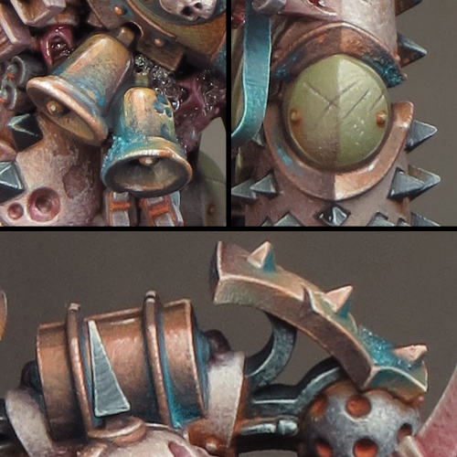
The pictures used below to illustrate my colour palette are far more close-up than I would normally show. I think this may be of interest in itself as you can see every brush mark and blemish I've made to create my textures!
The Colour Palette
Bone coloured armour

Base: Rakarth Flesh (GW)
Shade: Black Leather (SC)
Highlight: Mojave White (SC)
The bone coloured armour is painted almost entirely with very fine stippling to give an overall texture. I started with a mid-tone base then added the shadows followed by highlights. I then went back and forth between the tones to adjust the overall balance. The final step was to paint the scratches and chips.
Green Armour

Base: Death Guard Green (GW)
Shade: Black Leather (SC)
Highlight: Mojave White (SC)
The green armour was painted in much the same way as the bone coloured armour. I decided to try the new GW paint Death Guard Green and I’m very pleased I did. This is an extremely flexible colour sitting midway between light/dark and warm/cool. As a result it could form the basis of almost any green colour scheme and I’ll be experimenting further with Death Guard Green in the future.
Copper
Base/Shade: Black Leather (SC)
Midtone: Ratskin Flesh (GW)
Highlight: Mojave White (SC)
The copper uses a palette of colours I developed earlier that includes Ratskin Flesh to bring a warm, almost pink, tone to it.
Verdigris
Sotek Green (GW), Baharroth Blue (GW), Black Leather (SC) & Ratskin Flesh (GW)
I was just going to have a little bit of verdigris on this mini but I decided to try a bluer tone than I’ve used before. The use of blue in the overall colour scheme has turned out to be crucial! The blue provides a saturated colour that harmonizes with the greens and contrasts with the browns and oranges. I think the blue makes the whole scheme come together and pop!
I’ve combined several blue tones for the verdigris by mixing Sotek Green with other colours from my palette. The addition of Black Leather creates a purple/blue tone while Ratskin Flesh creates a green/blue tone.
Flesh/tubes

Base: Rakarth Flesh (GW)
Shade: Mayhem Red (SC)
Highlight: Mojave White (SC)
The fleshy parts of the mini are only a small part of the whole but the red and pink tones provide a nice touch of saturation in contrast to the armour and colour contrast with the blue and green.
Green Iron

Base: Dark Sea Blue (V)
Highlight: Mojave White (SC)
The green iron areas were originally going to be a dark grey/black. But the subtle introduction of a green tone, through the use of Dark Sea Blue, brings more colour into the palette without adding too much extra colour contrast.
Black Iron

Base: Dark Sea Blue/ Black Leather mix
Highlight: Mojave White
The combination of Dark Sea Blue and Black Leather is a very useful one. Mixed together these colours give a very dark neutral tone that, when mixed with Mojave White, creates an interesting range of greys. It’s possible to play with warm & cool tonal variations by varying the proportions of the colours used in the mix.
Rust

Kalahari Orange (SC)
Windsor & Newton Designers Gouache – Orange Lake Deep/Olive Green mix
I decided to try something different with some of my rust effects this time. The use of Designers Gouache means that the paint, much like pigment powders, can be applied, left to dry and then adjusted with a clean damp brush. This has enabled me to achieve a greater degree of control and subtlety with my rust than I’ve done before. I can see that Designers Gouache, a relic from my schooldays, may well become a staple in my miniature painting from now on, and I’m looking forward to further experimentation with it!
Amazing work as always! This guy could almost be life size with the amount of detail in there. Thank you not only for sharing but also explaining and helping the community with your knowledge. Massively appreciated!
ReplyDeleteCareful with the gouache. It's not easy to seal and reactivates easily making it a bear to work around or with if you have any other work left to do in those areas o_O I've had some fails with it recently...
ReplyDeleteGood point! I'm using the gouache as the very final stage and the fact that it reactivates so easily is what makes it great for subtle weathering. But, as you say,it can be very tricky to work around and the potential for a fail is pretty high. It's a high risk/high reward paint to use on a mini!
DeleteHey! I made that model!
ReplyDeleteGreat stuff, David. As usual, the paintjob is flawless.
I especially like the texturing work, and the subtlety of your effects.
Will you enter him on this Sunday's competition?
I would love to see him in the flesh if possible (not through a cabinet). I'll be at the Studio area most of the day.
Keep up the good work!
Cheers,
Maxime / morbäck
You could possibly win the sword with this David...
ReplyDeleteI could indeed ;)
DeleteBeautiful pastel hues that work well with the Death Guard. Excellent work sir!
ReplyDeleteThis is going to be a dumb question: when you have listed a base colour and a highlight colour, are you mixing them to gradually work up to the pure highlight? Or with the stipple technique are you using the pure highlight colour and just stippling it on more and more intensely as you hit the highest parts of the sculpt?
ReplyDeleteNot a dumb question at all! The answer is not all that straightforward as there is a bit of both going on.
DeleteA lot of the work is done by building up the density of the stippling. However do mix the base and highlight colours to create intermediate shades as there is a lot of going back and forth and stippling with these shades to fine tune the effect.
Well done David! I love him. The tones and values you've established on the model are outstanding to say the least. Congrats on the win!
ReplyDeleteBy the way, are those micro beads in the fleshy, decayed elements? What's your process for creating that effect? I'd love to try it out.
All the best,
Jake
This is amazing work. I know I’m late to the party, but this is an inspiration for me for my DG. I love how you got the DG green to look almost like a dirty pastel.
ReplyDeleteI’ve been trying my hand at stippling with a 0; I get the feeling this work is a bit finer than that. For some reason I’m going right down the rabbit hole and giving NMM a go too. 🤦🏾♂️
Will you be returning to Papa Nurgle or the Death Guard, I don't seem to recall a recent post. Life's hard sometimes...
ReplyDelete