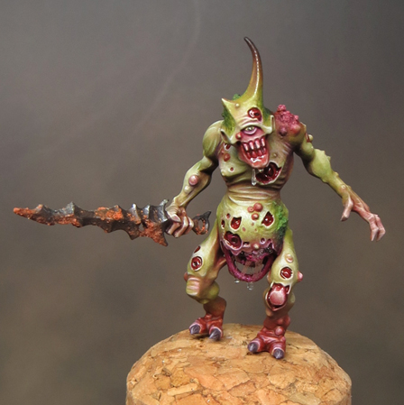
I’ve also made a start on the champion. I’m trying a darker base colour for this mini, compared to the others, and I think it cuts down a little on the shading work. The only drawback is that I misjudged the colour. I think I would have had an easier time if the green had been slightly yellower and more desaturated. Having said that, once I got my head around the problem, things went a lot more smoothly. It’s early days but, so far, so good.
Tuesday, 23 February 2016
Plaguebearers part 5
I’ve managed to get a fair amount of painting time under my belt this last week and, as a result, I’ve finished off the third Plaguebearer. It feels good to see another completed mini so soon after re-starting the project, but I think I’ll have to take another look at the Plaguebearers once they are all painted. I’ve a feeling that they will need some final retouching and finesse to pull them together as a finished unit.
I’ve also made a start on the champion. I’m trying a darker base colour for this mini, compared to the others, and I think it cuts down a little on the shading work. The only drawback is that I misjudged the colour. I think I would have had an easier time if the green had been slightly yellower and more desaturated. Having said that, once I got my head around the problem, things went a lot more smoothly. It’s early days but, so far, so good.
Tuesday, 16 February 2016
Project Nurgle - Plague bearers part 4
Getting to grips with Project Nurgle!
With the Golden Demon painting competition on the horizon I’ve dusted off my plans to paint a unit of plague bearers. Although the project has been on hold, I’ve been giving it some thought; in particular’ the matter of a champion to lead the unit.
At first I planned to make the champion stand out through giving him a predominantly red colour scheme, but as time has passed, I’ve decided that I need to do a bit more. To that effect I’ve customised a champion for the unit. This has enabled me to make him more physically imposing than the other plague bearers in the unit.
Creating a custom champion turned out to be an enjoyable little project, but I was surprised by just how many minis went into this one! The champion includes parts from; Plague bearers, Gutrot Spume, Putrid Blightkings and a mutant from the Chaos Warshrine. In total eight miniatures blended together with plastic glue, green stuff and baking soda!
Once I gave the mini a coat of primer it became easier to see it as a whole.
At the same time as I’ve been rebooting ‘Project Nurgle’ I’ve been trying out a new miniature holder. It’s the Crazy Grip from CrazyWenky, which I first saw reviewed on Massive Voodoo.
My first impression is extremely positive! Previously I've been using a pin vice but with a mini in place it's top heavy and badly balanced. It can also be uncomfortable to hold for long painting sessions. Straight away the CrazyGrip had a really good feeling of weight and balance to it! For ease of use and comfort alone the GrazyGrip will make an indispensible addition to my painting kit.
I also appreciate its stability (even without the stand provided) when I put it down on my desk during painting. When I’m not handling a mini for painting I tend to stick it into a cork. Now I can keep my minis on their corks all the time. It’s simply a matter of popping the corked minis in and out of the handle (using the stand) as needed.
With the Golden Demon painting competition on the horizon I’ve dusted off my plans to paint a unit of plague bearers. Although the project has been on hold, I’ve been giving it some thought; in particular’ the matter of a champion to lead the unit.
At first I planned to make the champion stand out through giving him a predominantly red colour scheme, but as time has passed, I’ve decided that I need to do a bit more. To that effect I’ve customised a champion for the unit. This has enabled me to make him more physically imposing than the other plague bearers in the unit.
Creating a custom champion turned out to be an enjoyable little project, but I was surprised by just how many minis went into this one! The champion includes parts from; Plague bearers, Gutrot Spume, Putrid Blightkings and a mutant from the Chaos Warshrine. In total eight miniatures blended together with plastic glue, green stuff and baking soda!
Once I gave the mini a coat of primer it became easier to see it as a whole.
At the same time as I’ve been rebooting ‘Project Nurgle’ I’ve been trying out a new miniature holder. It’s the Crazy Grip from CrazyWenky, which I first saw reviewed on Massive Voodoo.
My first impression is extremely positive! Previously I've been using a pin vice but with a mini in place it's top heavy and badly balanced. It can also be uncomfortable to hold for long painting sessions. Straight away the CrazyGrip had a really good feeling of weight and balance to it! For ease of use and comfort alone the GrazyGrip will make an indispensible addition to my painting kit.
I also appreciate its stability (even without the stand provided) when I put it down on my desk during painting. When I’m not handling a mini for painting I tend to stick it into a cork. Now I can keep my minis on their corks all the time. It’s simply a matter of popping the corked minis in and out of the handle (using the stand) as needed.
Wednesday, 10 February 2016
Looking back... and forward.
About his time last year I’d reconciled myself to a less productive 2015, at least in terms of the number of minis I’d get finished. I decided to concentrate on quality and enjoy myself obsessing over Gutrot Spume. Gutrot was painted with an eye to entering the Golden Demon competition, whenever that happened; and I’d resolved to quite literally push the boat out for him.
As it turned out 2015 was a far more productive year than I had predicted! After a slow start, Gutrot came together and was finally finished in September. I’d already taken time out to paint Mole, but once Gutrot was done, I switched up in scale to paint Commodore Borgossa, and most recently Abalam Prince of Hell. I also started painting a unit of Plague bearers as part of the preparations for my Weekend Workshop in Cardiff.
And now we finally have a date for the next Warhammer Fest and the 2016 Golden Demons! Sunday, May 15, at the Rico Arena in Coventry. It’s been a long wait!
With Abalam finished, all bar his plinth, I am turning my attention to the next project. I was going to paint another mini for Salute (April 16) and then return to the unit of Plague bearers, but the Golden Demon announcement has changed everything. The Plague bearers have jumped right back up to the top of my painting priorities. Remembering 2014’s last minute Haemonculus, I want to try and complete them without putting too much pressure on myself.
Project Nurgle is all GO….again.
As it turned out 2015 was a far more productive year than I had predicted! After a slow start, Gutrot came together and was finally finished in September. I’d already taken time out to paint Mole, but once Gutrot was done, I switched up in scale to paint Commodore Borgossa, and most recently Abalam Prince of Hell. I also started painting a unit of Plague bearers as part of the preparations for my Weekend Workshop in Cardiff.
And now we finally have a date for the next Warhammer Fest and the 2016 Golden Demons! Sunday, May 15, at the Rico Arena in Coventry. It’s been a long wait!
With Abalam finished, all bar his plinth, I am turning my attention to the next project. I was going to paint another mini for Salute (April 16) and then return to the unit of Plague bearers, but the Golden Demon announcement has changed everything. The Plague bearers have jumped right back up to the top of my painting priorities. Remembering 2014’s last minute Haemonculus, I want to try and complete them without putting too much pressure on myself.
Project Nurgle is all GO….again.
Tuesday, 2 February 2016
Abalam Prince of Hell - Part 3
Shifting my attention away from Abalam’s head to concentrate on the overall paint job proved to be a good move! I’ve made a fair degree of progress and the overall colour palette has come together. Most importantly, I’ve managed to avoid losing momentum.
Sorting out the red/green balance was key to resolving the colour scheme. When I started painting Abalam, I hadn’t intended to use so much green; but as I’ve worked on the gold areas, the green swiftly became a key colour. With so much red used in the flesh tones and costume, the green introduces contrast and drama to the palette. Similarly the sash across Abalam’s chest is now painted in a light cool grey, rather than red, to add both colour and tonal contrast.
With the bulk of the painting done, I’ve finally glued Abalam’s head onto the bust so I can better work on the piece as a whole. There are lots of finishing touches to do, but the project feels like it’s moving onto the final stage!
Sorting out the red/green balance was key to resolving the colour scheme. When I started painting Abalam, I hadn’t intended to use so much green; but as I’ve worked on the gold areas, the green swiftly became a key colour. With so much red used in the flesh tones and costume, the green introduces contrast and drama to the palette. Similarly the sash across Abalam’s chest is now painted in a light cool grey, rather than red, to add both colour and tonal contrast.
With the bulk of the painting done, I’ve finally glued Abalam’s head onto the bust so I can better work on the piece as a whole. There are lots of finishing touches to do, but the project feels like it’s moving onto the final stage!
Wednesday, 20 January 2016
Painting Commodore Borgossa – part 3
As promised back in December here is a more detailed description of how I finished painting Commodore Borgossa. You can see the finished bust on Putty & Paint HERE.
The Face
I chose a desaturated mid-grey/green as a base colour for Borgossa’s face. This gave me a muted foundation that helped to prevent the subsequent colours becoming too saturated, which might have happened with a lighter base colour. The shading and highlights were built up with translucent layering and glazes. Much of the apparent colour on the face is the combination of several layers of translucent colour rather than something that was mixed on a palette.
The eyes
I decided to give Borgossa a ‘dead eye’ by extending the scar sculpted across this mouth up across the rest of his face. This may not be the most original thing to have done, but it seemed to suit both the character and the sculpt. I used pictures of the actor Kirk Douglas from the movie ‘The Vikings’ as reference for the eyes, and this was a great help in getting some life into them. I also applied a spot of gloss to the eyes once they were painted. I’m always wary of going too glossy on a finished model; but, in this case, the varnish gives the eyes a sparkle that works with the painted reflections to great effect!
Clothing
Painting the clothing was a fairly straightforward task but I had to remember to keep the saturation down at all times. I’m constantly surprised by just how far you can push the desaturation of your colours without compromising the colourfulness of your work. One example of this is the ‘gold’ decoration on Borgossa’s waistcoat. The effect is achieved with the use of just three colours (grey, yellow ochre and ivory) but grey is the most used colour by a wide margin!
The blue/grey and maroon colours used in the clothing were picked to complement and contrast with the green flesh tone. They bring some extra interest to the piece but don’t detract from the face. For the textures I decided to paint a silky shine on the waistcoat and give the coat a slightly courser texture. In the end, I used a stipple texture on the coat as this seemed to best complement the slight stippled texture in the sculpt.
Metallics
One of the targets I’ve set myself for 2016 is to experiment with true metallics. The buckle and buttons on Borgossa’s costume were a good opportunity to do this. By painting them in true metallic they contrast with the materials around them and help to sell the overall illusion of reality. Although I like to paint non-metallic metals, I’m currently of the opinion that true metallics work better for larger scale projects.
Fishtail
The fishtail decoration in Borgossa’s hat proved to be the most difficult part of the project for me to get right. In my first efforts I attempted to use a metallic foundation and glaze over that with inks. The effect was interesting but, no matter what I tried, I couldn’t get it to look like it belonged with the rest of the piece. In the end I used the same blue and maroon colours as Borgossa’s costume and these proved to be successful! The fishtail now feels like a part of the whole and is colourful without being distracting.
Base
I usually prefer to base my models on plain black resin plinths but I wanted to try something a little different with Borgossa. In this case I decided to use a tall wooden plinth and to burn and stain it to resemble an old ship’s timber. I’ve seen tutorials where bases are burnt using a cigarette lighter but this proved to be too subtle. The wood was quite hard and burnt very slowly. Taking my plinth (and my life) in my hands, I burnt it in the flame on my gas cooker hob. This proved to be more successful and gave a more dramatic effect.
Obviously working with fire is hazardous and all due caution was taken with regards to ventilation and avoiding injury. In addition I found it very useful to have a large basin of cold water close to hand to extinguish the flames and cool the wood down - it became very hot!
Painting the hat.
The leather texture on Borgossa’s hat was painted with a combination of several basic techniques.
Step 1. Base coat using GW Baneblade Brown.
Step 2. Initial texture.
To begin creating the texture, I daubed & stippled the hat with a darker brown using a combination of brushes and sponges. The process was fairly random, although I concentrated the texture effects on the areas I wanted to be darker. I then went over this with a stippled highlight of GW Baneblade Brown mixed with Valleyo ivory. The highlights begin the process of creating definition for the shape of the hat.
In addition to brushes, I used a combination of both natural & synthetic sponges to create a more varied texture. Try to avoid only using one surface of the sponge as this runs the risk of inadvertently creating a repeating texture.
Step 3. Wash.
The first stages are fairly rough and random but that will help to create an interesting texture. The following stages will tie everything together and refine the texture. The first step towards this is an overall wash of ink. I used scale colour chestnut ink for this and it totally transformed the overall effect for the better.
I found it necessary to dilute the ink as inks can give a very intense layer of colour and it’s easy to over-do the effect.
Step 4. Refining the texture and highlights.
Returning to my base and highlight colours, I began to refine the details and texture with further stippling and glazes. It's all about brushes this time! It's quite good to use a couple of different sizes to help vary the marks. As well as Windsor & Newton series 7 I like to use Windsor & Newton Scepter Gold II brushes for a lot of the stippling. They are a sable/synthetic mix and a bit stiffer (& cheaper) than pure sable, which works well for stippling.
This stage involves a bit of going back and forth between the shades used but it’s worth the effort. It is also during this stage that I picked out and enhanced the sculpted textures and damage on the hat. The trick here is to enhance and add to the sculpted detail in a complementary way. The final step is to add a few carefully applied glazes to enrich the colour and tie all the details together.
The Face
I chose a desaturated mid-grey/green as a base colour for Borgossa’s face. This gave me a muted foundation that helped to prevent the subsequent colours becoming too saturated, which might have happened with a lighter base colour. The shading and highlights were built up with translucent layering and glazes. Much of the apparent colour on the face is the combination of several layers of translucent colour rather than something that was mixed on a palette.
The eyes
I decided to give Borgossa a ‘dead eye’ by extending the scar sculpted across this mouth up across the rest of his face. This may not be the most original thing to have done, but it seemed to suit both the character and the sculpt. I used pictures of the actor Kirk Douglas from the movie ‘The Vikings’ as reference for the eyes, and this was a great help in getting some life into them. I also applied a spot of gloss to the eyes once they were painted. I’m always wary of going too glossy on a finished model; but, in this case, the varnish gives the eyes a sparkle that works with the painted reflections to great effect!
Clothing
Painting the clothing was a fairly straightforward task but I had to remember to keep the saturation down at all times. I’m constantly surprised by just how far you can push the desaturation of your colours without compromising the colourfulness of your work. One example of this is the ‘gold’ decoration on Borgossa’s waistcoat. The effect is achieved with the use of just three colours (grey, yellow ochre and ivory) but grey is the most used colour by a wide margin!
The blue/grey and maroon colours used in the clothing were picked to complement and contrast with the green flesh tone. They bring some extra interest to the piece but don’t detract from the face. For the textures I decided to paint a silky shine on the waistcoat and give the coat a slightly courser texture. In the end, I used a stipple texture on the coat as this seemed to best complement the slight stippled texture in the sculpt.
Metallics
One of the targets I’ve set myself for 2016 is to experiment with true metallics. The buckle and buttons on Borgossa’s costume were a good opportunity to do this. By painting them in true metallic they contrast with the materials around them and help to sell the overall illusion of reality. Although I like to paint non-metallic metals, I’m currently of the opinion that true metallics work better for larger scale projects.
Fishtail
The fishtail decoration in Borgossa’s hat proved to be the most difficult part of the project for me to get right. In my first efforts I attempted to use a metallic foundation and glaze over that with inks. The effect was interesting but, no matter what I tried, I couldn’t get it to look like it belonged with the rest of the piece. In the end I used the same blue and maroon colours as Borgossa’s costume and these proved to be successful! The fishtail now feels like a part of the whole and is colourful without being distracting.
Base
I usually prefer to base my models on plain black resin plinths but I wanted to try something a little different with Borgossa. In this case I decided to use a tall wooden plinth and to burn and stain it to resemble an old ship’s timber. I’ve seen tutorials where bases are burnt using a cigarette lighter but this proved to be too subtle. The wood was quite hard and burnt very slowly. Taking my plinth (and my life) in my hands, I burnt it in the flame on my gas cooker hob. This proved to be more successful and gave a more dramatic effect.
Obviously working with fire is hazardous and all due caution was taken with regards to ventilation and avoiding injury. In addition I found it very useful to have a large basin of cold water close to hand to extinguish the flames and cool the wood down - it became very hot!
Painting the hat.
The leather texture on Borgossa’s hat was painted with a combination of several basic techniques.
Step 1. Base coat using GW Baneblade Brown.
Step 2. Initial texture.
To begin creating the texture, I daubed & stippled the hat with a darker brown using a combination of brushes and sponges. The process was fairly random, although I concentrated the texture effects on the areas I wanted to be darker. I then went over this with a stippled highlight of GW Baneblade Brown mixed with Valleyo ivory. The highlights begin the process of creating definition for the shape of the hat.
In addition to brushes, I used a combination of both natural & synthetic sponges to create a more varied texture. Try to avoid only using one surface of the sponge as this runs the risk of inadvertently creating a repeating texture.
Step 3. Wash.
The first stages are fairly rough and random but that will help to create an interesting texture. The following stages will tie everything together and refine the texture. The first step towards this is an overall wash of ink. I used scale colour chestnut ink for this and it totally transformed the overall effect for the better.
I found it necessary to dilute the ink as inks can give a very intense layer of colour and it’s easy to over-do the effect.
Step 4. Refining the texture and highlights.
Returning to my base and highlight colours, I began to refine the details and texture with further stippling and glazes. It's all about brushes this time! It's quite good to use a couple of different sizes to help vary the marks. As well as Windsor & Newton series 7 I like to use Windsor & Newton Scepter Gold II brushes for a lot of the stippling. They are a sable/synthetic mix and a bit stiffer (& cheaper) than pure sable, which works well for stippling.
This stage involves a bit of going back and forth between the shades used but it’s worth the effort. It is also during this stage that I picked out and enhanced the sculpted textures and damage on the hat. The trick here is to enhance and add to the sculpted detail in a complementary way. The final step is to add a few carefully applied glazes to enrich the colour and tie all the details together.
Subscribe to:
Posts (Atom)