Showing posts with label Warhammer 4000. Show all posts

Friday, 10 April 2026

Aeldari Voidscarred Corsair, Part Four

Painting and repainting the Shade Runner


With forty six years of mini painting experience I should know better than to rush a paint job in order to meet a deadline! After all, my No.1 personal painting rule is ‘take as much time as I need to paint a model to my satisfaction’. But alas, my most recent Corsair fell foul of short cuts and I didn’t even realize it at the time!

The Corsair in question is the Shade Runner and I’ve been working on her since August last year. However, I‘d put her on aside in late October and didn’t get to work on her again until late January. The deadline in question was the Hammerhead Painting competition on February 28th and I had four weeks to get into gear and finish the model. I quite like the occasional tight deadline because it energizes my painting and keeps me on my toes. I do, however, have to be very careful as I never do my best work at speed. But I thought I had just enough time to finish the model properly.

This was, after all, the third of my Corsairs so I was familiar with my colour palette and scheme. Indeed part of the reason for the hiatus was a touch of boredom as I started to get that ‘been there, done that’ feeling about the paint scheme. One solution was to shake things up a bit. I’d always planned to vary the armour colour of my Corsairs within the overall scheme. Those with higher status would feature more gold armour and the rest would feature more red and black with less gold. 

I decided to figure out what the lower end of the range would look like and apply this to the Shade Runner. The black armour is not, in fact, a true black but rather an extremely dark grey green. I think of it as a soft black and Dark Sea Blue from Vallejo once again proved itself an invaluable part of my colour palette. I decided to restrict gold to the knees, vambraces, buckles and helmet. All the Corsairs will have gold helmets. The red was kept fairly minimal by restricting it to the belts, holster and one pauldron. In order to test this scheme out I made a quick sketch using the colours from my palette which was an incredibly useful step to help consolidate my plans.

As a result the painting of the miniature was pretty straightforward and enjoyable. The dark armour gave me an opportunity to introduce colours into it from the overall palette and experiment with reflections from other areas of the mini and the wider environment. Black armour can be uninteresting but I think these reflections added a lot of nuance.


One other thing that I thought would add some variety was my choice of head for the Shade Runner. The ‘standard’ head for this model has a hood over the helmet giving it an assassin like vibe. I went with this option but modified it by adding the ‘tail’ from the hood of the Harlequin Solitaire model. This played into the ‘over the top’ aesthetic I wanted for my Corsairs.

By this time I’d been painting between four and six hours every day for over a month. This had been an incredibly productive period but a little bit of mental fatigue had started to set in!  I’d constructed a base at the start of the project and had it primed, base coated and ready to go. This was just as well because I only had a couple of weeks left to paint it. This was simply a matter of repeating my scheme so I forged ahead. I would normally spend almost as much time thinking about painting as doing it but that was a luxury I didn’t have time for. However, the model was finished with a couple of days spare and I was happy with the result … mostly.

Something bothered me about the overall scheme and it took a while for me to pin it down to the head. I’d spent a lot of time converting the hooded head and liked the result. In itself the miniature was fine but not as a part of a larger unit. I came to realize that the hood skewed the colour scheme of the Shade Runner away from that of the planned unit. It introduced a dominant bright blue element to the front of the model. In addition the helmet, showing only it’s faceplate, did not have the same bold impact as the other models with their tall gold helmets. I decided that for the sake of my long-term plan I would have to replace the helmet. That, however, would be after the competition.

It felt strange to enter a competition with a model that I knew I was going to change. But I was pleased with the Shade Runner as a stand alone model. I was even more pleased when it was given gold in the Sci-Fi Single Miniature category!

After the comp, I had the chance to chat with the Judge Matt Parks. Matt had some incredibly helpful feed back for me. In short my basing ‘was not up to my usual standard’. I really hadn’t seen this and even when pointed out it took a bit of time for it to sink in. After all the model had just won Gold but what I came to realise was that, although okay, the base was very basic! This was not as disappointing as it might have been because I already intended to rework the model. This time I would work at a more considered pace.

Removing the head was a nasty job with the potential to cause some damage but I thought through the process and worked cautiously. I realised that the safest way was to sacrifice the hooded head and remove it in pieces. This was a shame but I had a bigger picture to concentrate on. I had cut a small notch out of the blink pack when I fitted the hood so that also had to be repaired and repainted. Milliput was the filler of choice here as it could be sanded more easily than green stuff. The job was certainly fiddly but the area was easily accessible so I was able to make the repair with no slip ups.

For the new head I selected a helmet from the Drukhari Raider kit. It had a set of ‘fins’ running down either side that helped to give it some visual impact. I painted the helmet and then glued it onto the body. It made a huge difference to the appearance of the model! It had been a drastic step to remove a perfectly good head and replace it but the new version of the Shade Runner feels far more in keeping with the overall scheme I’m creating.

It was then time to scrutinize the base. It was indeed rather basic and that wouldn’t do at all. I decided to add some fallen statuary and rubble to create a bit more interest. This was done with minimal disruption to the existing work so then all I had to do was paint it. Or so I thought because once I started painting I realised just how right Matt was about the base not being up to standard!

Studying my earlier work, I discovered that I’d missed many stages of layers, glazes, washes and highlights. The Shade Runner’s base matched my earlier work on a superficial level but lacked depth and nuance in it’s painting. So I set about repainting the entire base. This time I would not be cutting any corners. 

Even when fully painted to my satisfaction I felt that the base and the figure needed something more to tie them together involving the colour scheme. So I added a green trophy/trinket to the models belt (as I had on the Felarch) and some blue ferns to the base. With that I’m now far more satisfied with my Shade Runner. The model and it’s base feel visually cohesive and painted to the same standard.   

Feedback can be difficult to accept but it’s always worth considering. Matt Parks’ advice saved me from failing to do my best and I’m very grateful for it!


Wednesday, 28 August 2024

Aeldari Voidscarred Corsair, Part Two

Painting the Felarch

As the first model of this project, the Felarch sets the overall colour palette and character for the rest of the models in the Corsair unit. This turned out to be problematic as the Felarch’s armour is quite ornate and proved to be a challenging subject for a new colour palette. However, going in at the deep end made me work a lot harder than I might have done if I’d started on a standard trooper. In the end, painting the Felarch forced me to thoroughly explore and refine my colour choices, which can only be a good thing.

I’d put a lot of time into planning the colour palette for my Corsairs but I made one major change before I even picked up a brush. My idea had been for an overall warm palette with a brown hue in the shadows but I decided to change this to a cool dark blue/green hue. I felt this would help in creating more of an overall colour contrast. It also lent itself to the atmosphere I wanted to create giving the model a more muted and sinister feel. 

Before I started painting, I experimented with lighting my model and took a series of reference photos. This has become a regular part of my painting process. These photos give me a fixed point to refer to as the paint scheme develops. They are an invaluable guide to the placement and general shape of the highlights and shadows. However, it’s important to remember that the photos don’t show how different materials will reflect light. Metal, fabric and flesh will each reflect light differently and not in the same way as a plastic model.

An example of my reference photos for lighting


The very first step was to put down a base layer of colour onto the primed mini. Yes I now prime my minis! It’s only taken me forty four years, but I find the base layer goes down better on primer than it does on unprimed plastic, quelle surprise!

For this scheme I worked mostly from dark to light so I used a black primer. Vallejo Black Primer Spray is my primer of choice and I’m very pleased with how it performed. The base colour is a dark blue/green. I used a mix of Scale Colour Black and Vallejo Dark Sea Blue at a 50/50 ratio. Pure black shadows can be visually boring and the addition of the Dark Sea Blue adds some nuance to them. It also helps create a smoother transition into the mid-tones than a pure black would.

Aelderai minis have an undersuit beneath their armour. For my Corsairs I decided to paint this a dark greenish grey. This will be a common feature that helps to tie all the models in the unit together. Perhaps not surprisingly, I used Dark Sea Blue for this and lightened it with Rakarth Flesh for the mid-tones and highlights. These two colours are an interesting combination that I will further explore elsewhere on the model. In the case of the Felarch there was very little of the under suit showing so I quickly moved on to painting the armour.

Painting the gold armour


Inspired by John Blanche’s artwork I decided to paint the Felarch’s armour a NMM gold. In fact, it would be more accurate to describe my approach as painting a NMM yellow! Many of John’s drawings featured a strong yellow wash to represent gold and I wanted to bring something of this to my models. However, this is more about taking inspiration and seeing where it leads me than it’s about trying to copy.

Working from a dark blue/green base up to a yellow mid-tone inevitably results in murky green hues. I decided to play into this because I have a preference for cool greenish gold hues. To create this transition I used US Olive Drab from Vallejo Model Colour. I could have simply mixed the base colour with my yellow for a similar effect; but the Olive Drab gave me a little more variety in the shadows, especially when going back over earlier work with glazes.

To transition into the yellow mid-tones I introduced Sahara Yellow. This is a deep yellow with a slight greenish hue that worked well with the Olive Drab. I worked the mid-tones up to pure Sahara Yellow and then began to create the highlights. To do this I used Tenere Yellow from Scalecolour although Vallejo’s Ice Yellow would work equally well. For the final extreme spot highlights I used pure white. 


Part of the trick in painting NMM is to create contrasts by placing deep shadows next to extreme highlights. This is something I have to push myself to do, as my default setting is to create smooth transitions. Ultra sharp edge highlights also help to sell the illusion of a hard polished metal surface and the pure white spot highlights are an important part of the effect.

So far I’d worked in a systematic step-by-step process going from dark to light, however in an unsatisfying monochromatic effect. The transitions need to be further refined and the colour palette needs to be expanded to help create the illusion of a reflective surface. All subsequent work on the armour will be a matter of going back and forth between the shadows, mid-tones and highlights constantly tweaking and refining until I’m satisfied with the result. The techniques used are mostly layering and glazing but there is also some ultra fine stippling used to blend the transitions.

Introducing colour nuances to the armour


To counter the monochromatic look I introduce colour nuances. These help to create the illusion that the armour is reflecting colours from both the immediate vicinity and wider environment. For the environmental reflections I usually pick a warm and a cool colour. In simple terms these represent colours reflected from the ground and the sky. 


For my warm nuances I used Citadel Layer Wild Rider Red while Citadel Base Thousand Son Blue provided the cool nuances. Both of these colours are very saturated and need to be mixed with the mid-tone colours. This will desaturate them and help to incorporate them into the overall colour palette. The mix ratios vary depending on their placement. Knocking the colours back like this helps to make them look like reflections on the metal surface, as opposed to being splashes of colour. 


The colour reflections from the model’s immediate vicinity are taken from elements of the Felarch’s costume. These are Citadel Layer Xereus Purple reflected from the lining of his cloak and a mix of Vallejo Model Color Dark Sea Blue and Citadel Base Rakarth Flesh reflected from the sashes. As with the environmental reflections its important to mix these colours with the mid-tones used on the armour. Placement of these reflections will depend upon the model but where an area is close to the armour it is likely that it’s colour will be reflected there. 

Finalising the paint scheme on the armour took quite a bit of time and effort. As is often the case when using a new colour palette there was a lot of trial and error to get through, and the process was not straightforward. However, all the hard work has paid off resulting in a scheme that I’m very satisfied with. There is every indication that painting gold armour on other models in the unit will now be a more straightforward process. 


Friday, 9 August 2024

Aeldari Voidscarred Corsairs. Part 1.

Picking a new project.


I decided on my current mini painting project quite some time ago. The release of the ‘new’ Aeldari models had me hooked from the moment I saw them; and lets be honest, when it comes to Warhammer, if I’m not painting Nurgle it will probably be Elves of some kind! So, it was an easy choice when I got myself a box of Voidscarred Corsairs back in July 2022.

Over the years I’ve painted many types of Eldar or Aeldari, as they are now known. Back in the ‘90’s I painted Guardians, Aspect Warriors, a Harlequin and an Incubi. In more recent times I’ve turned my hand to a Farseer, Drukhari Scourges and a Haemonculus. But I’ve never painted any Corsairs and, now that I think about it, that feels like a big omission! 


Corsairs have been around for a very long time but it wasn’t until the release of the Voidscarred Corsairs that I felt inspired to paint any. The models in this Kill Team have a tremendous amount of variation and feel like a group of distinct individuals. That’s exactly what I need if I am to have any chance of painting a unit. Only time will tell how many models from the box I paint but I’m confident that I will paint more than one!

Corsairs can come from any of the Aeldari or Drukhari factions and this is reflected in the design of the miniatures. That’s something I particularly like about these models and, together with the background information, it began to give me some ideas for a paint scheme. Back when I was first painting ‘Eldar’, I had a very black and white view of them as good Eldar and bad Dark Eldar. I don’t think that was ever really the case and, over time, I’ve developed a more nuanced view of them with human notions of good and bad not really being applicable to the ‘alien’ Aeldari. Some of the newer models also seem to reflect a blurring of the boundaries between the different factions. This blend of design elements has created a striking aesthetic for the Corsairs.

Finding inspiration


The independent and adventurous nature of Corsairs suggested that I shouldn’t be too bound to the idea of creating a uniform paint scheme. Rather the unit should have a shared palette and iconography that allows for a lot of individuality. That, together with the individuality of the sculpts, should provide plenty of creative opportunities.

Amidst the background information for the Aeldari Corsairs, certain words began to jump out at me: wild, unrestrained, garishness and ostentation, for example. These characteristics fired up my imagination and I decided to go ‘Full Pirate’ in my treatment of them. After a moment of reflection, I decided that peg-legs, hook-hands, eye patches and parrots might be too ‘on the nose’, but only by a little. The models would require some modification to achieve my full vision.

Thinking time is just as important as painting time. I especially enjoy the early stages of a project where anything I can think of is a possibility. As my ideas for an overall approach to the Corsair model developed, I began to consider a colour palette. I decided upon was a dark and sinister blue/green contrasted with saturated red/oranges and purples. That’s a colour scheme very much to my taste with strong light/dark and warm/cool contrasts. 


However, I began to go off this idea. It felt a little obvious and very similar to other schemes I’d done, most especially to my Farseer. I was making the mistake of sticking to my comfort zone and, as a result, the scheme I planned didn’t really excite me.

It was at this point that ‘taking my time’ really began to pay off. Once I’d rejected my initial plans, I indulged in a little leisurely research by reading up on Aldari Corsairs and searching through images of both artwork and painted models.

There was plenty to be inspired by. But when I came across some old John Blanche illustrations of Eldar and Eldar Corsairs, they fully grabbed my attention. I knew these images from years back but I’d forgotten them. John Blanche’s artwork is in the very DNA of Warhammer and its influence can’t be overestimated! I first found John’s work in the pages of the 1979 Tolkien Bestiary, long before I was aware of Citadel miniatures or Games Workshop. However, John’s artwork is not something I’ve been consciously inspired by in my own mini painting … until now that is.

Seeing John’s Eldar illustrations afresh gave me quite a jolt because here were some of the very qualities I wanted to put into my models. John’s Eldar had a baroque, barbaric look that triggered my interest and imagination. Not for a moment am I pretending that I will take a ‘Blanchitsu’ approach to my painting but rather John’s illustrations have provided inspiration and a starting point for my ideas.

The style of the illustrations reinforced my resolve to modify the models but it was in the choice of a colour palette that they provided the greatest inspiration. I began to experiment with a warm palette featuring red, dark brown, black, white and greenish yellows. This is a very different sort of palette for me and I spent some time playing with these colours in my notebook. I wasn’t 100% there but my ideas were coming together! 


Building a ‘better’ pirate.


The model that most troubled me was the Felarch. When I first looked at the Corsairs I wasn’t at all sure what to do with this model. There is nothing wrong with the Felarch that comes in the box, but it lacked the over-the-top ostentation I wanted for my Corsairs.

I didn’t have to look too far for replacement parts. The Visarch, Champion of Ynnead is a model I had in my collection and I’d noted that his armour is a good match with the new Corsairs. It’s styling is more baroque and that’s exactly what I needed! I began to see how I could use him as a donor for multiple parts.

I said earlier that I’d rejected full-on pirate trappings like parrots and peg legs, but those thoughts wouldn’t go away. I combed through Games Workshop’s range for a parrot equivalent. There were several possibilities but the one that really caught my interest was the Wyvach familiar that comes with Kyria Draxus.

Kyria Draxus is a beautiful model in her own right but I thought the Wyvach would be a perfect pet for my Felarch. The Kyria model has this creature perched on her outstretched arm, which is wearing a power fist. I can remember when the Eldar models first came out and many of those early models had power fists. The power fist on Kyria is comparatively lighter, more delicate, than those worn by Space Marines. As such I didn’t think it would look too out of proportion on an Aeldari model. So I decided to use the entire arm - power fist, Wyvach and all. I also removed the skull pauldron from Kyria’s other arm to use on my Felarch. These additions certainly bring the desired garishness and ostentation but they also add a barbaric touch that works well for my Blanche-inspired vision of the Corsairs.

Putting all these parts together into one cohesive model was fiddly work, so I proceeded with due care. I started by assembling the Felarch’s Torso and cloak from the Corsairs set. To this I attached the legs from the Visarch. I had to do a little carving to enable them to fit at the angle I wanted and then pinned the parts together for strength. This left a fairly large gap that had to be filled and sculpted over with greenstuff. I decided to leave the power fist and Wyvach unattached to make painting easier. But these parts are a crucial element of the overall pose so I prepared them as a sub-assembly that could be attached on a temporary basis. The left arm also came from the Visarch and could be attached with minimal trimming.

I’d decided to use the Visarch’s helmet, which is very similar to the helmet option for the Felarch, but more elaborate. I removed the spike from its crest and replaced that with the plume from the Felarch’s helmet. Rather than simply putting the Visarch’s helmet onto the Felarch’s torso, I also used a portion of the Visarch’s neck and collar, which brought another ostentatious element to this character.

The final piece to add was the skull pauldron. This comes in two halves so I had to assemble the Kyria Draxus torso first and then cut the skull from it. To my surprise this came away cleanly and only needed minimal trimming to make it fit the Felarch’s torso. 


I took my time customizing the new Felarch. Details like the relative angles of the head and limbs make a massive impact on the overall pose of the model and I wanted to get this right. I can remember all too well how many times I had to tweak my Tomb King before I was happy with his pose!

Originally I hadn’t intended more than a head and arm swap but I’m delighted with how my new Felarch came together. I now felt that I had a striking and unique model that would be enjoyable to paint!


Tuesday, 29 March 2022

Project P30 - Part 14.

So just when I though I’d be getting back into the swing of things, with a regular painting schedule, life had other ideas! We’d been planning some long-overdue house renovations (by long I mean 20 years!) and had scheduled them in for 2022. However the chance came to get the work done earlier and we took it. As a result our home was in complete upheaval, from October until mid-January, and there was no way on earth I could do any painting. Stressful as the disruption was it’s been great to finally get our bathroom and kitchen sorted and things are now getting back to normal, whatever that is.

The enforced hiatus has given me the opportunity to take stock and realise that I’ve undergone a big shift in attitude towards this project. Up until now I’ve been very focussed on getting the paint scheme for my Daemon Engine up and running. It’s been a sign of my uncertainty that I’ve concentrated on establishing the colours, textures, overall contrast and direction for the scheme but haven’t really looked beyond that.

Over the last month that has changed and I quite suddenly realised that I’ve now painted the bulk (no pun intended) of the flesh on this model. I have no firm idea of how long it will actually take to complete, but it feels like I’ve reached a sort of halfway point in the painting! I’m well aware that much of what remains to be done features fiddly mechanical details but I’ve most definitely moved forward into a new phase of the project.

When I started work on this project, back in February 2019, it was with the final model very much in mind. But as I’ve progressed, and especially since I’ve started painting, my thinking became more wrapped up with the process rather than the end goal. I think this was necessary because I needed to make a lot of decisions about what I was actually going to do with my scheme, but it did overwhelm my thinking.

With some major decisions made (I’m sure there are many more to come!) and considerable progress under my belt, I can now see my way ahead. So much so that I’ve started to work on a base for this model. The end of the project may be some way off but I think it’s a good time to start planning for it. The overall composition of this model and its base will make or break this project so there is no room for a last minute solution! I have plenty of time for planning and preparing a base and I fully intend to use it.

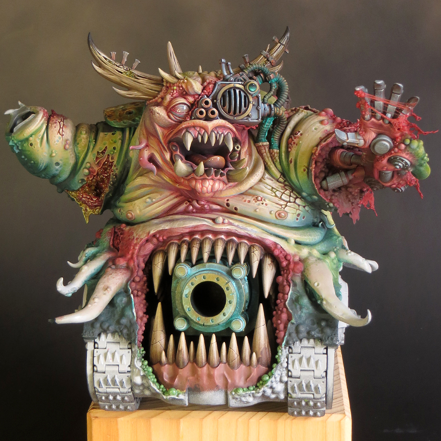
My thoughts on basing the model have greatly evolved over time. I’d thought of something quite large and elaborate, inspired by the type of basing you often see for historical tank kits. Thankfully I saw sense as that would have taken the project into diorama territory. What I now intend is to base the tank as though it were, and in many ways it is, a character model.

I’m not going to say too much about my basing plans until later in the project. But I must say a huge ‘thank you’ to Byron Orde who, through the course of a general discussion about basing, helped me to clarify my ideas. However, Byron went above and beyond that with some significant practical help towards getting this model onto the right base. I don’t like to blow my own trumpet but, with the help I’ve had from Byron, and if I can pull off all my plans, it’s going to be epic!

But all of that is in the future and for the moment I need to crack on with painting. I will go into more detail in my next posting but for the time being I will bring things up-to-date with a summary.

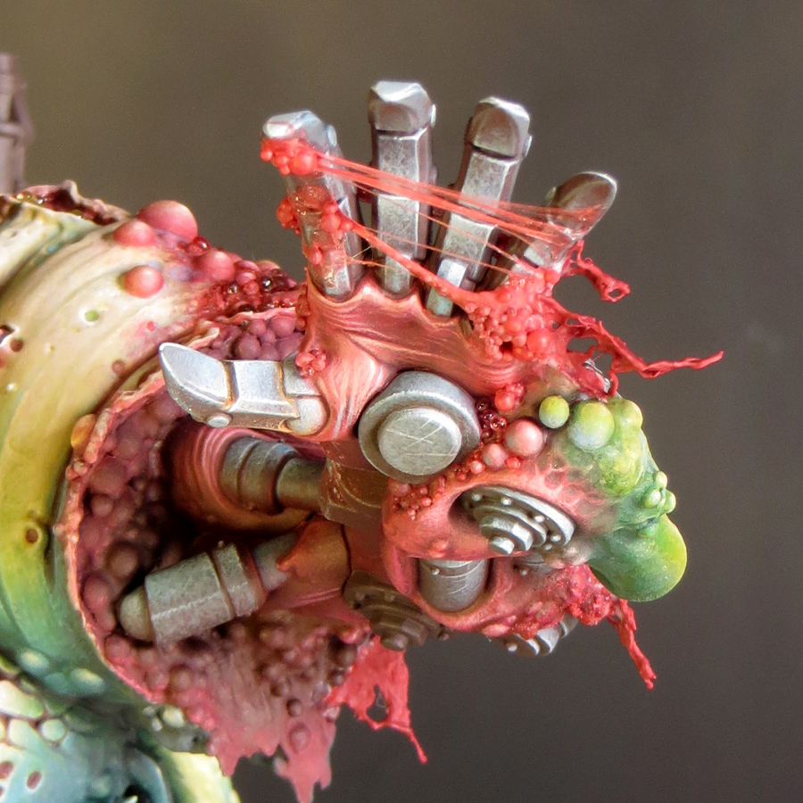
Back in October I painted the large horns on the Daemon’s head. This was straightforward but very fiddly. I then moved onto the mechanical left hand and arm. I’d made a good start on these when everything ground to a halt. 

At the end of February I was able to pick up my brushes again but decided not to go straight back to the hand. I decided to paint a sub-assembly to help me get back into the swing of things. For this I chose to paint the large chimney which I first had to detach from the model! This was not a fun job but well worth the bother as the chimney was much easier to paint as a separate element. 


With the chimney painted, I’ve now returned to painting the mechanical hand and arm.


Saturday, 2 October 2021

Project P30 - Part 13.

Ding Dong!


I’m back! Not that I’ve been away as such but I decided to take a bit of a break from painting my Daemon Engine. Things had gone very well, and I’d made excellent progress, but I felt that I was beginning to get a bit too relaxed with the project. To do my best work I need to keep on my toes and I think I was getting a bit complacent. The break in painting has given me the opportunity to reset and refresh the feeling of a challenge. 
 

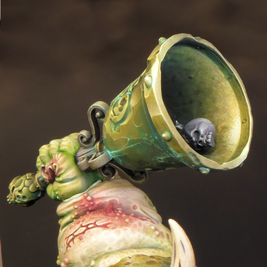
To get re-started I decided to paint the bell, which I’d been keeping back for just such an occasion. The bell was perfect to paint as a sub-assembly and, as it features distinct areas of flesh and metal, was also perfect to help me get back up to speed with the colour palette and techniques I’m using on this model.

Although this model will feature a variety of non-metallic metal (NMM) effects the majority of my metal will be painted in bronze tones. Often used for bells, cannon and in ancient armour, bronze seemed like the perfect choice for a model that features all of these. It also works very well with my overall colour palette not least because of the opportunity it gives me to use cool green hues in the verdigris effects.

As with all metals the colour of bronze, an alloy of copper and tin, will vary depending upon it’s exact composition, age and the conditions it’s been exposed to. Broadly speaking, bronze is a warm metallic hue along the lines of gold or brass; but slightly darker and browner than either, and less ‘orange’ than copper. In reality the colour bronze includes a wide range of tones and hues and can be achieved in many different ways.


I’d taken this into consideration when I created my initial colour palette but, as I‘ve now spent some time working with those colours, I decided to make some additions. The new colours are Balor Brown and Mournfang Brown both from Games Workshop and Ice Yellow from Vallejo Model Colour. The introduction of these colours has enabled me to create some warmer hues than my initial colour choices allowed. 
 

So far I’ve painted two distinct areas of bronze on my model: the back plate (including the shoulder) and the bell. Although both areas use colours from the same overall palette they have been treated quite differently. 

The back plate.


This is the single largest area of bronze on the model and much of it is in shadow. I decided that a warmer more saturated bronze would work best here, as it would have a strong contrast with the green hues in the adjacent areas of flesh and verdigris. In addition, a warmer and more saturated shadow colour gives more interest to the back of the model.


Base/shadows.


The base colour for this area is Rhinox Hide mixed with Boreal green and Black Leather. The additions serve to darken the Rhinox Hide.

Mid-tones.


I lightened the base colour with the addition of Mournfang Brown. As I moved into the mid-tones I increased the amount of the Mournfang and gradually began to add Balor Brown to my mix. The use of Mournfang Brown and Balor Brown give warmth and saturation to the final result.

Highlights.


As my colours go into the highlights, I introduced a mix of Balor Brown and Ice Yellow moving to pure ice yellow. The final highlights are Ice Yellow with a little white added. 
 

The use of Ice Yellow was a little risky as my global highlight colour is Flayed One Flesh and the introduction of a new highlight colour could cause a colour clash with previously painted areas. However, Ice yellow has, compared to Flayed One Flesh, a cooler more saturated yellow hue that works very well for bronze.

The bell.


Base/shadows


The base colour for the bell is a mix of Rhinox Hide, Boreal green and Black Leather. These are the same colours as on the back plate but there is less Rhinox Hide and more Boreal green and Black Leather in this mix. The resulting colour is darker, cooler and more desaturated.

Mid-tones


The biggest difference between the two bronze areas lies in the mid-tones. For the bell I have only used Balor Brown. This is mixed with the base colour in increasing amounts as the colour lightens. However, I have not used any pure Balor Brown on the bell.

Highlights.


As my colours have moved into the highlights, I’ve added Ice yellow to the Balor Brown/base colour mix. As with the back plate my highlights shift through pure Ice Yellow to an Ice Yellow/white mix. 
 

The final result for the bell is a bronze colour that is cooler, more desaturated and with shadows that are more blackened than the back plate.

The base/shadow mix of Rhinox Hide, Boreal green and Black Leather that I’m using on this model is one that I’ve often used before due to it’s flexibility. The mix gives a surprisingly dark result that I like to think of as ‘almost black’ and I can easily shift the temperature and saturation of this colour by altering the mix. 
 
A page from my notebook comparing my
'almost black' Black Leather/Boreal Green mix with Black

I’ll be adding more areas of bronze as my paint scheme progresses and I’m looking forward to creating more variations of this colour.

After painting the bell I turned my attention to the hand holding it; and what I thought would be relatively simple proved to be quite a challenge. As I said earlier part of my reason for painting the bell was to help me to get back up to speed with the colour palette. And it’s a good thing too. I forgot that my base colour for the flesh tones was a mix of two parts Rakarth Flesh with one part each of Bugman’s Glow and Sahara Yellow. Instead I used only Rakarth Flesh and it made a massive difference! The flesh tones were all far too cool and I had to glaze a lot of warm tones over this to balance things out. I’m now happy with the hand although I will almost certainly adjust it a little more once I glue it into place on the model.
 

As I’ve said before with this model nothing is finished until it’s all finished!


Thursday, 29 April 2021

Project P30 - Part 11

Skulls, Nurglings, Tentacles and a spot of bother with my microbeads!

Since I started painting my Daemon Engine at the beginning of February, I’ve made very good progress because I’ve managed to paint for a few hours almost every day. In fact, at times, I’ve almost gotten ahead of myself. I went into the painting stage of this project with a plan, of course, but I had many different options. That’s because I’ve spent years thinking about this project so I have a lot of ideas for how I could paint it. Far more ideas than I can (or should) incorporate into one scheme! 


So part of the challenge I face is to sort through all the ideas I have and edit them down to those I’m going to implement. I have to make just as many choices about what I’m not going to do as to what I am going to do. This is where my notebook and a file of reference/inspirational images have come to the rescue. They help me to keep track of my changing ideas and make sure I don’t forget any of them when the time comes to make a decision. This is an ongoing process because the more I paint the more resolved my ideas become but they can also develop in directions I’d not anticipated.

Every now and then I need to pause, sit back and consider my work. Which is just what I hadn’t been doing so it should come as no surprise that I found myself working on a part of the model for which I had no firm plan. The back of the left arm featured the sculpted detail of three skulls, forming a Nurgle icon, set into a large open wound. Very gruesome and apparently straightforward, all I had to do was paint what was in front of me.


However, I had a nagging feeling that I needed to do something with this area other than just paint it as it is! The skulls are a great detail in their own right but were too distinctive a detail from the donor model (Great Unclean One) and in the new context seemed a little fiddly. Whenever I’ve had doubts or problems with this model I find the best solution is nearly always to be bold, so I decided to replace the skulls with something a bit more dynamic!

I chose to have a Nurgling popping out of the wound. I painted my Nurgling, stuck him in place and filled the surrounding wound with microbeads. As it turns out this was not a good choice because I had replaced one fiddly detail with another. In addition to that the microbeads looked very artificial. It was time to follow my own advice and be bolder! 


I scraped away the microbeads and prised the Nurgling off the model. Then I took my Dremel and ground away all the detail of the wound to make a deeper recess. This was nerve-wracking work, and it made a horrible mess, covering the area in tiny plastic flecks that were very difficult to clean off the painted surfaces. But no pain no gain!

I decided to see how the model looked with a tentacle hanging out of the wound. This was a much bolder element than the skulls or Nurglings and it also tied in to the other tentacles on the model. A quick test fitting confirmed that this was a move in the right direction but I decided to add two tentacles because that was a little more dynamic than just one. I pre-painted and varnished the tentacles before I pinned and glued them into place. Next I had to deal with the wound and microbeads. 


I’ve covered the use of microbeads on this blog before and you can find my tutorial HERE. However as time has passed I’ve gained more experience with my technique and materials.

I still recommend applying the microbeads one at a time as this gives far more control over the final look. If you fill or cover an area with a mass of microbeads in one go the finished result can be formless and bland. Taking care with their placement will enable you to ‘sculpt’ with the microbeads and create some form and structure to your effect.

In my experience water effects is the best medium to fix your microbeads in place and bind them together; but it can also be mixed with a range of differing materials to tint it. Of course quantities used can be varied to adjust the finish but the examples bellow show my favourites. 

Water effects finished with a coat of gloss varnish will give a crystal clear finish.

 
Tamiya clear colours will tint the water effects without lessening the transparency. 
 
 
A small amount of pigment powders will give a slightly cloudy and less translucent finish. 
 
 
Acrylic paint can create a more opaque effect. 
 

To varnish or not is a big question because it can radically alter the final result of any water effects. I use Vallejo Still Water which dries to a clear shiny finish but that may change over time. I’ve noticed that over the course of a few days the finish will become a little duller and eventually take on a matt/frosted look. This may be a result of my products being out of date but it has eventually happened in all cases where I’ve not varnished over my water effects! 


However all is not lost because I quite like the frosted/translucent look. It’s an interesting and useful variation on the effect and the frosting doesn’t occur if the water effects have been varnished once they are dried. Where the frosting occurred and was unwanted it was easy enough to fix. I think the frosting is caused by humidity so I take a hairdryer and apply a gentle stream of warm air to the model. The frosting will disappear and the clear gloss finish will return before your eyes - like magic! It is then possible to apply a couple of coats of gloss varnish for a permanent fix. My preferred varnish for high gloss effects is Tamiya clear X-22.

The final update to my use of microbeads and water effects came as a direct result of how they looked on my Daemon Engine. I’ve always intended to feature a quantity of slime and goo on my new model, as it was a prominent feature of the old one. I felt that the semi-opaque look and more muted colour I get from using pigment powders was the way to go because I didn’t want my slime to be too bright and ‘cartoony’. But as soon as I started adding water effects and microbeads to this model it looked very artificial and didn’t feel like a part of the whole.

The solution was to apply some subtle red glazes over the green slime once it was dry. I usually build up a stronger red in deeper areas and along the top edges of my slime. This has the effect of toning down the slime and blending it into the surrounding areas. Even when it has been glossed over the slime now feels like a part of the whole scheme.