Showing posts with label nmm. Show all posts

Wednesday, 28 August 2024

Aeldari Voidscarred Corsair, Part Two

Painting the Felarch

As the first model of this project, the Felarch sets the overall colour palette and character for the rest of the models in the Corsair unit. This turned out to be problematic as the Felarch’s armour is quite ornate and proved to be a challenging subject for a new colour palette. However, going in at the deep end made me work a lot harder than I might have done if I’d started on a standard trooper. In the end, painting the Felarch forced me to thoroughly explore and refine my colour choices, which can only be a good thing.

I’d put a lot of time into planning the colour palette for my Corsairs but I made one major change before I even picked up a brush. My idea had been for an overall warm palette with a brown hue in the shadows but I decided to change this to a cool dark blue/green hue. I felt this would help in creating more of an overall colour contrast. It also lent itself to the atmosphere I wanted to create giving the model a more muted and sinister feel. 

Before I started painting, I experimented with lighting my model and took a series of reference photos. This has become a regular part of my painting process. These photos give me a fixed point to refer to as the paint scheme develops. They are an invaluable guide to the placement and general shape of the highlights and shadows. However, it’s important to remember that the photos don’t show how different materials will reflect light. Metal, fabric and flesh will each reflect light differently and not in the same way as a plastic model.

An example of my reference photos for lighting


The very first step was to put down a base layer of colour onto the primed mini. Yes I now prime my minis! It’s only taken me forty four years, but I find the base layer goes down better on primer than it does on unprimed plastic, quelle surprise!

For this scheme I worked mostly from dark to light so I used a black primer. Vallejo Black Primer Spray is my primer of choice and I’m very pleased with how it performed. The base colour is a dark blue/green. I used a mix of Scale Colour Black and Vallejo Dark Sea Blue at a 50/50 ratio. Pure black shadows can be visually boring and the addition of the Dark Sea Blue adds some nuance to them. It also helps create a smoother transition into the mid-tones than a pure black would.

Aelderai minis have an undersuit beneath their armour. For my Corsairs I decided to paint this a dark greenish grey. This will be a common feature that helps to tie all the models in the unit together. Perhaps not surprisingly, I used Dark Sea Blue for this and lightened it with Rakarth Flesh for the mid-tones and highlights. These two colours are an interesting combination that I will further explore elsewhere on the model. In the case of the Felarch there was very little of the under suit showing so I quickly moved on to painting the armour.

Painting the gold armour


Inspired by John Blanche’s artwork I decided to paint the Felarch’s armour a NMM gold. In fact, it would be more accurate to describe my approach as painting a NMM yellow! Many of John’s drawings featured a strong yellow wash to represent gold and I wanted to bring something of this to my models. However, this is more about taking inspiration and seeing where it leads me than it’s about trying to copy.

Working from a dark blue/green base up to a yellow mid-tone inevitably results in murky green hues. I decided to play into this because I have a preference for cool greenish gold hues. To create this transition I used US Olive Drab from Vallejo Model Colour. I could have simply mixed the base colour with my yellow for a similar effect; but the Olive Drab gave me a little more variety in the shadows, especially when going back over earlier work with glazes.

To transition into the yellow mid-tones I introduced Sahara Yellow. This is a deep yellow with a slight greenish hue that worked well with the Olive Drab. I worked the mid-tones up to pure Sahara Yellow and then began to create the highlights. To do this I used Tenere Yellow from Scalecolour although Vallejo’s Ice Yellow would work equally well. For the final extreme spot highlights I used pure white. 


Part of the trick in painting NMM is to create contrasts by placing deep shadows next to extreme highlights. This is something I have to push myself to do, as my default setting is to create smooth transitions. Ultra sharp edge highlights also help to sell the illusion of a hard polished metal surface and the pure white spot highlights are an important part of the effect.

So far I’d worked in a systematic step-by-step process going from dark to light, however in an unsatisfying monochromatic effect. The transitions need to be further refined and the colour palette needs to be expanded to help create the illusion of a reflective surface. All subsequent work on the armour will be a matter of going back and forth between the shadows, mid-tones and highlights constantly tweaking and refining until I’m satisfied with the result. The techniques used are mostly layering and glazing but there is also some ultra fine stippling used to blend the transitions.

Introducing colour nuances to the armour


To counter the monochromatic look I introduce colour nuances. These help to create the illusion that the armour is reflecting colours from both the immediate vicinity and wider environment. For the environmental reflections I usually pick a warm and a cool colour. In simple terms these represent colours reflected from the ground and the sky. 


For my warm nuances I used Citadel Layer Wild Rider Red while Citadel Base Thousand Son Blue provided the cool nuances. Both of these colours are very saturated and need to be mixed with the mid-tone colours. This will desaturate them and help to incorporate them into the overall colour palette. The mix ratios vary depending on their placement. Knocking the colours back like this helps to make them look like reflections on the metal surface, as opposed to being splashes of colour. 


The colour reflections from the model’s immediate vicinity are taken from elements of the Felarch’s costume. These are Citadel Layer Xereus Purple reflected from the lining of his cloak and a mix of Vallejo Model Color Dark Sea Blue and Citadel Base Rakarth Flesh reflected from the sashes. As with the environmental reflections its important to mix these colours with the mid-tones used on the armour. Placement of these reflections will depend upon the model but where an area is close to the armour it is likely that it’s colour will be reflected there. 

Finalising the paint scheme on the armour took quite a bit of time and effort. As is often the case when using a new colour palette there was a lot of trial and error to get through, and the process was not straightforward. However, all the hard work has paid off resulting in a scheme that I’m very satisfied with. There is every indication that painting gold armour on other models in the unit will now be a more straightforward process. 


Wednesday, 19 October 2022

Project P30 - Part 16a

The End is Nigh!

It will come as a great surprise to anyone if I state that a lot has happened since I last posted regularly on this blog! Not least the long anticipated return of Golden Demon UK at Warhammer World on October 1 & 2. I posted some finished pics here during the weekend of the competion but it’s time to indulge in a little time travel as I bring things up to date.

For some time my gut feeling was that I’d finish the Daemon Engine this year but there’s nothing like a deadline to boost momentum! I felt that, with some effort, the October deadline might be achievable so I decided to go for it. The last few months have seen some adrenaline fueled painting and I now feel more confident about that deadline. Things have been coming together well and the end is in sight!

As I move towards the closing stages of a project I usually create a checklist of things to do. This helps me to keep focused, stay on target and avoid missing anything out in a rush to get finished. It’s been especially useful this time around as there have been many steps to complete. In my next few posts I’ll describe that list of jobs in the order I did them.

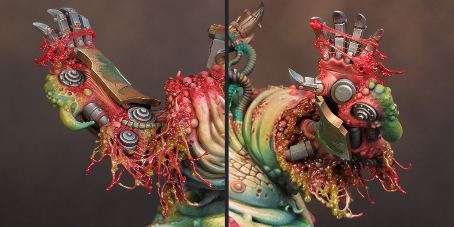
Finish the mecha arm.


This arm has been the most physically difficult area of the model to paint so far! In retrospect, I wish I had found a way to paint the arm as a sub-assembly, which would have made things a lot easier. 


However, the more interesting problem was to address the transitions between areas of flesh and metal. The arm came from the Forge Fiend kit and as such already depicted a union of monster and machine. This was a good starting point. I especially liked the hand as it matched the size of the fleshy hand holding the bell. However, some of the fleshy parts of the arm lacked the definition and texture that I wanted. I built up these areas with a combination of greenstuff, texture paste and microbeads. This had the additional benefit of helping to integrate the arm with the overall scheme by the use of common textures. This applied most especially to the bubbly/blistered texture I’d added elsewhere.

The next task was to address the stump out of which the mechanical arm protruded. Microbeads (of course) provided much of the texture, but I wanted something more. I wanted to create a semi liquid, ragged texture, as if the flesh was in the process of flowing into a new form. My greatest inspiration for this was the writing of Michael Moorcock, and most especially ‘Stormbringer’, which has had a huge influence on how I see the forces of Chaos and their effects. To create the flowing flesh, I used a variation of the cotton wool and water effects splash effect (shown HERE). In this case, however, I used a PVA glue and paint mix instead of water effects. 


I was very pleased with the final effect but the overall look of the arm didn’t feel right to me. After some thought I decided that I needed more metal and machine parts in proportion to the fleshy parts. Taking my nerves in hand, I clipped off the large green tentacle (I was to later use it elsewhere) and added the spikey guard rail from the Plague Burst Crawler. It was a nasty job but I was much happier with the arm once it was done!


Paint the sides of the tank.


I regarded the sides of the tank as three distinct areas: the side panels, the tracks and the entropy cannon. The side panels are especially significant because it was here I wanted to create a major transition between flesh and metal.

I’d decided upon the colours for this transition as a part of my ongoing work. The fleshy parts of the side panels were to be a deep green, transitioning from the lighter green upper parts. I felt that a flashy NMM effect would be inappropriate for the metal parts. So I used a brown hue inspired by patinated bronze. This was the same treatment I’d used on the ‘boiler’ at the back of the tank. It is a colour that contrasts with the green but not in a way that draws the eye away from the focal points of the model.

The transition is created through the use of a freehand texture. This was based upon the painted texture of the upper flesh areas, so it felt like a part of the overall scheme. I’d not been looking forward to painting this transition but, by the time I came to do it, things had become fairly straightforward. All my choices had been made as an on-going part of the project’s evolution, so I was able to focus on executing them rather than worrying about what to do! All in all this was one of the faster parts of the paint scheme to complete. 


Now I could paint the tracks. Once again my choices were informed by my earlier decisions. I kept the scheme for this area fairly simple. I painted the tracks and all the associated wheels, gears and general gubbins in the same dull grey NMM I’d used elsewhere. This would contrast with the adjacent parts of the model but fit in with the overall scheme. I had some plans for adding lots of mud and dirt but decided against this. As things have progressed, I’ve been editing my plans as it is easy to go OTT with this project. There is already a lot going on with the overall scheme. 


Rather than adding heavy layers of dirt, I painted some fairly subtle rust effects and blended them into the brown shadows to give a grimy feel. My global shade colour is Black Leather from Scale Colour which helped with this a great deal. I am particularly fond of shading cool or neutral greys with brown hues. As always, the photographs I took for lighting reference were extremely useful when it came to placing my highlights and shadows!

The final job for this overall area was to paint the two entropy cannons. These were painted as sub-assemblies and provided a nice little sub-project. 


The sides of the tank were the last significant areas of the tank to be painted.

The remaining work consists mostly of finishing things off and bringing together previously painted sub-assemblies.

Saturday, 2 October 2021

Project P30 - Part 13.

Ding Dong!


I’m back! Not that I’ve been away as such but I decided to take a bit of a break from painting my Daemon Engine. Things had gone very well, and I’d made excellent progress, but I felt that I was beginning to get a bit too relaxed with the project. To do my best work I need to keep on my toes and I think I was getting a bit complacent. The break in painting has given me the opportunity to reset and refresh the feeling of a challenge. 
 

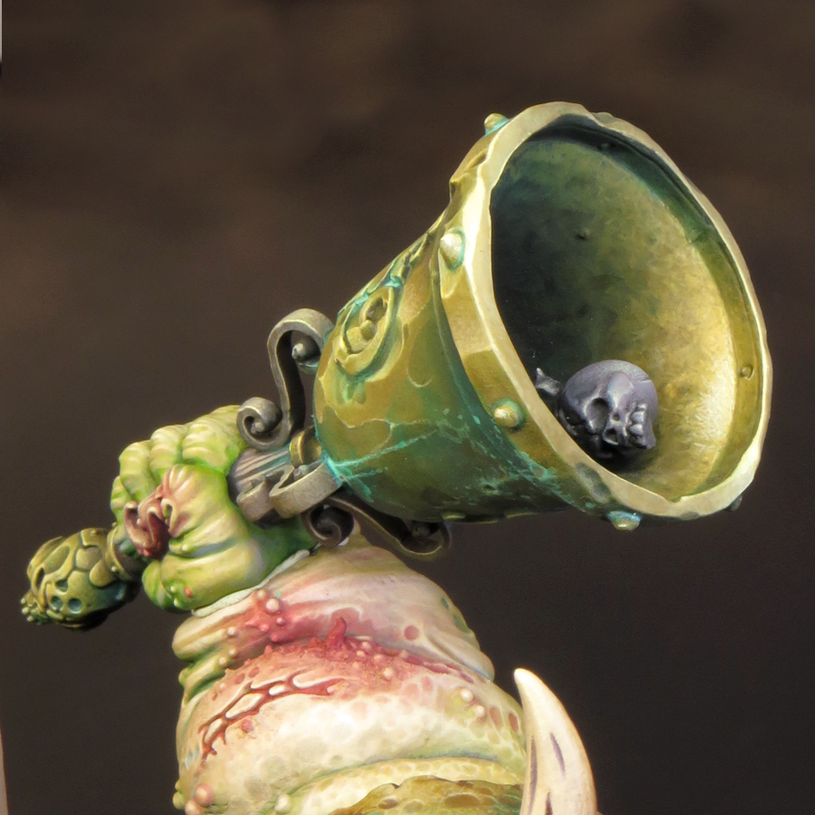
To get re-started I decided to paint the bell, which I’d been keeping back for just such an occasion. The bell was perfect to paint as a sub-assembly and, as it features distinct areas of flesh and metal, was also perfect to help me get back up to speed with the colour palette and techniques I’m using on this model.

Although this model will feature a variety of non-metallic metal (NMM) effects the majority of my metal will be painted in bronze tones. Often used for bells, cannon and in ancient armour, bronze seemed like the perfect choice for a model that features all of these. It also works very well with my overall colour palette not least because of the opportunity it gives me to use cool green hues in the verdigris effects.

As with all metals the colour of bronze, an alloy of copper and tin, will vary depending upon it’s exact composition, age and the conditions it’s been exposed to. Broadly speaking, bronze is a warm metallic hue along the lines of gold or brass; but slightly darker and browner than either, and less ‘orange’ than copper. In reality the colour bronze includes a wide range of tones and hues and can be achieved in many different ways.


I’d taken this into consideration when I created my initial colour palette but, as I‘ve now spent some time working with those colours, I decided to make some additions. The new colours are Balor Brown and Mournfang Brown both from Games Workshop and Ice Yellow from Vallejo Model Colour. The introduction of these colours has enabled me to create some warmer hues than my initial colour choices allowed. 
 

So far I’ve painted two distinct areas of bronze on my model: the back plate (including the shoulder) and the bell. Although both areas use colours from the same overall palette they have been treated quite differently. 

The back plate.


This is the single largest area of bronze on the model and much of it is in shadow. I decided that a warmer more saturated bronze would work best here, as it would have a strong contrast with the green hues in the adjacent areas of flesh and verdigris. In addition, a warmer and more saturated shadow colour gives more interest to the back of the model.


Base/shadows.


The base colour for this area is Rhinox Hide mixed with Boreal green and Black Leather. The additions serve to darken the Rhinox Hide.

Mid-tones.


I lightened the base colour with the addition of Mournfang Brown. As I moved into the mid-tones I increased the amount of the Mournfang and gradually began to add Balor Brown to my mix. The use of Mournfang Brown and Balor Brown give warmth and saturation to the final result.

Highlights.


As my colours go into the highlights, I introduced a mix of Balor Brown and Ice Yellow moving to pure ice yellow. The final highlights are Ice Yellow with a little white added. 
 

The use of Ice Yellow was a little risky as my global highlight colour is Flayed One Flesh and the introduction of a new highlight colour could cause a colour clash with previously painted areas. However, Ice yellow has, compared to Flayed One Flesh, a cooler more saturated yellow hue that works very well for bronze.

The bell.


Base/shadows


The base colour for the bell is a mix of Rhinox Hide, Boreal green and Black Leather. These are the same colours as on the back plate but there is less Rhinox Hide and more Boreal green and Black Leather in this mix. The resulting colour is darker, cooler and more desaturated.

Mid-tones


The biggest difference between the two bronze areas lies in the mid-tones. For the bell I have only used Balor Brown. This is mixed with the base colour in increasing amounts as the colour lightens. However, I have not used any pure Balor Brown on the bell.

Highlights.


As my colours have moved into the highlights, I’ve added Ice yellow to the Balor Brown/base colour mix. As with the back plate my highlights shift through pure Ice Yellow to an Ice Yellow/white mix. 
 

The final result for the bell is a bronze colour that is cooler, more desaturated and with shadows that are more blackened than the back plate.

The base/shadow mix of Rhinox Hide, Boreal green and Black Leather that I’m using on this model is one that I’ve often used before due to it’s flexibility. The mix gives a surprisingly dark result that I like to think of as ‘almost black’ and I can easily shift the temperature and saturation of this colour by altering the mix. 
 
A page from my notebook comparing my
'almost black' Black Leather/Boreal Green mix with Black

I’ll be adding more areas of bronze as my paint scheme progresses and I’m looking forward to creating more variations of this colour.

After painting the bell I turned my attention to the hand holding it; and what I thought would be relatively simple proved to be quite a challenge. As I said earlier part of my reason for painting the bell was to help me to get back up to speed with the colour palette. And it’s a good thing too. I forgot that my base colour for the flesh tones was a mix of two parts Rakarth Flesh with one part each of Bugman’s Glow and Sahara Yellow. Instead I used only Rakarth Flesh and it made a massive difference! The flesh tones were all far too cool and I had to glaze a lot of warm tones over this to balance things out. I’m now happy with the hand although I will almost certainly adjust it a little more once I glue it into place on the model.
 

As I’ve said before with this model nothing is finished until it’s all finished!


Friday, 9 June 2017

Sproket's Painting Masterclass at Element Games

The last few weeks have been a pretty intense time for me hobby wise and I’ve been left feeling a little tired, but very inspired.

I like to sit back and take time to reflect after a painting competition. But as soon as this year’s Golden Demon Classic was over I had to knuckle down and finish preparations for my Painting Masterclass at Element Games in Stockport. Although I’d painted enough of the Abyssal Warlord to serve as a reference model, I wanted to spend a little extra time refining the content and structure of my workshop. In addition to that I had to prepare a presentation for the ‘seminar’ being held on the Saturday Evening.

This was my first trip to the Element Games Gaming Centre and I was thoroughly impressed with it! It’s a great venue for a painting workshop with a very friendly and relaxed atmosphere. There is plenty of space and the facilities are excellent. There were HD screens linked up to a web cam for a close up and personal view of the painting and, later on, to display my slides for the evening seminar. The centre also has a bar and a well-stocked ‘Aladdin’s Cave’ of a shop, so all the necessaries are catered for!

I’d realised while working on my Megaboss that the combination of non metallic metals (NMM) and stippling I was using could form the basis of a painting workshop. The Megaboss himself, though a brilliant model to paint, is just a bit too complicated to be a good workshop model. I wanted an armoured fantasy miniature that would be relatively quick to assemble and feature plenty of easily accessible surfaces. The Abyssal Warlord from Scale 75 proved to be perfect for the job!


While the main focus of the workshop was on specific painting techniques, it was important to provide some structure and context. Most of all I think it’s important to demonstrate how they could be used to play their part in an overall paint scheme. To that end, alongside the stippling and NMM, I also incorporated topics such as planning, colour theory and contrast into the weekend.


The practical focus for day one was on painting a NMM steel effect that transitioned from warm shadows to cool highlights. The colour palette we used works very well as it is tried and tested and this enabled everyone to concentrate their efforts on learning the stipple technique of painting. I prefer to get everyone painting at my workshops as quickly as possible. I think the best way to learn is by doing and I wanted everyone to have enough time to get comfortable with the ‘new’ technique they were learning before we went on to explore some potentially trickier colour palettes during day two.


By the end of day one everyone had gained in confidence and experience with stippling. I‘d stressed that speed came with practise and as the afternoon progressed this became very apparent! Many of the attendees found themselves able to do in 15 minuets what had earlier taken them a couple of hours.

Although a part of the whole weekend Masterclass evening seminar also functioned as a stand alone event and this gave me the opportunity to open things up. Titled ’10 Top Tips, Tricks and Techniques’ I presented a selection of my favourite techniques and materials and showed how I had used them in my work. It’s probably no surprise to anyone that microbeads featured!


For day two we turned our attention to painting first a cold gold tone and then black metal. Both of these use simpler colour palettes than the steel we’d painted the day before but, as I mentioned earlier, they can be tricky to get right. It’s necessary to carefully control both the hue and saturation of the colours in these palettes as even subtle variations can alter the finished effect dramatically!

I’d made a point of putting the NMM colours in order of increasing difficulty. I wanted to present a challenge that would push everyone out of their comfort zones, but not traumatise them. It was hugely rewarding to see how everyone got to grips with the challenges, were able to resolve them, then move on and cope with the increasingly difficult colour palettes. I’d expected that by the end of the weekend there would be in a great variety in the results achieved. While it’s true that some painters got more of the model covered than others they all demonstrated a solid grasp of the techniques we had covered over the weekend. Everyone had reached the point where they will be able to take what they had learned over the weekend and apply it appropriately to their own project. I really couldn’t have asked for a better result!


I also have a partially finished Abyssal Warlord to attend to. I’d considered keeping him as a work in progress to use in teaching but after the workshop I’m feeling too inspired to leave him as he is. During the Masterclass we had some very useful discussions about how the Warlord could be completed and I came away with some great ideas for my own take on him.


Things are going to get very ‘Abyssal’, there will be tentacles and microbeads … Watch this space!